An Unfair Critique Of OS/2 UI Design From 30 Years Ago
A favourite YouTube channel of mine is Michael MJD, who likes to explore retro PC products and software from the 90s and early 2000s. Examples of these include videos on Windows 95, Windows 98, and the various consumer tech products designed to get people online. Can I just say how interesting those times were, where phrases such as “surfing the net” were thrown about, and where shopping centres were always used to explain visiting websites. I guess it was the best analogy one could use at the time.
A staple of Michael MJD’s channel is when he installs an old operating systems onto old hardware1. Yesterday, I watched the one where he installed OS/2 Warp 4 onto a 98 PC. We were an OS/2 household back when I was growing up, thanks to my dad using it for work, and I can remember using OS/2 2.1 and thinking it was actually pretty good. Better than Windows 95, in fact. I can’t remember if I ever used Warp 4, though.
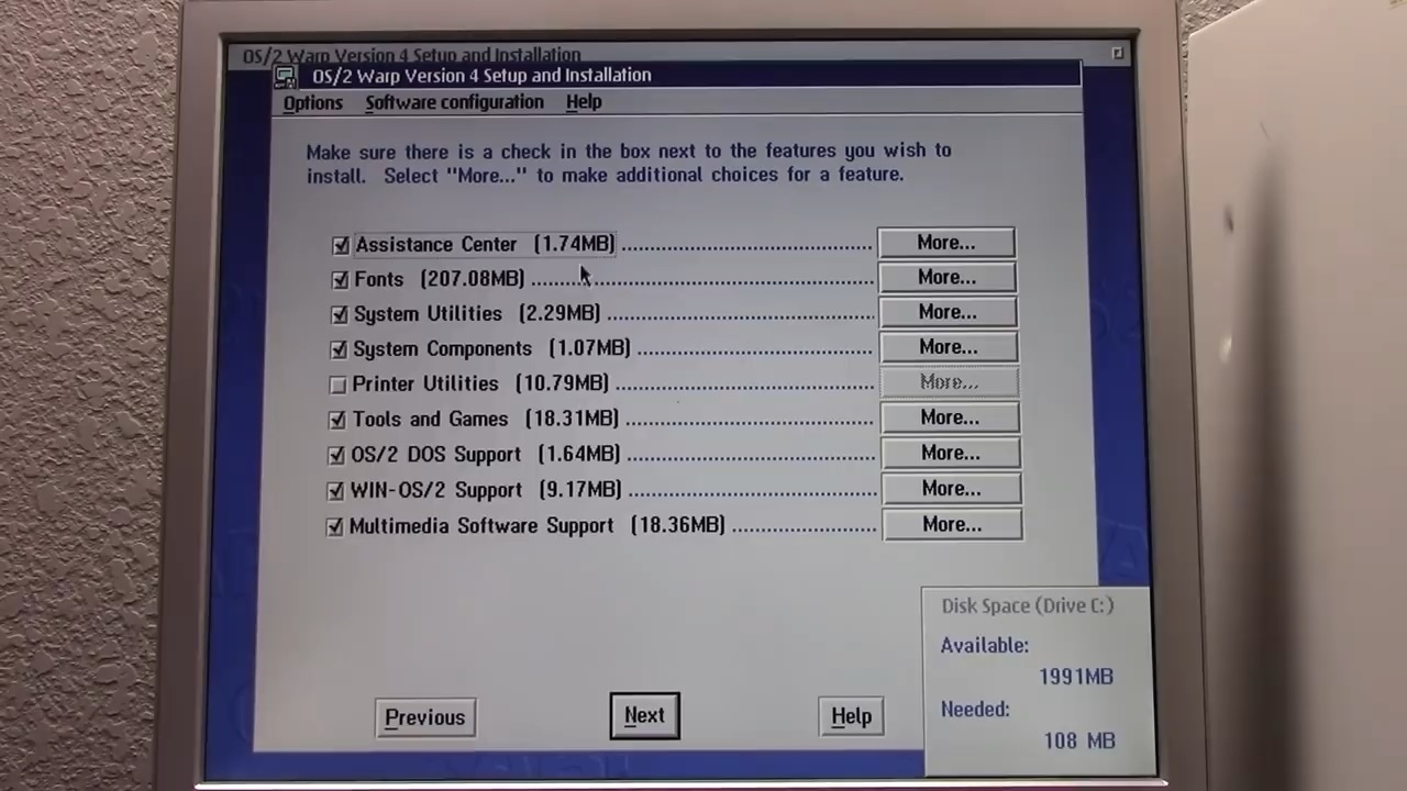
Anyway, while watching this video, and I was taken aback on how bad the UI design of OS/2 Warp 4 was. And really, I probably shouldn’t be throwing stones here: I’m not a great UI designer myself. But I guess my exposure to later versions of Windows and macOS matured my tastes somewhat; where I got exposed to the idea of interaction systems and user experience design (and generally just growing up). Obviously given how new the GUI was back then, many of these concepts were still in their infancy, although if you were to compare these UIs to the classic Mac or even Windows 3.1, I do think there was something missing in IBM’s design acumen. Was it ability? Interest? Care? Not sure. But given that it’s been 30 years, I’m not expecting the OS/2 devs to be able to defend themselves now. That’s what makes this critique wholly unfair.
Anyway, I’d thought I share some of the stills from this video that I thought contained some of the more cringeworthy UI designs2, along with my remarks. Enjoy.