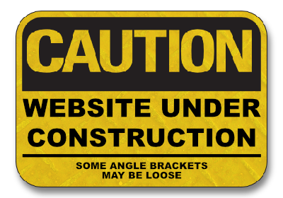
Trying out a bit of an experiment. I’m going to start accenting a few posts here with a small image in the form of marginalia, similar to what Dave Winer does on Scripting News. We’ll start with a classic for this post: a “website under construction” sign (this won’t appear in the RSS feed, so click through to see it).

This has been something I’ve been thinking about trying for a while, and I’ll be honest, I have no idea how it’ll look here. In fact I’m a little nervous about this. Would it enhance the post in any way, or be the blogging equivalent of clip-art on a Powerpoint slide? Would it make the site look dated, or even work with the type of posts I write here? I personally like the ones that appear on Scripting News, but I do wonder if that’s because they’re more likely to sit beside comments about the status quo, rather than the “today I did this” or “struggling with that” posts I tend to write here (this unbalance of topics is an anxiety I have about this blog that’s best suited for another time).
I guess we’ll find out together. I’ll try them for a bit and see how I feel in, say, a month. If I don’t like them, or I find myself never adding them, then I’ll pull them down and consider the experiment complete. Hopefully by then I’d have some answers.