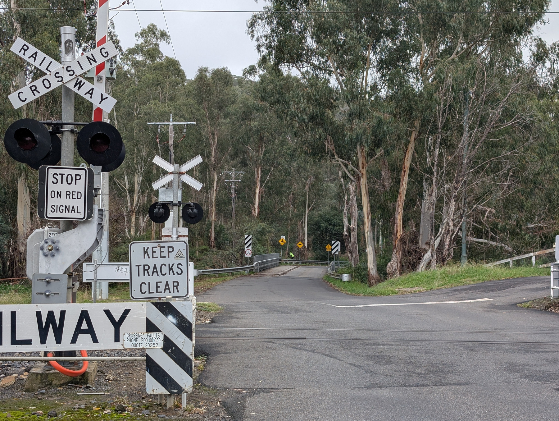
Probably the most disobeyed sign in all of South Melbourne. 😏

A sign indicates that cycling on footpaths is prohibited with a red circle and a line through a bicycle symbol.

I wish it was possible to style the carat shape in CSS. There may’ve been a future where that would’ve been possible, if CSS Tricks is any indication. But based on what I found elsewhere, I think that’s off the table for now. A pity. Would’ve been good to have a text field with a block-shaped caret.

I think a key to my continued use of Obsidian at work is that I’ve configured it to launch at startup. I wonder if I did likewise on my home desktop, I’d still be using Obsidian for personal notes too.

I can’t see a future in which we all program in one computer language. Such a language would be a “jack of all trades, master of few.” I really like Go, but I bristle at the thought of having to use it for things like command shells, configuration, or querying a database.

Speaking of JavaScript frameworks, I do appreciate the person who put together this “project website” for vanilla JS. Got a chuckle from it.

Via HTMX.

🔗 If Not React, Then What?

Quite the condemation of React and “frameworkism” in frontend web development. I’m not a frontend guy, but I do poke through the code from time to time, and it’s mindboggling how complicated it is. And for what? Is it for any specific engineering decision that are relevant to us? Or is it just because “Facebook does it?”

Speaking of which, if you read anything from this post, read the “But” section. An excellent set of rebuttals for why React may not be a good default choice.

Oh, and also the first footnote. I had no idea that some of React’s design decisions came about because of IE 6. The ghost of Microsoft’s shitty browser continues to haunt us all.

Green grass in summer.

A lush green field stretches under a partly cloudy sky, bordered by trees and featuring a tall tree standing prominently on the right.

In other building-small-things-for-myself news, I spent a bit of time this morning on the image processor for Blogging Tools. The big new change was adding support for working with multiple source images, instead of just one. This made way for a new “Phone Shot” processor, which arranges multiple screenshots of phone apps in a row, while also downscaling them and proving some quick crops and distribution options.

This should reduce the vertical size of mobile app screenshots I post here, something that’s been bothering me a little.

Some more work on that feed reader app. You know how I said that I wanted to hold off looking at appearances? Well, I abandoned that approach when I installed the app on my phone and tried viewing a few articles. And oof! There’s work to be done there.

First, it’s slow. Very slow. It’s taking a good second or two to pull feeds and entries from Feedbin. I was expecting this, and I’ve got a few plans on how to speed this up. But the biggest concern is the janky list scrolling. I mean, I wasn’t expecting the buttery smoothness of iPhone list scrolling, but I expected Flutter to be better than what I was experiencing. I’m hoping that it’s just because I was running a debug build, but part of me fears that Flutter is just not optimised for smooth list scrolling, favouring ease of development and a common runtime. I rather not change frameworks now, especially after spending an evening dealing with all the build issues, but I don’t want to live with this for ever.

But speed is not the biggest issue. The biggest offender was the feed reader view. The embedded web-view was only lightly styled, and it felt like it. The margins were all off, and I didn’t like the default font or colours. It made reading the article a bad experience to a surprising degree. I’ve dealt with rushed or poorly designed UIs in the past, but I didn’t have much tolerance for this. Not sure why this is, but I suspect it’s because I’ve been using feed readers that put some effort into the design of their reader screen.

In any case, a couple of evenings ago, I decided to put some effort into the styling. I replace the body text font with Noto Sans and the fixed-font with Ubuntu Mono. I dropped the font-size a little to 1.05 em (it was previously 1.1 em, with felt a little big, and 1.0 em felt a little small). I bought the margins in a little. And I styled the block-quote, figure, and pre elements to an appearance that, despite being a little overused, felt quite modern.

The results look much better, at least to my eye (and my emulator). Here are some side-to-side comparison shots of the changes (left side is the unstyled version, while the right side has the new styling changes):

Auto-generated description: Two smartphone screens display an article titled Apple Intelligence by Bitsplitting, discussing Apple's upcoming product announcement.
Demonstration of the new font and link colouring choices.
Auto-generated description: Side-by-side comparison of two smartphone screens displaying an email titled From the Department of Bringing Receipts to the Interview, featuring text from a Stanford Review interview with President Levin.
Demonstration of the changes to block-quotes. Having a line down the left-sided is a pretty common style, but it's one I like.
Auto-generated description: Two mobile screens showing a website with a summer dark theme, including CSS code for customizing the theme's appearance.
Demonstration of code blocks and figures with captions.

I still need to actually install this on my phone and try it out. I’m wondering whether I should do so after a bit more work syncing the read status with Feedbin. That’s a feature that’s keeping me on Feedbin’s PWA for now.

My poor work laptop has not seen a shutdown in two weeks. So many Vivaldi, Terminal, and Goland windows open. Not to worry, laptop. Soon they’ll all be closed and you can rest until Monday (or until I start you up over the weekend to check how a migration is progressing).

🔗 How I ship projects at big tech companies

Good post, although a hard one to read while reflecting on my last few weeks at work, and just feeling that I’ve been falling short in what it takes. 😔

Via this post, found on this BlogFlock.

Meeting at deadline is best. Second best is blowing past the deadline by such a wide margin that is was clear it was never going to happen. The worst by far is being close to meeting the deadline, yet it remains out of reach. Expectations are never recalibrated in those scenarios.

Spent the last few evenings continuing work on a Flutter-based RSS feed reader. This project is now further along then my previous attempts at doing this. I’m at the point where feeds and feeds items are being fetch from Feedbin and displayed in a list view:

Auto-generated description: A smartphone screen displays a list of feeds with titles like And now it’s all this, App Defaults, and Articles on Jose M.
The beginning of the feed list
Auto-generated description: A screenshot of a social media app shows posts by Manton Reece discussing topics like media coverage, book covers, custom emojis, and Micro.blog features.
The feed item list. Title-less posts are to be fully supported, with a bulk of the summary shown in the list. Titled posts should have a smaller summary.

The aesthetics are taking a bit of a back seat in favour of functionality for now; I haven’t even changed the default accent colour. But the infrastructure is there: tapping a feed will bring up the entries for that feed. This is using named routes for navigation, and cubits for state management. It’s a bit more work upfront, but it does make for a neater codebase.

The biggest challenge so far was getting the actual reader view working. I hoping to use the webview plugin, but when I tried adding it, I ran into a bunch of Gradle errors. These were either class version errors or dependency errors, depending on what I tried to fix it (I didn’t get screenshots, sorry). I eventually stumbled upon this Flutter Gradle plugin migration guide, and following this, along with upgrading Java to OpenJDK 25, got Gradle working again.

But I was still getting build errors. The first couple were Gradle plugins com.android.application and org.jetbrains.kotlin.android that needed to be updated. Easy stuff. And then I got this error message:

Execution failed for task ':webview_flutter_android:compileDebugJavaWithJavac'.
> Could not resolve all files for configuration ':webview_flutter_android:androidJdkImage'.
   > Failed to transform core-for-system-modules.jar to match attributes {artifactType=_internal_android_jdk_image, org.gradle.libraryelements=jar, org.gradle.usage=java-runtime}.
      > Execution failed for JdkImageTransform: /Users/leonmika/Library/Android/sdk/platforms/android-34/core-for-system-modules.jar.
         > Error while executing process /Users/leonmika/Applications/Android Studio.app/Contents/jbr/Contents/Home/bin/jlink with arguments {--module-path /Users/leonmika/.gradle/caches/8.10.2/transforms/575ccd1a7426c0be21d9fe3a81898be3-05a021da-a1a7-409f-a30a-bba769b57371/transformed/output/temp/jmod --add-modules java.base --output /Users/leonmika/.gradle/caches/8.10.2/transforms/575ccd1a7426c0be21d9fe3a81898be3-05a021da-a1a7-409f-a30a-bba769b57371/transformed/output/jdkImage --disable-plugin system-modules}

Running a web search on the error revealed this Stack Overflow answer, which resolve it. There were still a few complaints about the the NDK version but after all that, the app finally launched with the web-viewer.

Auto-generated description: A smartphone screen displays a simple app interface with the title Read The Feed and placeholder text saying Content goes here.
The web-viewer, with a "hello world"-ish test HTML document

I still need to actually render the entry, plus style the HTML a bit. The immediate goal after this, once the reader view, is getting this on my phone to start playing with it. It’s just barebones for now, but I find that the sooner I can start using a project myself, the more likely I am to keep at it.

If you’ve ever been asked to decide the session duration for a work-based application, choose a time based on how long your users will be at work. The AWS session token I have last 8 hours, but I’m at work for 9: 8 hours of work plus 1 hour lunch break. Come the end of the day, if I’m still doing things in AWS, I’m always prompted to log in again.

Even better would be a session duration of 10 hours, just in case work goes a little long that day.

Well, it took 2 years, but the final step of decommissioning a domain is over: the domain has now expired. I feel bad for all the links I now broke (it was a domain that receive a little bit of traffic). I just hope all the 301 Permanent Redirects I was sending for 2 years did something.

Must be Theme Changing day, as I’ve made one last change that’s been on my wish-list for a while: the ability to page within the post screen themselves. This allows one to page through the entries without having to go back to the Archive section.

Auto-generated description: Two navigation buttons labeled Previous Post and Next Post are displayed on a light background.

Here’s the template to do that, which uses Tiny Theme’s micro-hooks:

<!-- layouts/partials/microhook-after-post.html -->

<nav class="paging">
  <ul>
  {{ if .PrevInSection }}
    {{ if eq .PrevInSection.Params.trip .Params.trip }}
      <li class="previous">
        <a href="{{.PrevInSection.Permalink}}">❮ Previous Post</a>
      </li>
    {{ end }}
  {{ end }}
  {{ if .NextInSection }}
    {{ if eq .NextInSection.Params.trip .Params.trip }}
    <li class="next">      
      <a href="{{.NextInSection.Permalink}}">Next Post ❯</a>
    </li>
    {{ end }}
  {{ end }}
  </ul>
</nav>

I also added a bit of CSS to space the links across the page:

nav.paging ul {
    display: flex;
    justify-content: space-between;
}

The only thing I’m unsure about is whether “Next Post” should appear on the right. It feels a little like it actually should be on the left, since the “Older Post” link in the entry list has an arrow pointing to the right, suggesting that time goes from right to left. Maybe if I removed the arrow from the “Older Post” link, the direction of time will become ambiguous and I can leave the post paging buttons where they are. Ah well, no time for that now. 😉

One other thing I did was finally address how galleries were being rendered in RSS. If you use the Glightbox plugin, the titles and descriptions get stripped from the RSS. Or at least it does in Feedbin, where all the JavaScript gets remove and, thus, Glightbox doesn’t get a chance to initialise. I’m guessing the vast majority of RSS readers out there do likewise.

So I added an alternate shortcode template format which wraps the gallery image in a figure tag, and adds a figcaption containing the title or description if one exists. This means the gallery images get rendered as normal images in RSS. But I think this sacrifice is worth it if it means that titles and descriptions are preserved. I, for one, usually add description to gallery images, and it saddens me to see that those viewing the gallery in an RSS reader don’t get these.

Here’s the shortcode template in full, if anyone else is interested in adding this:

<!-- layouts/shortcodes/glightbox.xml -->

<figure>
<img src="{{ .Get "src" }}"
     {{ if .Get "alt" }}
        alt="{{ .Get "alt" }}" 
     {{ end }}
     {{ if .Get "title" }}
        title={{ .Get "title" }} 
     {{ end }} />
{{ if or (.Get "title") (.Get "description") }}
  <figcaption>
  {{ if .Get "title" }}
    <strong>{{ .Get "title" }} {{ if .Get "description" }} — {{end}}</strong>
  {{ end }}
  {{ .Get "description" | default "" }}
  </figcaption>
{{end}}
</figure>

I’ve also raised it as an MR to the plugin itself. Hopefully it get’s merged and then it’s just a matter of updating the plugin.

A Summer Theme

Made a slight tweak to my blog’s theme today, to “celebrate” the start of summer.

I wanted a colour scheme that felt suitable for the season, which usually means hot, dry conditions. I went with one that uses yellow and brown as the primary colours. I suppose red would’ve been a more traditional representation of “hot”, but yellow felt like a better choice to invoke the sensation of dry vegetation. I did want to make it subtle though: it’s easy for a really saturated yellow to be quite garish, especially when used as a background.

My original idea was to use yellow as the link colour, but there wasn’t a good shade that worked well with a white background that had a decent contract1. So I pivoted, making the background yellow instead, and throwing in a brown for the link colour. That improved the contrast dramatically, and helped to make the theme a little more interesting.

One thing I did do was make it conditional to the data-theme attribute in the html tag, leaving me the option of adding a theme picker in the future. If you’re interested in the CSS, here it is:

:root[data-theme="summer"] {
    --background: #FFFEF5;
    --link: #895238;
    --link_visited: #895238;
}

@media (prefers-color-scheme: dark) {
    :root[data-theme="summer"] {
        --text: #f8f8f2;
        --link: #fce98a;
        --link_visited: #fce98a;
        --background: #30302a;
    }
}

I plan to keep this theme for the next three months, then look at changing it again when summer turns into autumn. It’s probably not a great colour scheme, as I generally don’t have the patience for making minute adjustments to get the style “just right”. I guess it follows on from my feeling of the season: I generally don’t like summer and I just want to get it over with. Perhaps doing something small like this is a way of enjoying it a little more.


  1. It was much easier for the dark theme. ↩︎

A grey and wet visit to Hastings today for lunch and coffee. Met someone at the cafe who bought his two cockatiels along with him, both in little harnesses.

A small building labeled "Fire Shed" is situated near a pier with numerous sailboats in the background on a cloudy day.

Dear Google,

If an address book has a contact with both a home and work phone number, please indicate which number is which in the Messages app. I just sent a birthday message to my sister’s work phone by mistake.

Something like this would be enough:

A message exchange shows a birthday greeting followed by a response clarifying the use of a work number. This is annotated with a red box around the heading, which has a 'Work' badge underneath the contact name. A sticky note below it has the message: note the 'Work' indicator below the contact name.

Regards,

lmika