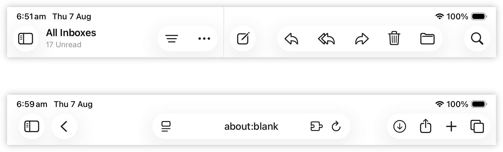
I gotta say, I’m not digging this white-on-white button motif in Liquid Glass. It looks buggy and unfinished. A little dated too: it reminds me of the late 2000’s when box-shadows were added to CSS 3 and websites were experimenting with using shadows as borders.