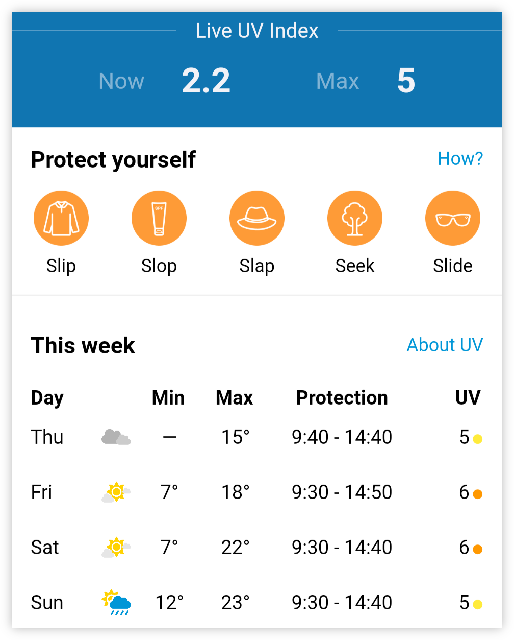
-
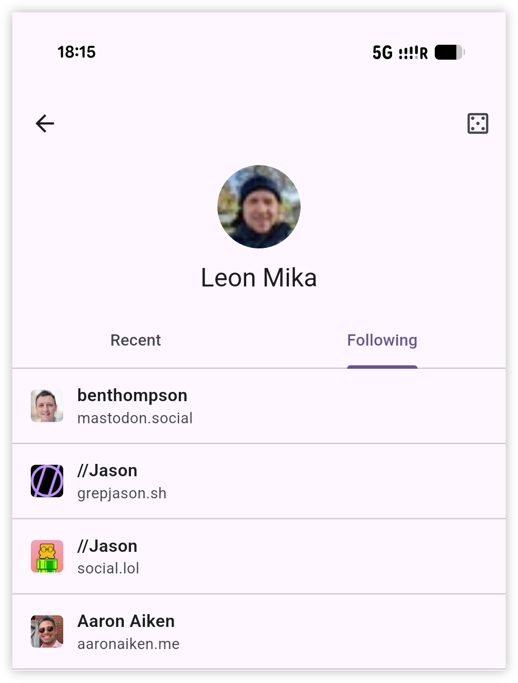
Asked the agent to make one small addition to my FollowSpec implementation: a button which will pick one at random and open the site. The goal is to discover new sites, and while the pickings are a bit hit and miss (there are a few dead sites in the lists I tried) I found one or two worth following. I guess I just need to cast that fishing line a few more times.
 screenshots
 -
📗 Vibelog
Tools Made In the Past Week
Loved the Lex On Tech post about the apps people vibe-coded to solve their own needs. Building for an audience of one has been a train I’ve been on for a long while, before the concept of AI coding agents came about. Their presence now has just made it easier, and made it feel less spending time of these things was time wasted.
This is a roundabout excuse to write about the tools I asked agents to build for me over the last week. They were:
Continue reading → -
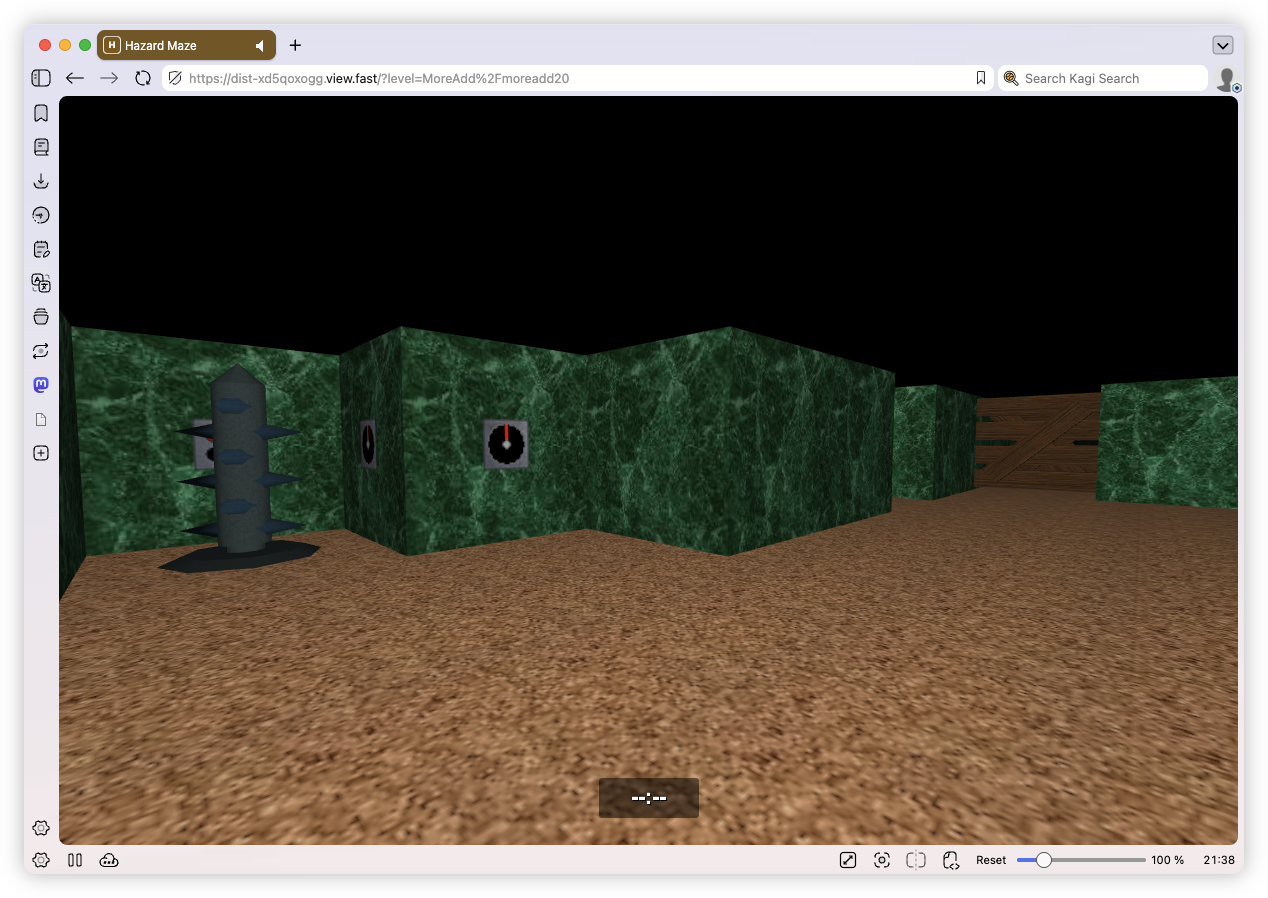
Coding agents managed to port Hazard Maze, another old Delphi project, to the web. Not as straight forward as the last one: it took about an hour to get 90% of it done, but another several to get it working right. But now, it’s working the best it ever has.
 screenshots
 -
The Compartmentaliser's Survival Guide To Obsidian Bases
My pattern for setting up Obsidian Bases for distinct topics. Continue reading →
-
📗 Vibelog
Porting Old Delphi Games To The Browser
This is pretty nice. I had some old Delphi games made more than 20 years ago that I wanted to get running again. They’re not very good games, but they were ones I spent a lot of time on in the past, and I wanted to make sure they were preserved in some way. In the past I would try to get them running in an emulator, with limited success. My ultimate goal is to get them running in the browser so they would survive any more platform changes.
Continue reading → -
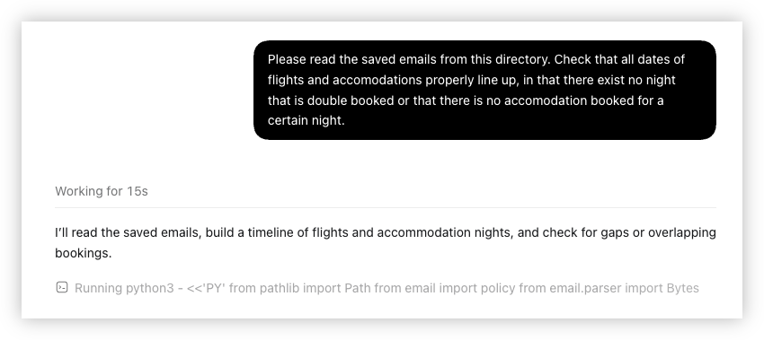
Might be a long time before I ask an AI agent to book my next trip, lest it screw up something. But at least it’s useful for checking the bookings I’ve made, giving me some assurance that I haven’t screwed up something.
 screenshots
 -
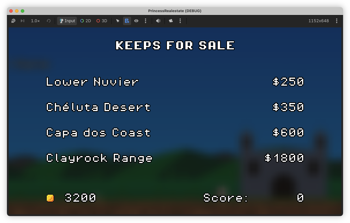
I think the end of this project is in sight. I settled on the end-of-game sequence, where your final score is calculated. I’ve only got the sequencing done, but that’s the hard bit: the actual maths is relatively simple. The final screen still needs doing but the game has got some cohesion now.
 screenshots
 -
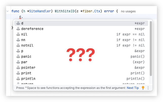
I don’t know what’s wrong with modern text editors, but none of them do code-completion well. Seems like whenever I type a dot to dereference something, they get confused and either throw up nothing, or suggestions of seemingly random things. Code-completion peaked in the frickin’ 2000s.
 screenshots
 -
📘 Devlog
Dequoter - Plugins
Trying out, and documenting some details of, UCL plugins in Dequoter. Continue reading →
-
I had a bit more of a think about that Unsung post about responsive code blocks. Apparently there exists a package which can format Go code assuming a certain width. It can also adjust the tab width and reflow comments and method calls. I asked GPT-6 Astra Light to build a quick playground for me to test it:
Prompt to Astra
In webtools is a set of basic web-tools. I would like you to add a new tool for testing out golines, shown here: github.com/golangci/… There should be a package version of this called shorten, documented here: pkg.go.dev/github.co…
What I’m thinking is a new tool which takes as input a Go program. It will use shorten to format the Go input and render it as output. There should be a slider allowing the user to adjust the Config.MaxLen (min width = 40, max width = 180, step = 5). Other config should be as follows:
- TabLen = 4, unless MaxLen < 80, then 2
- ShortenComments = true
- ReformatTags = true
- ChainSplitDots = true
Try to produce a WASM target for this, much like some of the other tools in this project.
It was my first test of Astra actually, and I was quite happy with what it produced:
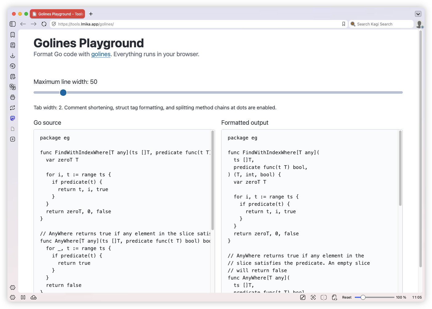
Anyway, adding something like this for Go code on this site might be viable. My current thinking is adding a module to Blogging Tools which would allow me to copy-paste a Go snippet, which would then be formatted four different ways, based on the assumed client width. I don’t know how that would appear on the site though. Probably one code block which would assume a baseline width, and some JavaScript or CSS which would replace it with something more size appropriate. I’ll also need to work with RSS and PageFind indexing. I’ll have to have a think about that.
screenshots golang -
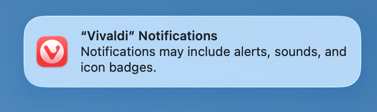
The ultimate irony here is that this notification about Vivaldi notifications comes up way more often than actual Vivaldi notifications. 😏
 screenshots
 -
📗 Vibelog
MD Treatment - Trying Out Pi and Kimi k3
I’m moving markdown files from an Obsidian vault to a private Hugo site, and I needed something that did text transformations. And these were text transformations that would’ve been… well, not difficult to automate, but annoying to automate. The transformations themselves would be easy, it’s just knowing where to apply them. Context is important, and I was not confident that a simple pattern matcher would’ve picked up or applied the transformations correctly.
Continue reading → -
Creating Keyboard Split Tracks In Logic Pro
Creating a MIDI track where the left plays one software instrument and the right plays another. Continue reading →
-
ChatGPT Briefings Via RSS
Using Hugo and ChatGPT Work/Codex to produce scheduled briefings that are available in an RSS reader. Continue reading →
-
It’s amusing to see what are obvious model training runs show up in the analytics. Huge, daily spikes spidering broadly through the archive (no individual page gets any more than a few visitors), all originating from one of a handful of countries.
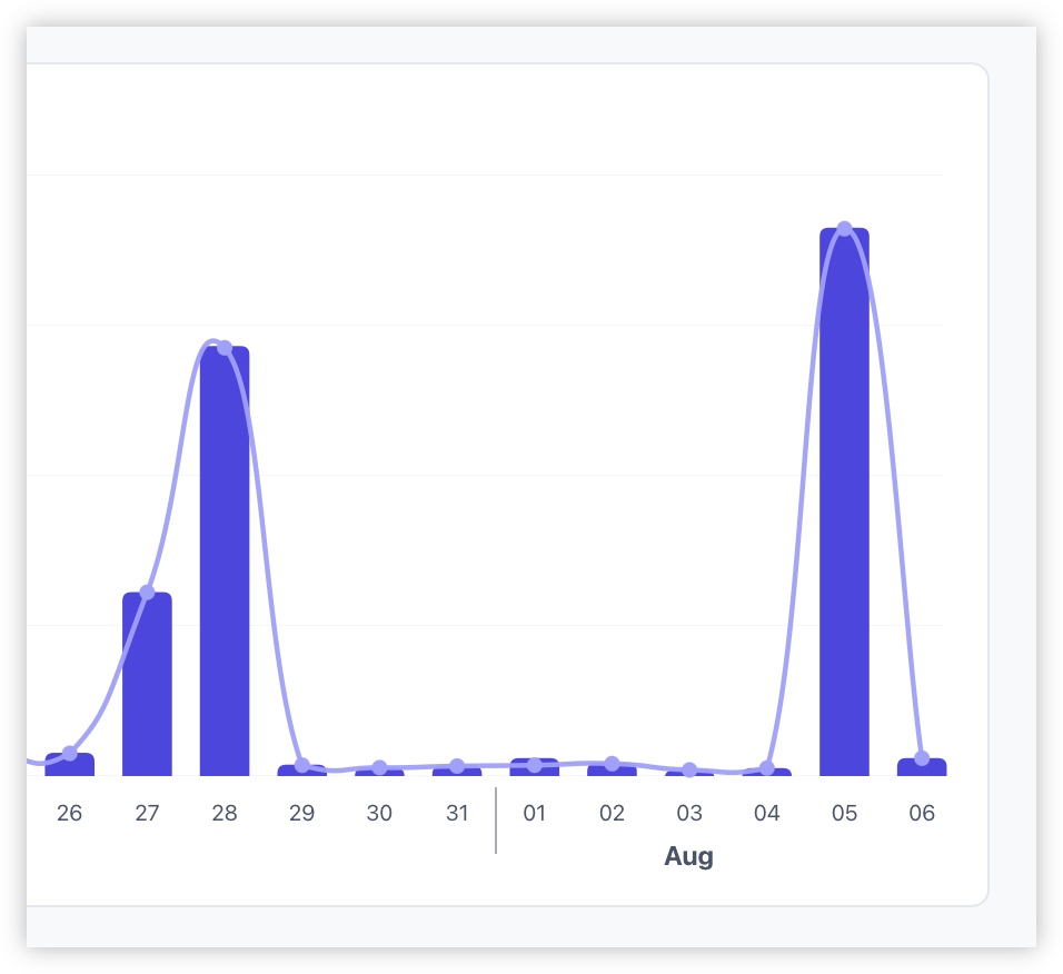
The latest spike is from Singapore, which got me thinking. I was unable to access my Coolify instance last night. I try to open the login page and all I’d see was a blank browser window. I opened the developer tools and checked the network tabs: all the connections were hanging, waiting for a response. I did manage to SSH into the VPS, which was also quite slow but usable. Checked CPU, memory, and available storage: all fine. So by all accounts, Coolify should be working.
Then it occurred to me: that VPS is running in Singapore. Could it be that these model training runs are saturating the available bandwidth? Access to my Coolify instance was always a bit of a crapshoot. Sometimes it would be fine, other times it would be completely unaccessible. It was only when I saw the correlation between the two phenomena that I began to suspect: maybe my blame of Coolify’s performance has been misplaced.
No matter. I’m back on using Dokku, and this new VPS is in Adelaide anyway, so hopefully this shouldn’t be too much of a problem now.
screenshots -
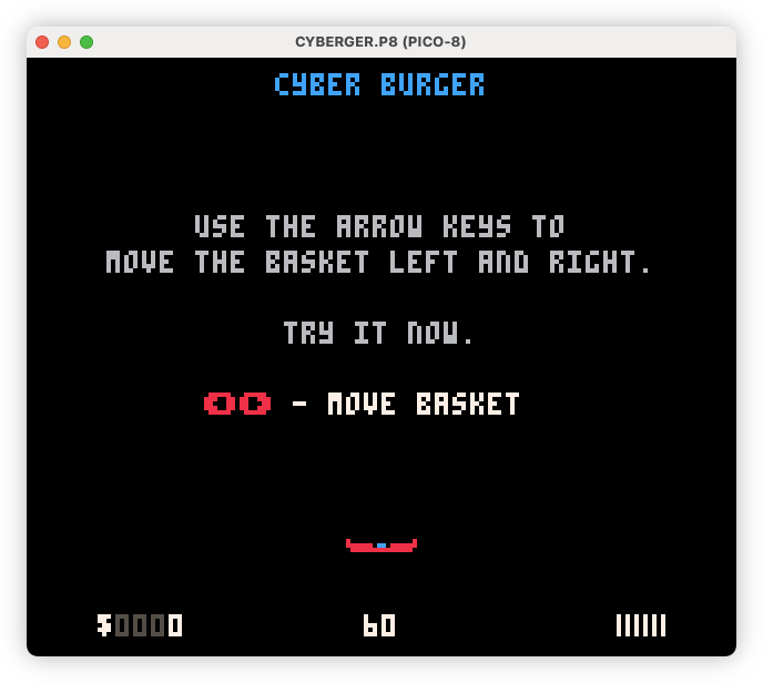
Had an urge to work on Cyber Burger this past week. Added an interactive tutorial, plus a harder “B mode” with a few new elements. Just managed to get under the maximum size of the cartridge, although it was touch-and-go for a bit, and I did have to pull out the onboard help.
 screenshots release
 -
Blog Design Update
Significant design updates have been made to the blog, including a new search page, an improved archives layout, and the reintroduction of backlinks and paging features. Continue reading →
-
📗 Vibelog
Well Read - A Fable Moment
Asking Fable to make some changes to my RSS reader, as well as getting Fable to look at a problem Opus couldn’t solve. Continue reading →
-
📗 Vibelog
Weatherpatch - UI Improvement
A few weeks ago, I vibe-coded a web-app called Weatherpatch. This is an app that is designed to receive email newsletters and produce them as an RSS feeds: basically what Feedbin does, but without needing to use Feedbin. The app was vibe-coded with Opus, and while functional, it is hardly an example of good design (unless you’re a fan of Cubism). To wit:
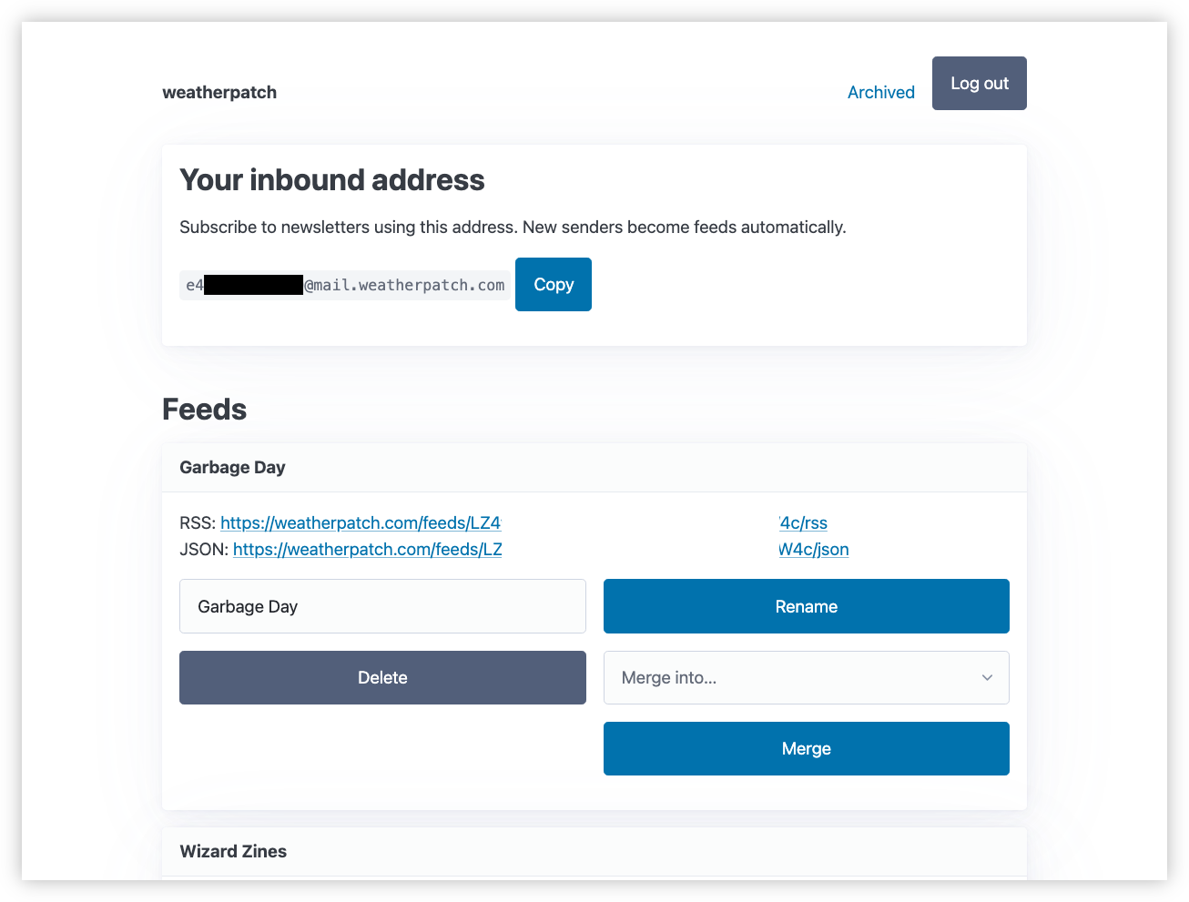
Yeah, Opus just threw the feed management controls all over the place. And I tolerated it for a time. I was more interested in having something functional, rather than pretty. But the thing about a bad UI is that it makes using the app feel bad. Sure I’m not in there managing feeds, but I would like to go in there are copy-paste the email address when setting a new one up.
Continue reading → -
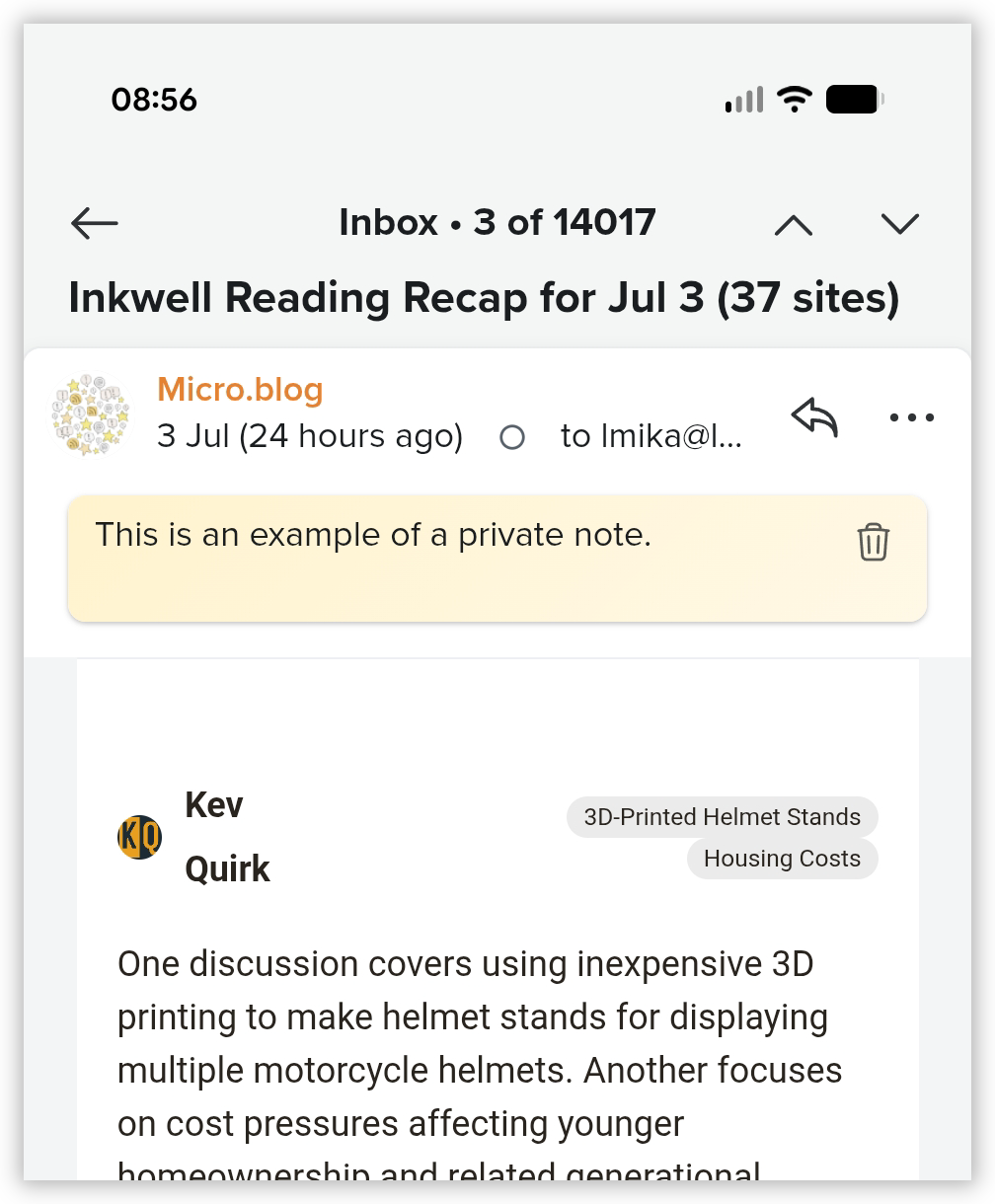
TIL that Fastmail added the ability to annotate an email with a private memo, similar to Hey. It also shows up in the email list. This is good. I hope I remember to use it.
 screenshots
 -
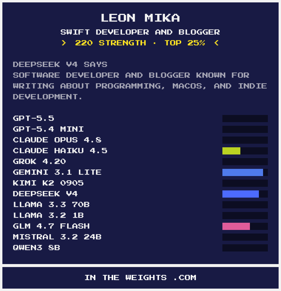
Turns out I’m in the weights. They know I’m a software engineer, but not much more than that. Hilariously, Claude and Gemini think I’m a Swift developer and contributor. I guess the models have a problem recognising Go as a proper noun (or there’s a Leon Mika out there that’s a legendary Swift dev).
 screenshots golang
 -
📗 Vibelog
Show As Table - A DSL In a Hurry
I was asked to make a couple of diagrams for the purpose of showcasing a database design. These diagrams were mainly used to show the relationship between entities, so I chose to use TLDraw for this. But there was a need to add some example rows, which TLDraw does not make easy. Furthermore, there was a bit of a push to get this done quickly, as these were to be shown to various stakeholders the next day.
Continue reading → -
📗 Vibelog
Blogging Tools - Some Post Authoring Work
Requesting some work from Claude to add post scheduling to Billing Tools. Continue reading →
-
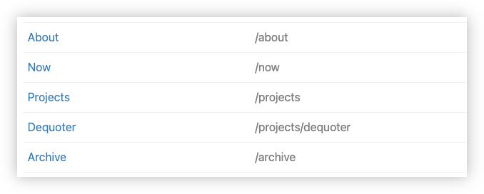
Ooh, this is a nice feature of Micro.blog. You can add pages that can hang off the URL of other pages, like a child page. As far as I can tell, it’s just a matter of including the parent path in the URL. I don’t know if you need the parent page. Having one works for me so I didn’t check.
 screenshots
 -
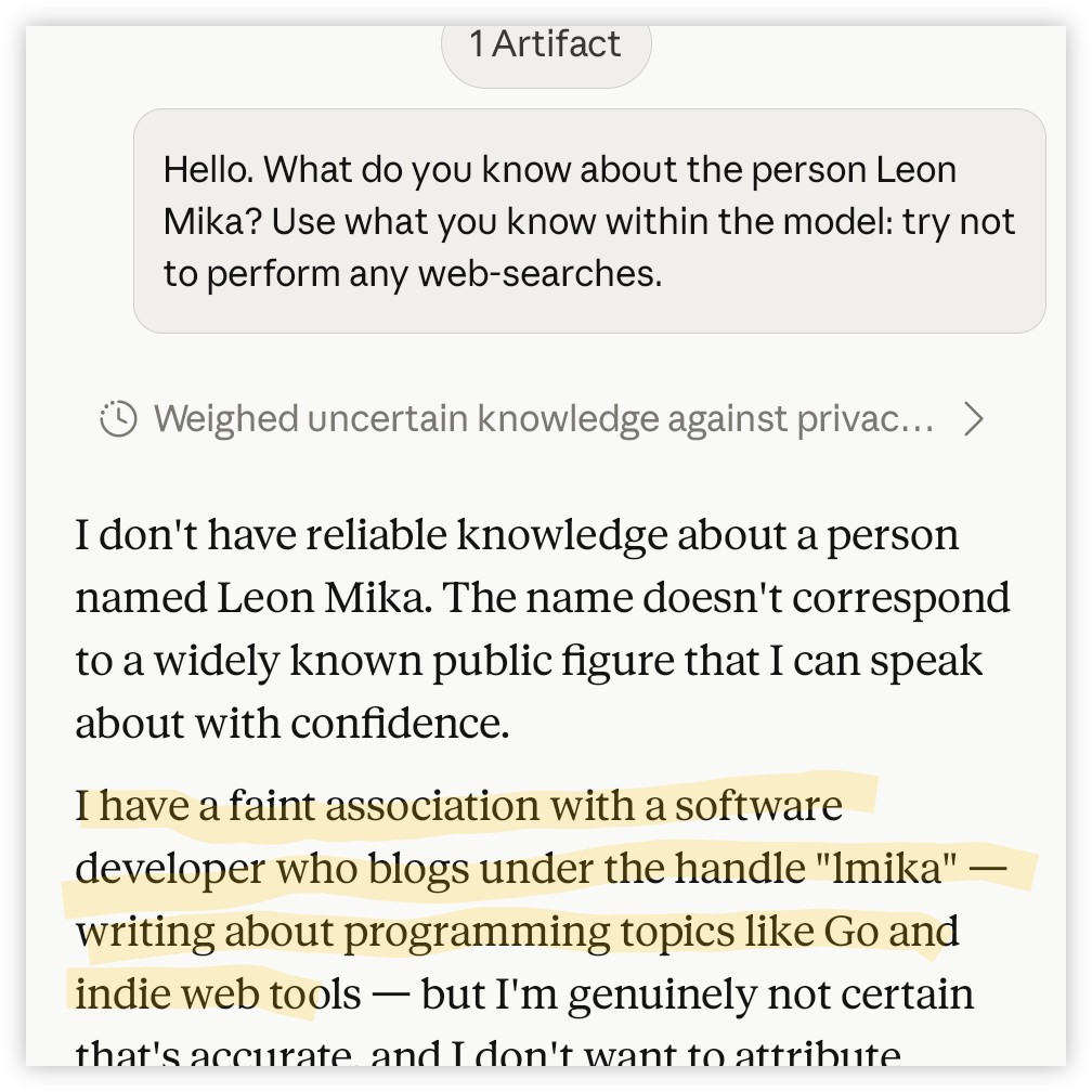
I was curious to see if Fable 5 had any knowledge of this blog in its training date (modern day equivalent of Googling yourself, I guess 😏). The answer seems to be maybe. It is aware of it, apparently, but isn’t quite ready to associate it with the author making the request.
 screenshots
 -
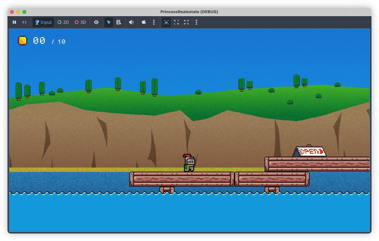
Done! The backdrops for my Godot game have been made. Finished the desert one last week, and the coast one this evening. I also redid the mountain one, which is a little less interesting than the one I had, but it better matches the others artistically. Now time for the meta elements. 😓
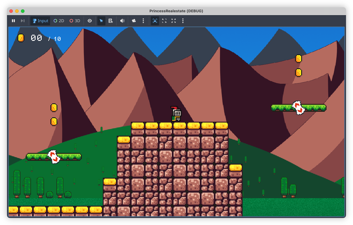
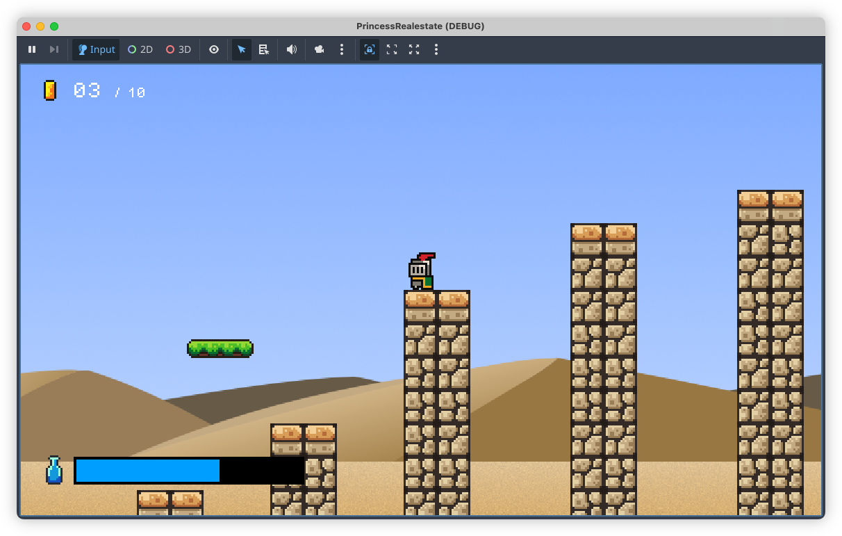 devlog screenshots
 -
Compared profile websites at work today. I really need to get mine cleaned up. I still have a link to GitHub, despite not using that account for much nowadays.
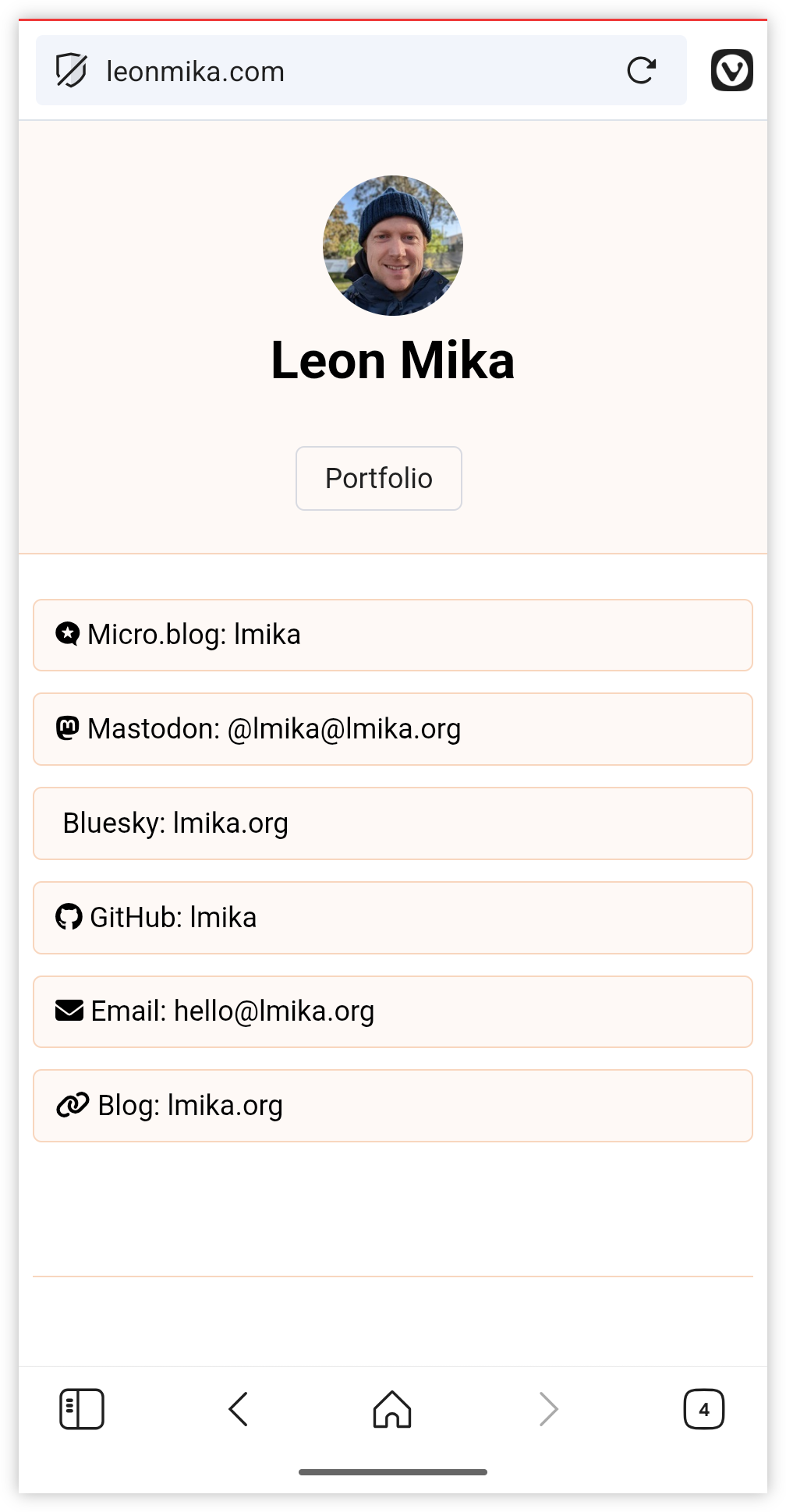 screenshots
 -
Trying to develop the habit of using the Micro.blog app for MacOS, so the backup feature will run. I expect the backups of this blog to be large. But 2.59 GB compressed? Wasn’t expecting it to be that large.
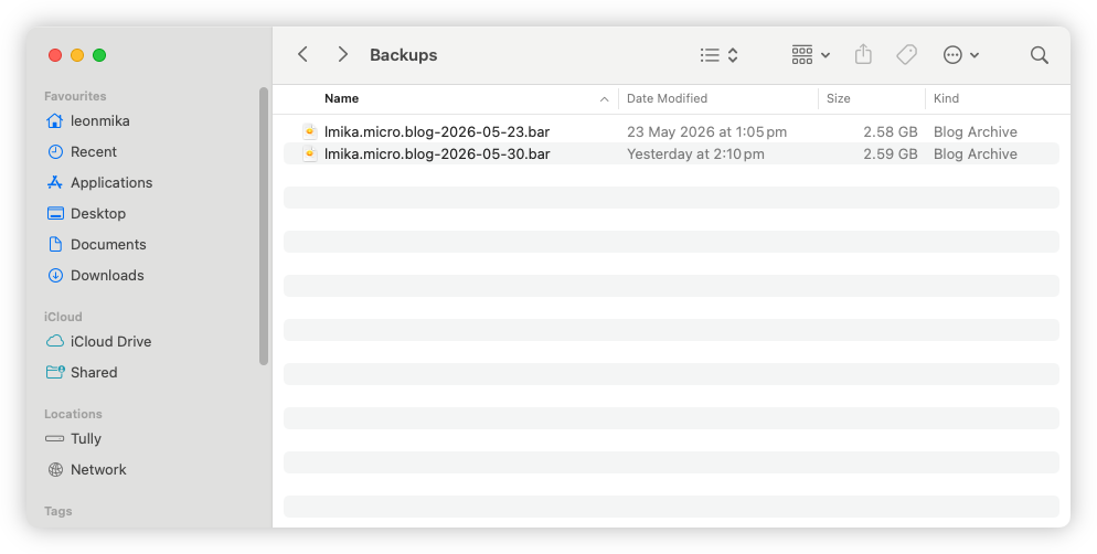 screenshots
 -
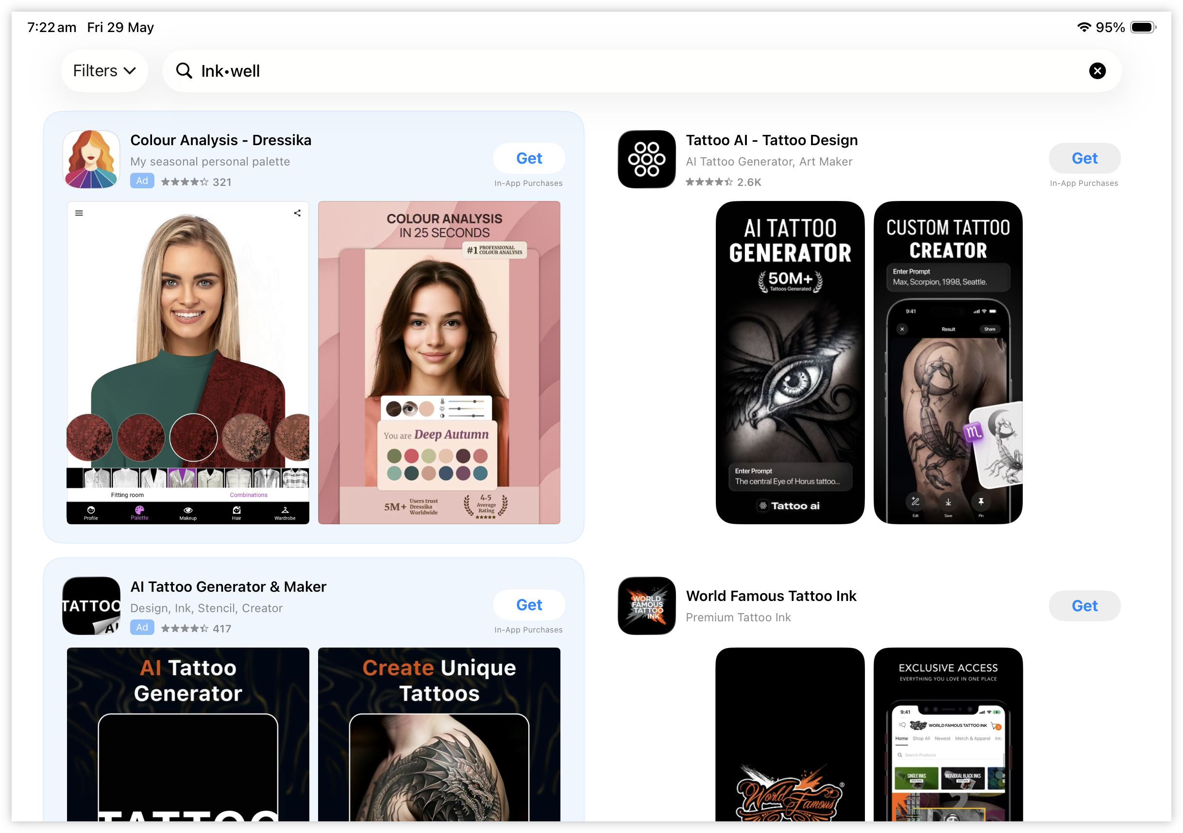
How does anyone find anything on the iOS App Store? Made several fruitless attempts at finding Inkwell, and ended up just using the link in the help guide. It’s there if you search for “Ink•well”. Just scroll past the unusually large number of AI tattoo generator apps, which is a thing apparently.
 screenshots
 -
Hmm, either Steven Pressfield’s blog got hacked, or he’s decided to diversify. 😏
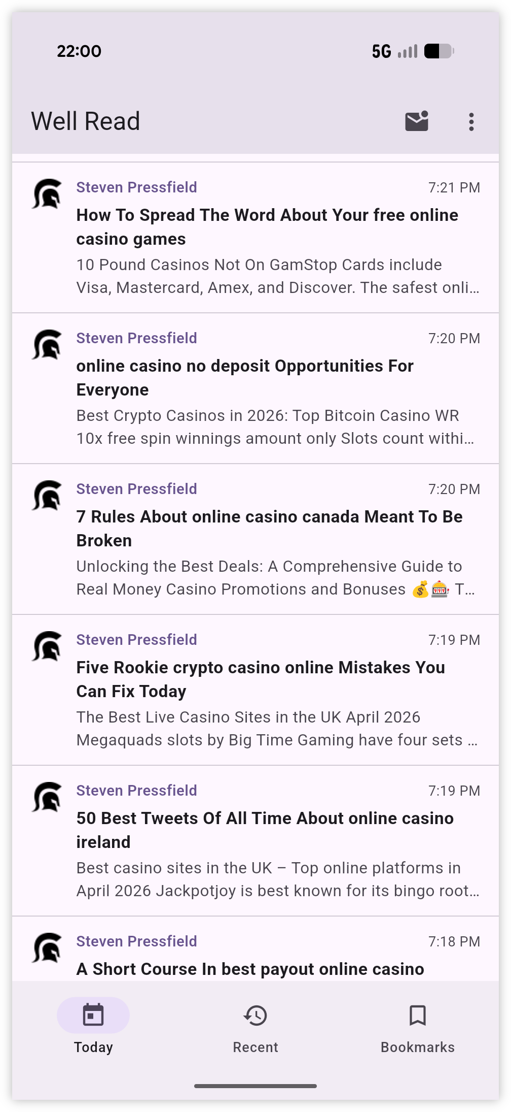
Also, props for being the first instance of RSS spam I’ve encountered in a long while.
screenshots -
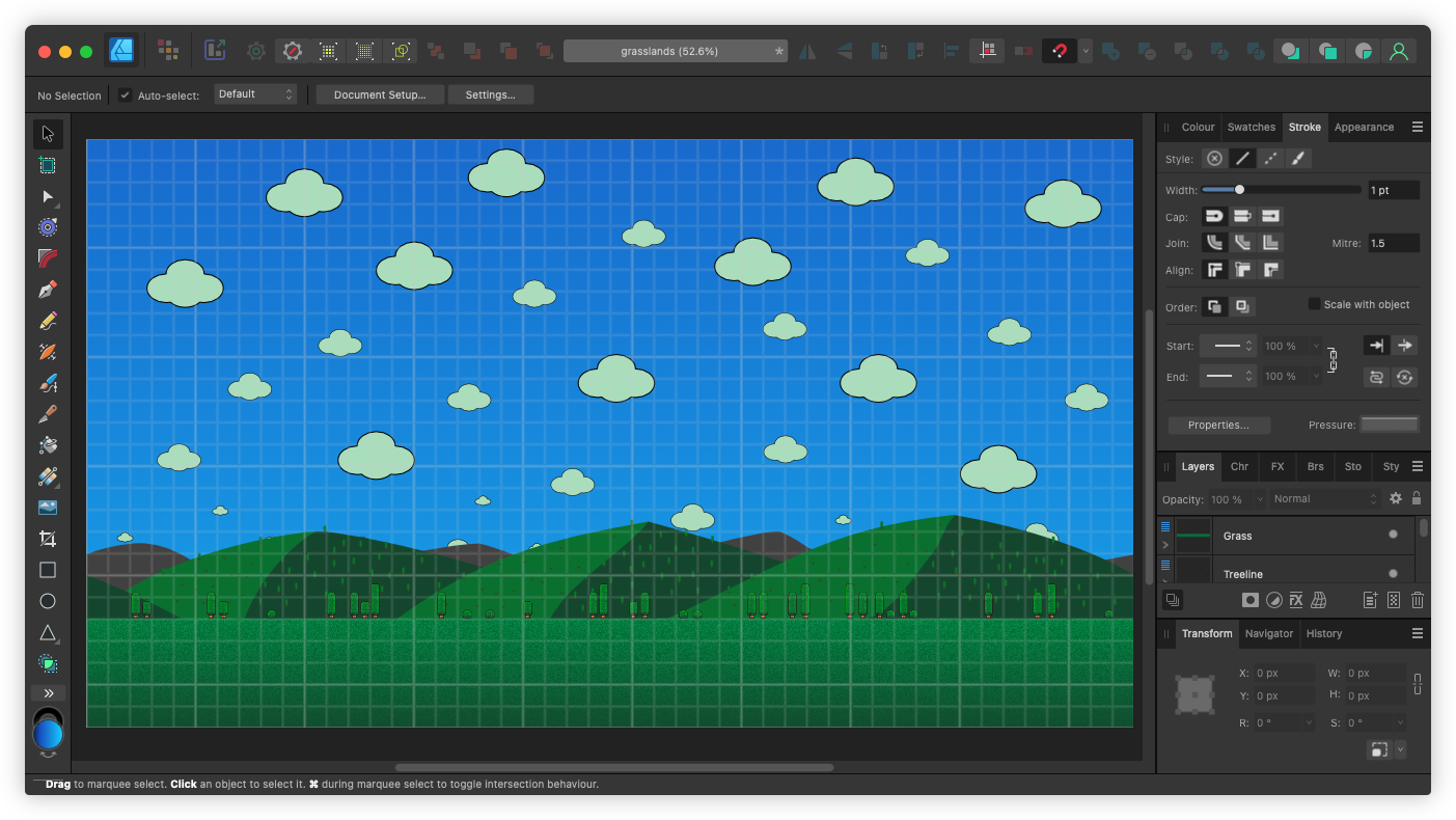
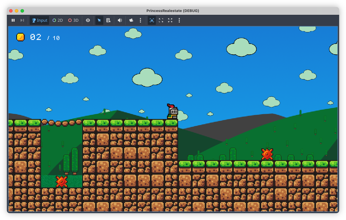
The on-again, off-again Godot project is still going. Most of the levels are done. Now it’s time to finished the backdrops and SFX, add the meta-elements (which I’m not looking forward to), and just spit and polish. Trying Affinity Designer for the backdrops, which feels more right for me.
 screenshots
 -
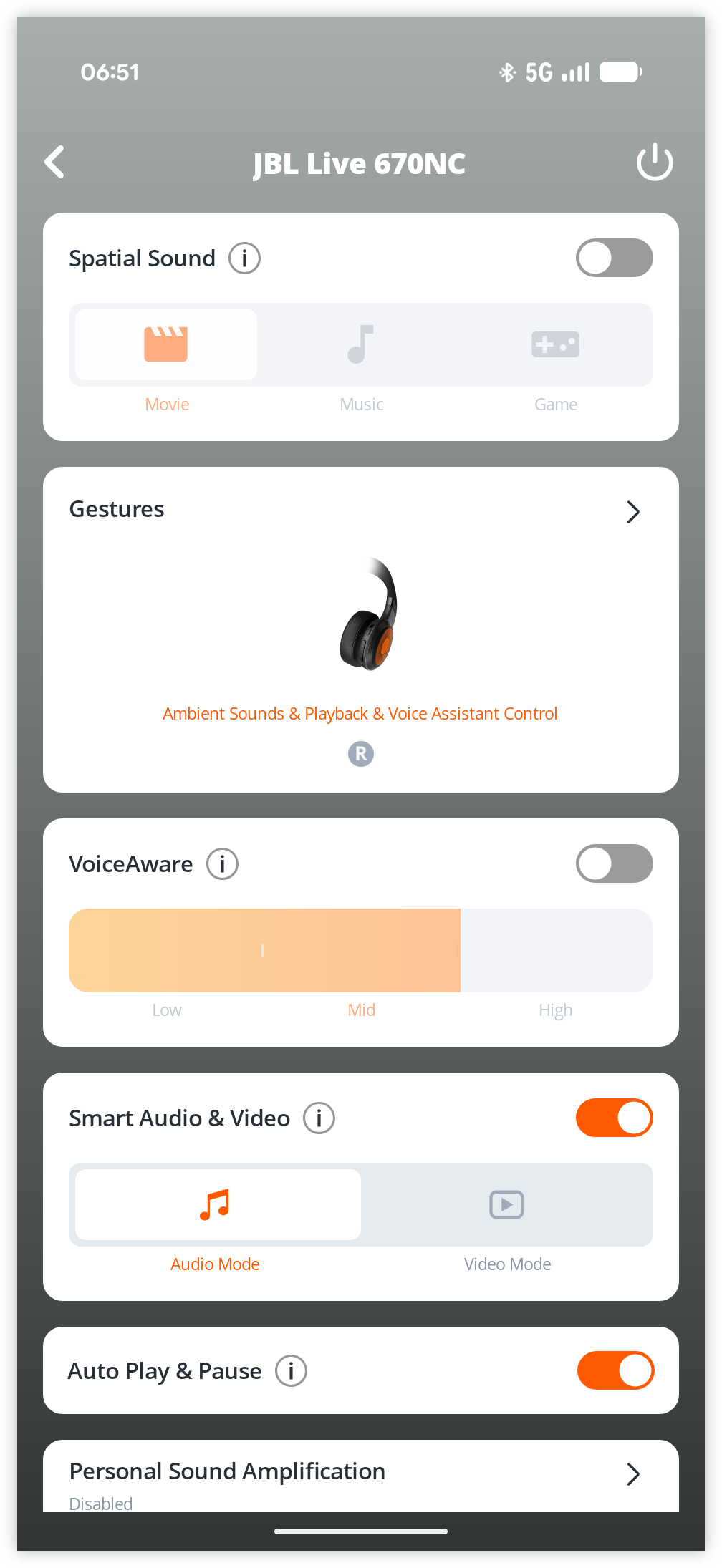
Some minor teething issues with my new headphones. While trying to turn off noise cancelling I pushed a button which paired it with someone’s device, and started hearing their music. Had to resort to getting the app, which doesn’t thrill me, but it’s better than randomly pressing buttons.
 screenshots
 -
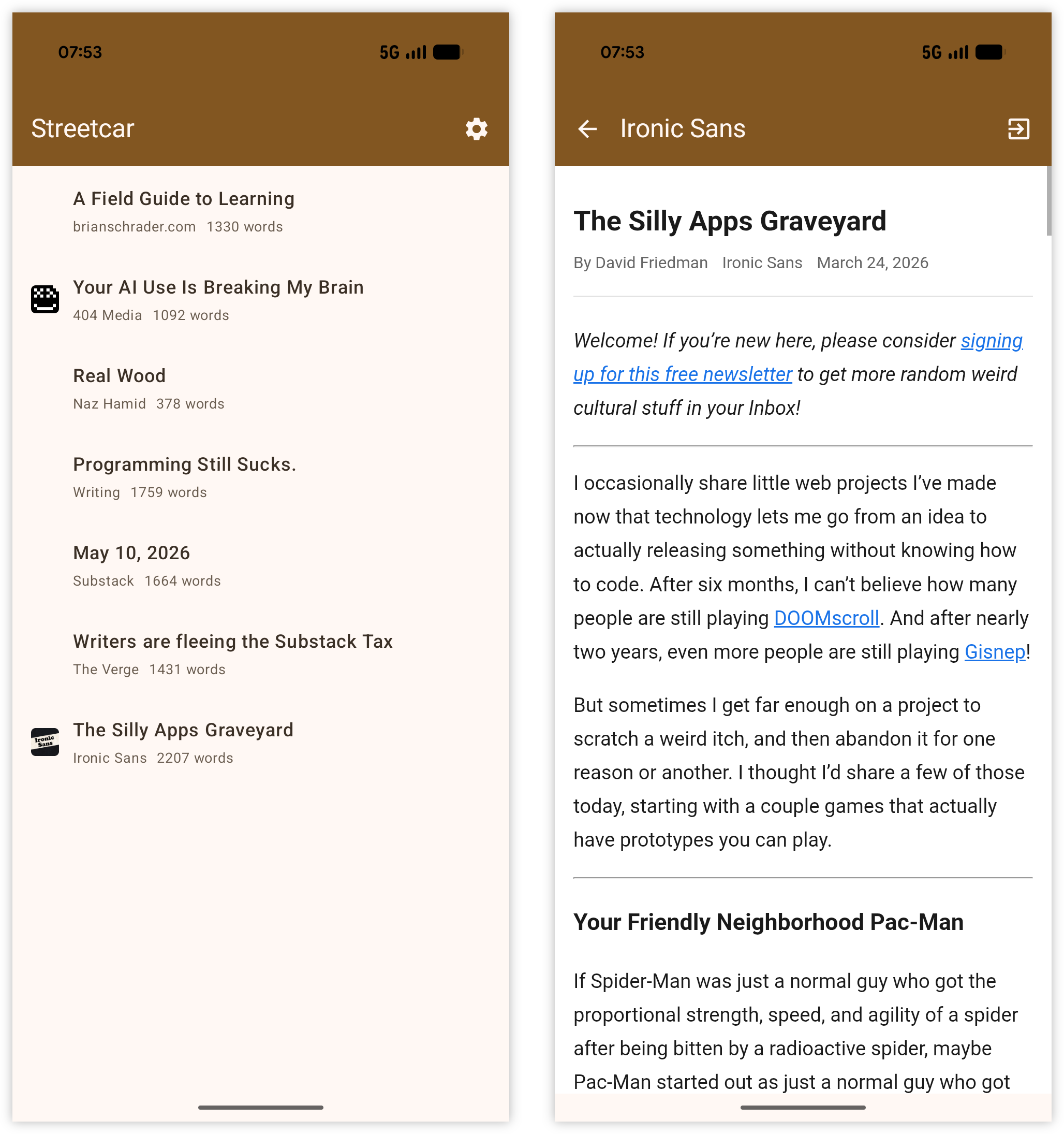
Talked to the agents yesterday and it’s come back with this Android app. Primed the pump, as it were, by bookmarking a few posts in Quick Reads for the commute home. We’ll see if I’ll read them.
 screenshots
 -
📦 Release
Dequoter 0.1.9
Initial release of Dequoter: a simple Boop-like text processor for MacOS. Continue reading →
-
📘 Devlog
Imagen
A personal playground with image generation models (not related to Google’s Imagen model). Continue reading →
-
I think I’m coming round to liking passkeys, but they’ve still got quite a way to go, particularly in their UX. Tried enrolling a passkey for something in Vivaldi for Android. The presented modal was a little unclear as to what device I was actually enrolling. There wasn’t a clear “Passkey” option. Instead, in a menu of four items, I saw NFC card, or USB dongle as the first two. “This device” was the last one.
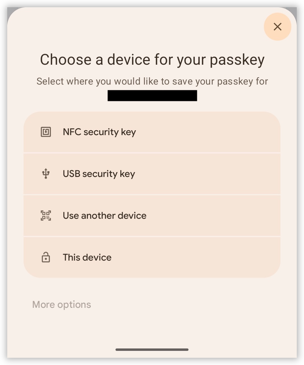
I tapped it and went through the prompts. It seemed like it produced a passkey, but when I tried to login, it wouldn’t present it as a login option. It offered something like “Use other device” or something, but nothing to suggest that it had a passkey on file.
I did eventually enroll my phone the desktop browser. The QR code exchange worked surprisingly well, but again, it was unclear which option I actually wanted. I think the choice was “Use other device.” Use? What do you mean by “use?” Either “Enroll other device” or “Setup other device” would’ve be clearer.
This could just be a Vivaldi/Chrome issue, but really, it would be nice for browser to refine this a little. The technical aspects of passkeys are amazing. It’s the UX that’s holding it back.
screenshots -
📘 Devlog
Other Project Updates
A few updates of some other projects I worked on recently.
Webtools saw some love as I needed some tooling made to make the icon easy to include in the Well Read Flutter project itself. Android expects the logo of a specific size, so I “commissioned” an Android Icon Resizer, which will take one or more PNG files, resize them to what Android expects, and prepare them in a ZIP that could be extracted at the route of the
Continue reading →res/mipmapdirectory. It will also produce a small preview of the icon, rendering it in a circle so you can see how it looks on the device. It’s background savvy, layering the icon over the PNG with “background” in the filename. -
📘 Devlog
gRPC Client - A Vibe-coded Client for Testing REST/gRPC Endpoints
My current craving of vibe-coding various tools I need to do my job continues, with an attempt to build a REST/gRPC test client.
This is motivated by my distaste with all the other clients I’ve tried. There’ve been a few, and I’ve been unhappy with each one. For one thing, they seem more heavyweight than my needs. I don’t know if this is just how they’re implemented, or it’s because the realm of HTTP request testing is complicated (It’s probably a bit of both).
Continue reading →