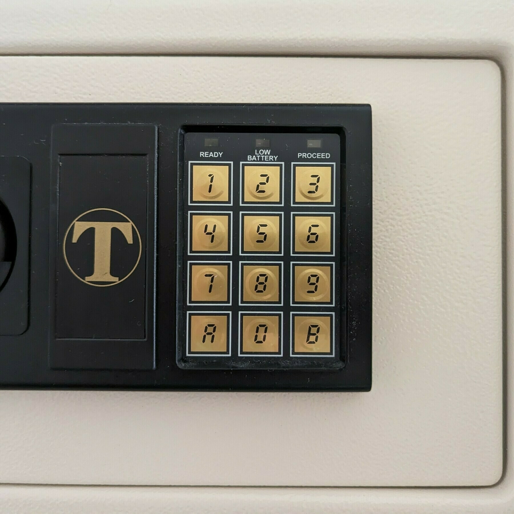
This safe uses a curious choice of font for the keypad. I’d guess they wanted to go with something more interesting than boring Helvetica? But they didn’t go all in with maintaining the allusion, breaking it for the B, which would normally be shown in lower-case on a real seven segment display.
