
Alternative Day Four Photo
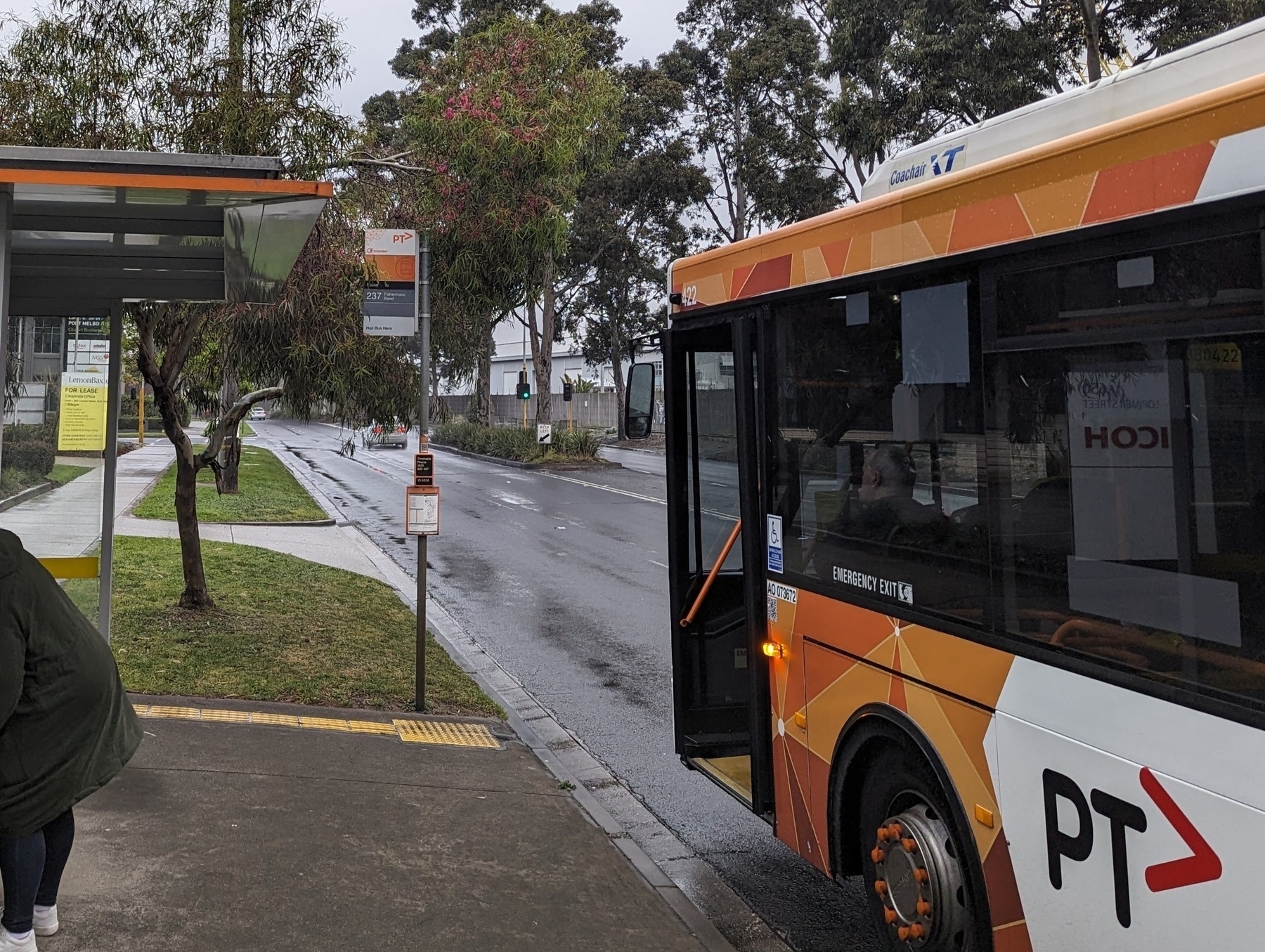
I had an alternative idea for today’s photo challenge, which is “orange”. I was hoping to post a photo of something related to Melbourne’s busses.
You see, PTV has designated different colour for different modes of transport. Blue for metro trains, purple for regional trains, green for trams, and orange for busses. And from my experience using the service, they’re pretty consistent with adhering to this design language:
Anyway, they’re doing train works along my rail line over the past few weeks and this morning I noticed this sign (forgive the lighting, it was before dawn):
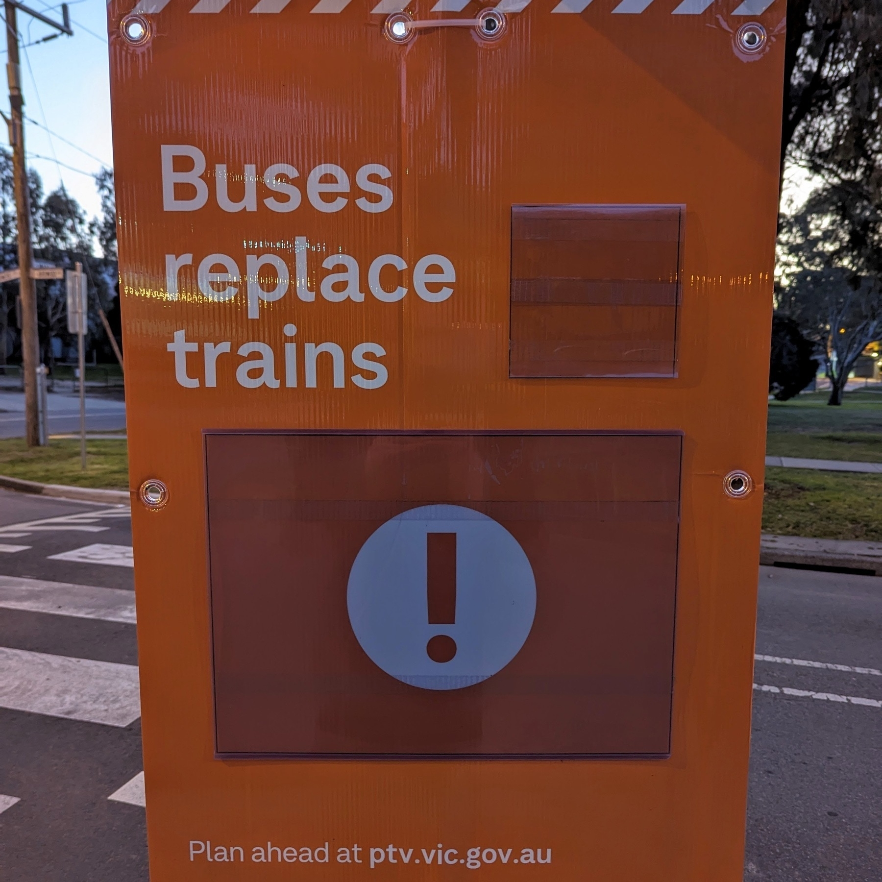
It’s not the first time I saw this sign, but I had orange on my mind and the fact that it mentioned busses got me thinking, “how cleaver, they’re maintaining the design language through and through, using an orange sign to reference the bus service that would be replacing the trains.” Or so I thought, until I saw this sign:
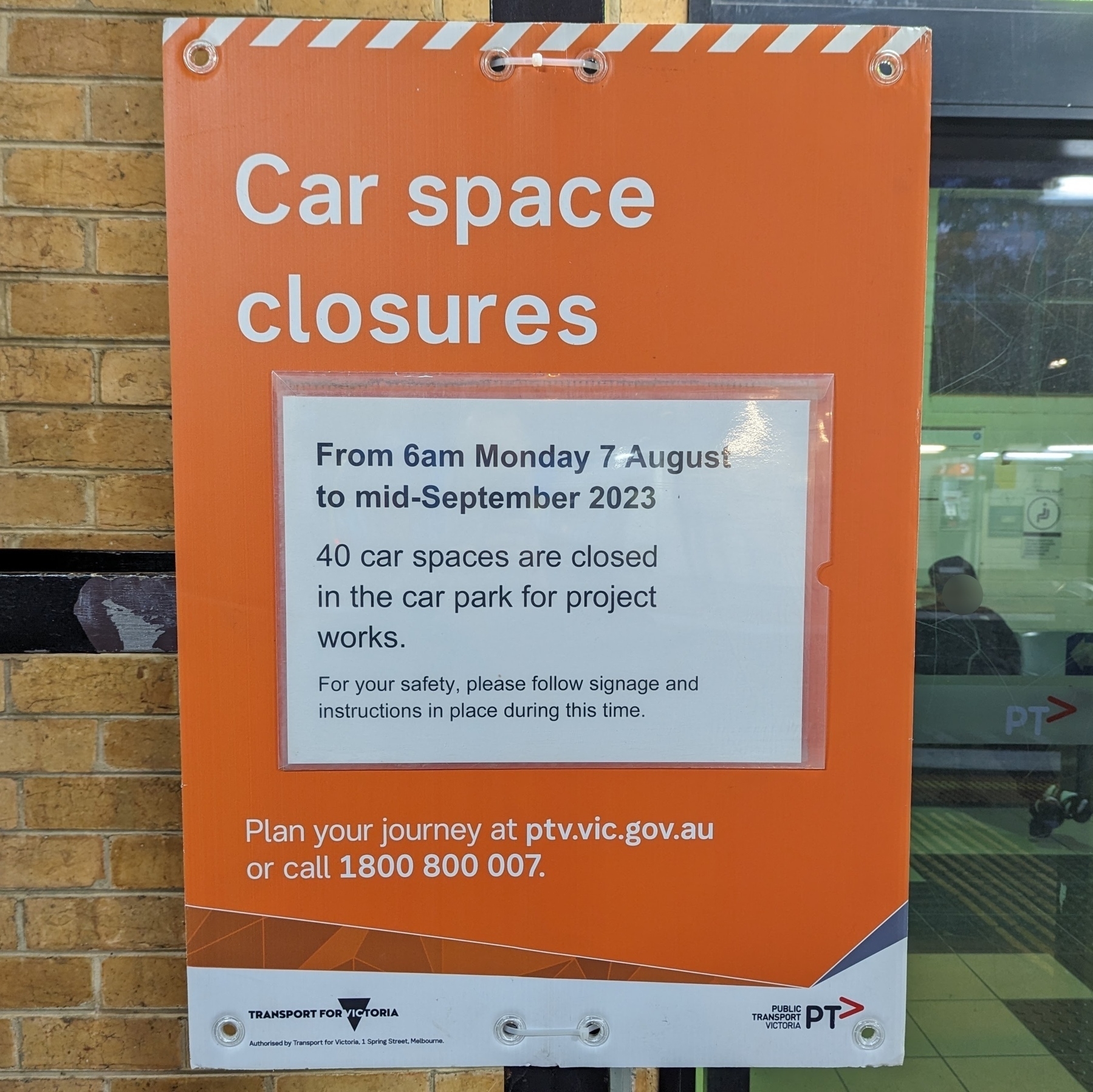
Ah, that blew that theory out of the water. And also the opportunity to use it as today’s photo. I mean, I could’ve still used it — it’s still orange after all — but it doesn’t have the neat adherence to the design language that I was hoping it did.