
Godot Game - Working On Backdrops
Time to focus on backdrops. Aaaaargh! What it’s time for is to face my inability to make artwork. I’ve been able to do small things: lifts, signs, even some pickups. But for the larger stuff, I don’t know where to begin. And regretfully it fills me with shame that I’m even looking at asset packs: despite most of the assets in this game already originating from an asset pack. But the alternative is drawing it myself. And I’m not confident that I’ll be able to do a good job here.
But let’s try. If it doesn’t work, I’ll use the asset pack.
The first idea is to get some inspiration. Well there are plenty of those in my photo collection. Here’s one that seems like a good start:
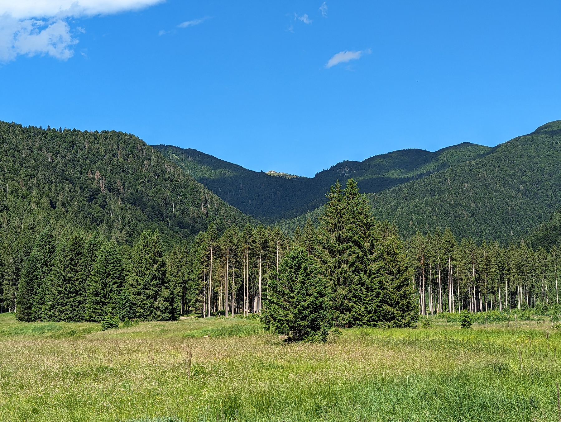
In short, foothills are slightly jagged yet mainly consist of sweeping curves at roughly the same vertical height. Colour and shadow provide the sense of distance. The hills in the photo are largely covered in vegetation, which could potentially be simulated by a vertical spray-brush: favouring light and dark green with some light brown on a largely mid-level green colour.
Also I need to remember a principal of illustrations: go from the foreground to the background. I guess one saving grace with modern art tools is that I’ve got layers to play around.
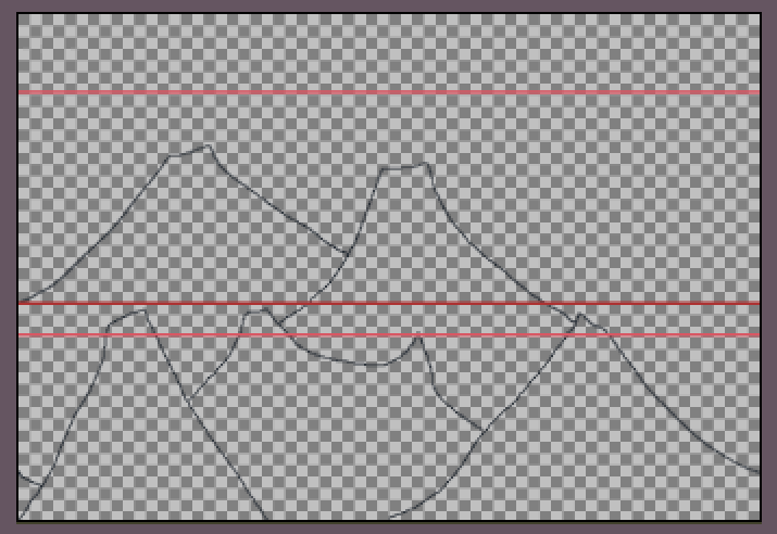
Okay, new sprite. Let’s start with the foothills. Taking inspiration from both the photo and the asset pack. Tracing around the foothills and adding some colour to give us depth yields the following:
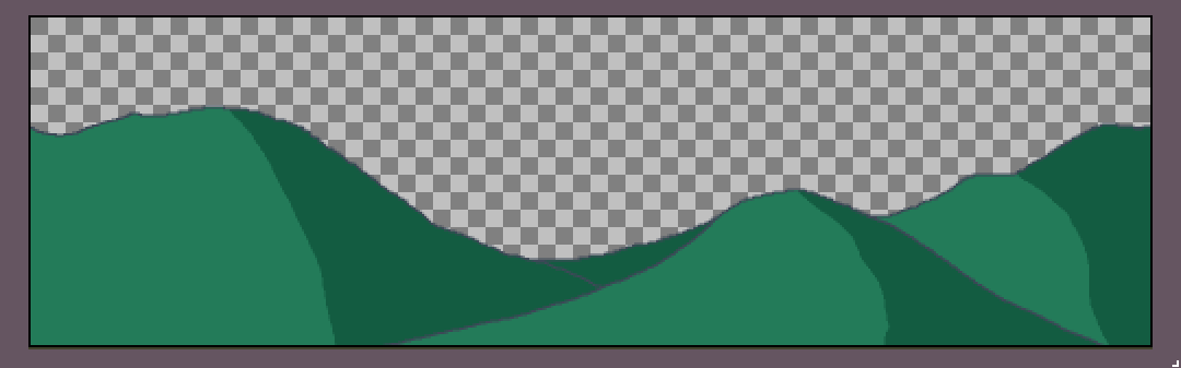 Okay, not bad. A little plain but a good first start.
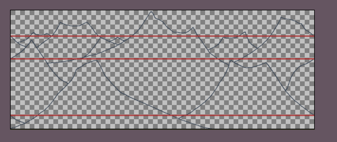
Trying out some ridge-lines.
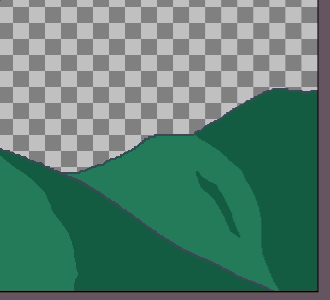 Ugh, that looks awful! Not convincing at all. Okay, forget about the ridge-lines. I also tried out adding a spray to simulate vegetation but that didn’t look convincing either. I think given the distance, my skill level, and the fact that this is a backdrop, less might be more here.
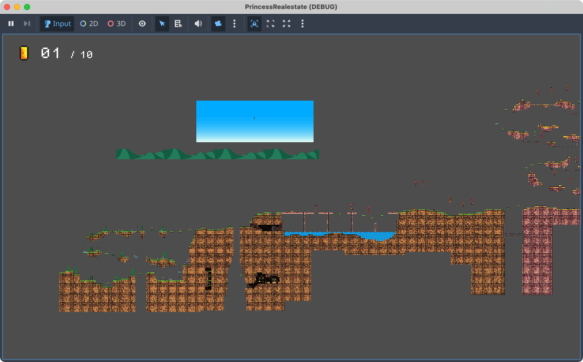
Let’s try it out in the game. I’ll use the existing blue sky image I have for the desert world. Let’s also remove the existing backdrop.
Hmm, the issue is trying to get the hills to look convincing, and given that the player starts quite high, and given that the camera is position to track the player near the centre of the screen, they won’t see this background layer. But this might be okay as I also need to make a distant mountain layer too.
Okay, after a lot of trial and error, I’ve got the foothills positioned in a way that works well:

In order to do this I had to do the following:
- Scale them down by 50% so that they don’t dominate the screen or have too large pixel edges.
- Use a horizontal scroll offset of 0.7 and a vertical scroll offset of 0.2 so they look convincing in the background. I did try a vertical scroll offset of 0.0 to keep them anchored at the bottom of the screen. But because of how the camera follows the player vertically as they jump, that just looked disorientating.
A few things I’ve learnt about using Parallax2D: you want the “repeat size” to be the size of the sprite (after transforms) so that they’re laid out seamlessly across the screen. If the scaled size doesn’t make it all away across, bump the “repeat times” up a few times. You will get the automatic repeat, which you can verify during play through by overriding the camera, zooming all the way out, and turning on 2D controls:
Now it’s time for the mountains. For this I’m going to use this asset pack for inspiration. Obviously much taller than the foothills, with jagged peaks. Less sweeping curves, and more like upside-down Vs, yet with flat tops.
Here’s attempt one:
No, don’t like it at all. For one thing the canvas is too wide in the vertical direction and too short in the horizontal direction. For another, the mountains don’t look convincing. The peaks are too pointy. So what I’ll do is cut the canvas in half and try again with a steadier brush.
Here’s attempt two:
A little better. The general shapes look okay. Might look better after colouring it in.
Okay, here’s the mountain layer with the colouring:
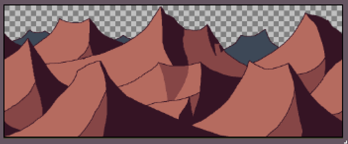
It’s almost convincing. Let’s try it out in the scene.
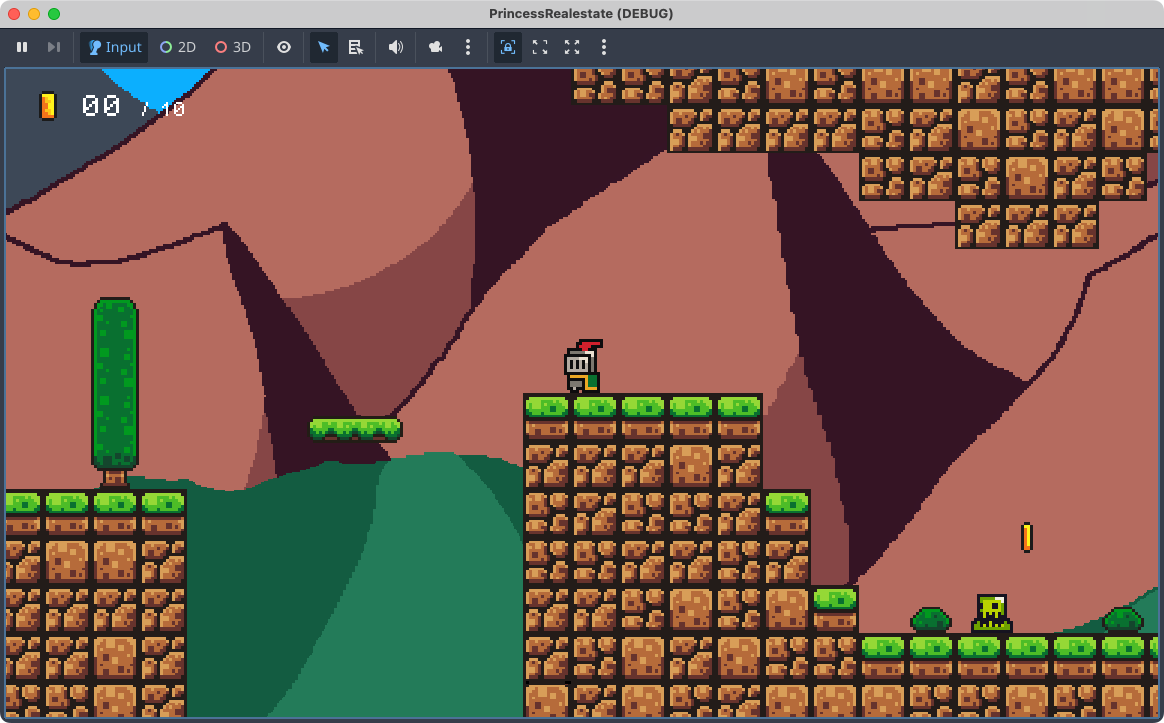
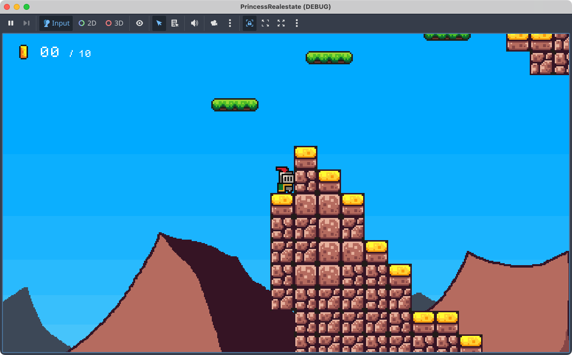
Hmm, I’m not sure I like it. It looks a little cartoon-ie, what with it’s large, sweeping areas filled with a single colour. I also don’t like the outlines: they’re a little too bold. It may help if I made the mountain layer a little smaller and reduce the motion a little.
Okay, after doing that, I like it a little more. The outlines are less pronounced and you see the more of the mountain plate throughout the level. I added back the outline in the foothill plate. I think you can either go with outlines, or you go without: mixing the two looks bad.
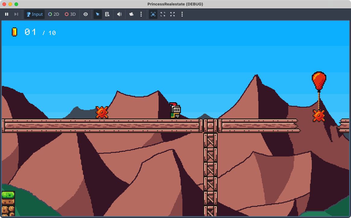
I’ll try this for a while. I may play around with the scroll settings a bit but it is difficult coming up with a combination that will show the mountains for more of the level while also hiding the seams between the layers. I may need to adjust the contrast a little, just so that the background doesn’t clash with the foreground: even in the screenshot about it’s a little muddy. I also need to put in a cloud layer too. Not quite sure how I’ll make convincing looking clouds, but I’ll think of something.