
Vibelog: Show As Table - A DSL In a Hurry
I was asked to make a couple of diagrams for the purpose of showcasing a database design. These diagrams were mainly used to show the relationship between entities, so I chose to use TLDraw for this. But there was a need to add some example rows, which TLDraw does not make easy. Furthermore, there was a bit of a push to get this done quickly, as these were to be shown to various stakeholders the next day.
Given all this, I thought it was worth asking Claude to make a tool to generate a table as an image from a DSL.
The initial prompt
Please generate for me a Go application which takes a DSL of the following form:
```
Title
Name Value
“Name2” “Value2”
```
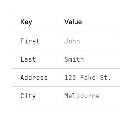
It is to render this as a “card” with Title appearing above a box which contains two columns: the left containing the name and the right containing the value. The columns are to be presented as two columns of a table that will rendered as this: [Image #1]
The result should be a PNG that I can include in another diagram.
In short, I was to provide the data in the form of a table, and the tool Claude wrote is to generate it as an image, that I could import into TLDraw. Here’s an example:
Key Value
First John
Last Smith
Address "123 Fake St."
City Melbourne
This was my first attempt at using the image upload for Claude Code, with the intent of producing something that that mimics it. I don’t have it handy with me but the image was of a table rendered in a GUI of a database client of some sort (I didn’t pick the table, someone else took a screenshot and said “make it look like this”). And Claude managed to get it looking pretty close. It originally chose to use the builtin Golang fonts, but switched Jetbrains Mono for the headers and Inter for the table cells, after I asked it to use a more “professional” font.
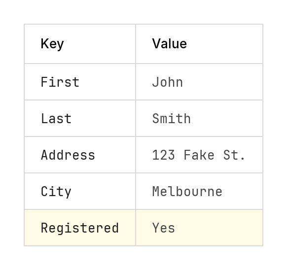
From there, the DSL evolved as the needs of the task arise, without any grand vision of it’s design. The diagram title was dropped, comments in the form of lines beginning with hash were added, and a row could be highlighted by prefixing it with a *. How Claude did this was up to it. It was given pretty-much free reign in many of details, including how to highlight a row (it chose to do so using a yellow background):
Key Value
First John
# Middle None
Last Smith
Address "123 Fake St."
City Melbourne
* Registered Yes
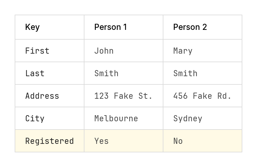
The DSL eventually extended to include tables with multiple columns.
Prompt to add multiple columns and highlights
Please also add support for multiple columns, i.e. more than 2. And any row that begins with a * should be highlighted, e.g *name value (do not include the leading star)
Key          "Person 1"      "Person 2"
First        John            Mary
Last         Smith           Smith
Address      "123 Fake St."  "456 Fake Rd."
City         Melbourne       Sydney
* Registered Yes             No
And multiple tables stacked vertically, with matching cell widths.
Prompt to stack multiple tables
Okay. I would also like you to support dividers between subsequent tables. When I have a line of the form “—”, it will indicate that I want two tables, positioned vertically, with a transparent gap between the two of about 1.5 times [since updated to be 1/2 that] the row height. The column sizes of both tables should be the same, in that they should be wide enough to fit whatever the widest cell of both tables.
Key          "Person 1"
First        John
Last         Smith
Address      "123 Fake St."
City         Melbourne
* Registered Yes
---
Key          "Person 2"
First        Mary
Last         Smith
Address      "456 North Fake Road, South"
City         Sydney
Registered   No

Finally, a dark-mode was added. The colours were taken from a fork of this where someone added a dark mode directly. I wanted the ability to invoke dark mode via a switch, and simply adopting the fork meant I would loose the multi-table features I asked Claude to add. So I copied their version of the source, and asked Claude to crib the colours from it:
Prompt to add dark mode
Okay. Someone has forked a version of this tool and implemented a dark version. They have shared with me the code located in @dark-version/main.go. Can you please adopt the colour scheme of this tool, and apply it when the flag “-dark” is present.
Key          "Person 1"
First        John
Last         Smith
Address      "123 Fake St."
City         Melbourne
* Registered Yes
"Dark Mode"  Yes
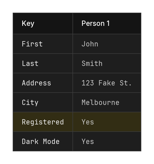
The results were decent, although you can guess that I didn’t actually run this tool in dark mode with a highlighted row.
So, why do I write about this? Not that I need a reason, but I always find these badly designed, hacked together DSLs fascinating. You can learn a lot about using something that’s truly terrible. Using this particular DSL for the task at hand is fine, but I can’t really see myself using it for anything else. Having the table cells defined as white-spaced table columns is not the easiest thing to maintain, let alone something easy to review when checked into Git. Yet it is obvious, and maybe with some better tooling it could be made to work better.