-
📘 Devlog
Godot Game - Level 3-2 and a Rotating Platform
Starting to work on level 3-2, and adding a new rotating platform mechanic, with some thoughts on how to build it. Continue reading →
-
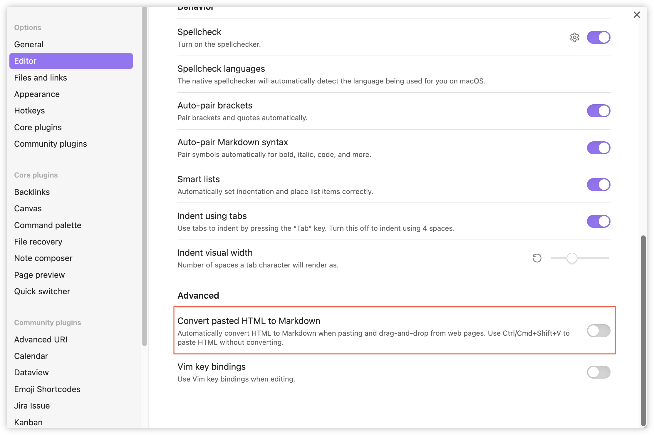
Discovered that turning off “Convert pasted HTML to Markdown” in Obsidian has eliminated the need to select Edit → Paste and Match Style when pasting things from the terminal to a note. So glad this setting exists. One more of those things I wished Obsidian had, and sure enough… 🫲 🫱
 screenshots
 -
Anyone remember jQuery Mobile? Looks to be live and well on Tram Tracker. First time I actually noticed it, as I usually don’t have a need to visit the website.
 screenshots
 -
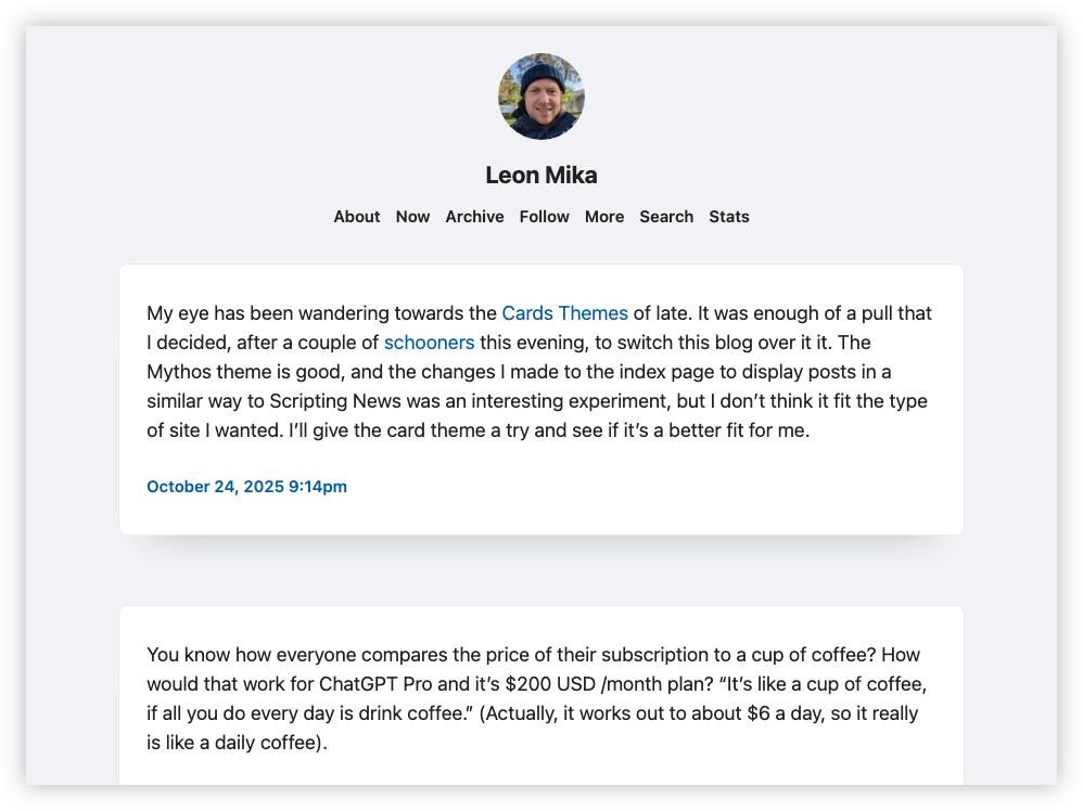
My eye has been wandering towards the Cards Theme of late. It was enough of a pull that I decided, after a couple of schooners this evening, to switch this blog over to it. The Mythos theme is good, and the changes I made to the index page to display posts in a similar way to Scripting News was an interesting experiment, but I don’t think it fit the type of site I wanted. I’ll give the card theme a try and see if it’s a better fit for me.
 screenshots
 -
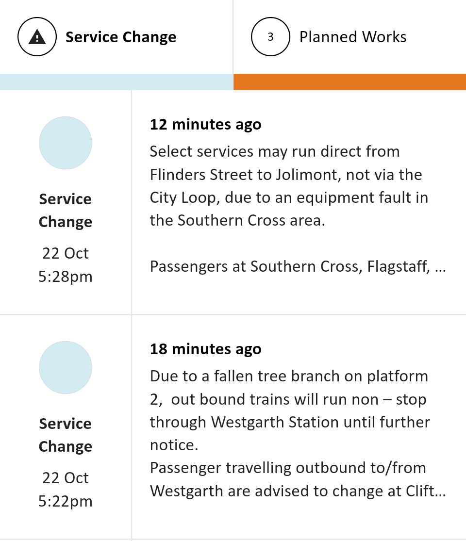
Whew! Made it home. A bit of a delay but given the strong winds, it’s fortunate that the commute wasn’t longer than it was. Could’ve been much worse. Good thing that large tree branch didn’t fall on the train line (it was close enough to brush against the side of the train).
 screenshots
 -
📘 Devlog
Godot Game - Working On Backdrops
Trying my hand in making some mountainous backdrops for world 3. Continue reading →
-
Finally added some checkpoints to level 1-3. Also added some animated water as a new type of hazard. The asset pack I’m using came with a single “wave” tile. I used Aseprite to shift that across 4 cells and configured it as an animation in the tile set. I was planning to add some background waves too, but that made it a little too busy and hard to discern. Less is more here.
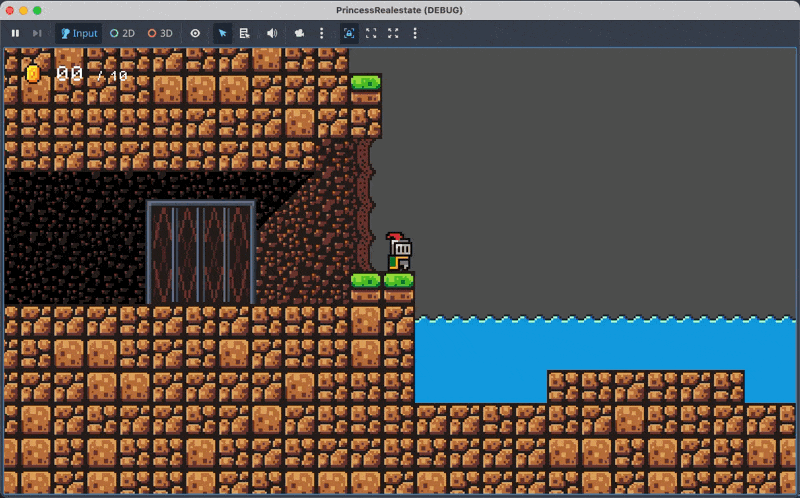 devlog screenshots
 -
A small devlog entry today. Just painting the level, adding background tiles and kill-zones. I also added a frame around the lift door, just to define it a little. Discovered that it’s probably best not to have sprites with non-even dimensions. It makes positioning them a little awkward, resulting in fractional offsets. I elected to include a transparent row at the top of the frame sprite, just to avoid this.
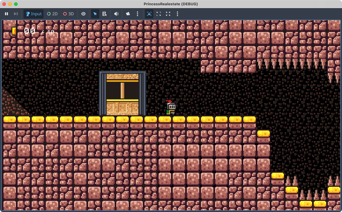 devlog screenshots
 -
📘 Devlog
Godot Game - A Trigger That Reveals Secrets
A new mechanic has been developed to reveal hidden areas in a game when players approach, using an
Area2Dnode that fades tile layers in and out for a smoother experience. Continue reading → -
📘 Devlog
Godot Game - More on Level 3-1
Placing the exit and adding an invulnerability power-up. Continue reading →
-
Some advice for the TLDraw Obsidian plugin maintainer: drop everything after the words “and” and “then” in these menu items, then remove duplicates. This should bring the menu items down to a number that’s easy to scan. I can manipulate tabs myself, but finding what I want here is a lot.
 screenshots
 -
📘 Devlog
Godot Game - More On Level 3-1
Continuing level 3-1, plus adding some more elements to stop long falls. Continue reading →
-
📘 Devlog
Godot Game - More On Level 3-1
Continuing the build out of the new zone for level 3-1, plus implement a new variant of the balloon with mine entity. Continue reading →
-
📘 Devlog
Blogging Tools - Podcast Clip Favourites
Finishing off the favourite podcast clips feature. Continue reading →
-
📘 Devlog
Blogging Tools - Podcast Clip Favourites
Working on saving podcast clips from Blogging Tools into a Hugo site, done in the “lab notes” running commentary approach. Continue reading →
-
Small change to the thirst mechanic for my Godot project. Switched from discrete thirst levels to a single timer that will tick down if the player is thirsty. This allowed for a change to how I indicate this to the player, replacing text messages that’ll be displayed at each thirst level with a gauge that shows up on the HUD.
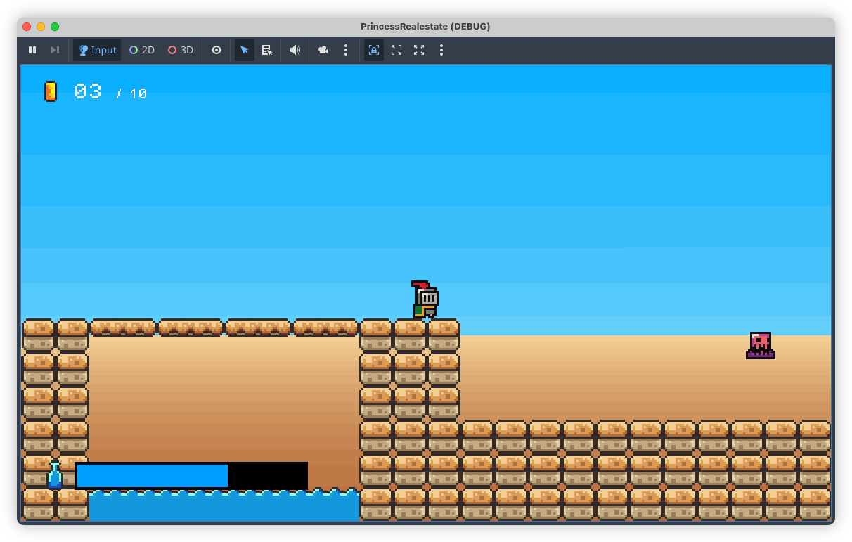
I thought that the messages would be enough, but after playing through with them, they turned out to be more of a hindrance. They didn’t communicate the player’s thirst level well enough: they show up for a few seconds, then disappear, leaving the player to wonder how much time they have. This information is now always present with the gauge. Plus, I think it gives more of a sense of urgency, in that a gauge that’s constantly ticking down will encourage the player to play a little faster in order to reach the next water bottle before they perish from thirst.
devlog screenshots -
More on that Godot project today. Finally bit the bullet and started working on proper backdrops. I’ve leaving the artwork until later (i.e. I’m procrastinating), today was all about the mechanics, trying to get parallax scrolling working. Fortunately Godot has built-in nodes to make this easy, although I did have to upgrade Godot to 4.5.
This is my first cut, some simple colour banding to represent sky and sand in one of the desert levels:
These two layers were added to the scene as Parallax2D nodes, each with a single Sprite child. Positioning the sprites was a little tricky. Godot suggests placing them at the origin, but what I didn’t understand was that the actual position of the sprite depends a lot on the scroll scale of the Parallax2D node. I added the sky layer without changing the scroll position and it took me a while before I discovered that it was appearing below the camera. Only after reducing the scroll scale to about 0.1 did it start showing up in the viewport (one nice thing about Godot 4.5 is that the “play scene” window includes debug options, allowing you to hijack the camera and move it around the scene).

I will need to introduce some detail in the backdrop layers soon. The bands are too simple and may induce some vertigo when the player is ascending to high platforms. Plus, it just looks boring. Not that they’re meant to be eye-catching but something a little more interesting would be nice.
devlog screenshots -
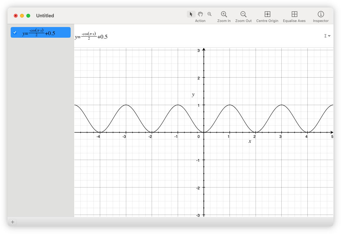
Just a reminder that MacOS comes with a grapher, and a pretty decent one at that. Came in handy when I wanted to visualise a few functions.
 screenshots
 -
📘 Devlog
Trying OpenAI Codex to Produce Freelens Logo Creator
Using OpenAI Codex to make a logo generator tool to allow customisation for different clusters in Freelens. Continue reading →
-
Ah, MacOS’s locked-down nature strikes again! Was testing the CI/CD build for Dequoter and after downloading the artefact and attempting to open it, I got this warning message:
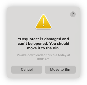
Turn’s out it was being quarantined by MacOS, and these instructions resolved the issue:
xattr -dr com.apple.quarantine '/Applications/Your Application.app'The binaries not notarised so I wasn’t expecting it to work out of the box. I was hoping that it would do that thing where the app will be listed in settings and I can allow it to launch from there, but I guess there’s something about where this file came from that was too much from MacOS. Ah well, I can live with this for the short term.
devlog screenshots -
Speaking of Dequoter, in “celebration” of the upcoming release of MacOS 26, I styled the command palette a little, adding a transmissive blur to give it a glass effect:
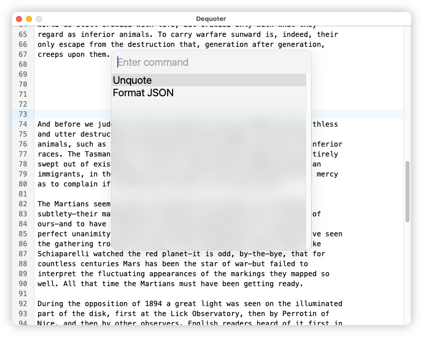
It’s a shame I can’t style the options of the select element. It would be nice to increase their margins a bit.
screenshots -
📘 Devlog
Dequoter — Something Different Today
A new project called Dequoter was started to unquote a JSON string and filter it, utilizing Go for backend functionality and HTML for the frontend. Continue reading →
-
I saw someone online mention Zo Computer so I though I’d give it a try. Asked it to produce a Go function based on one of my blog posts, since I needed the same thing in a different project. I saw it open the blog post and generate the function in about 5 seconds.
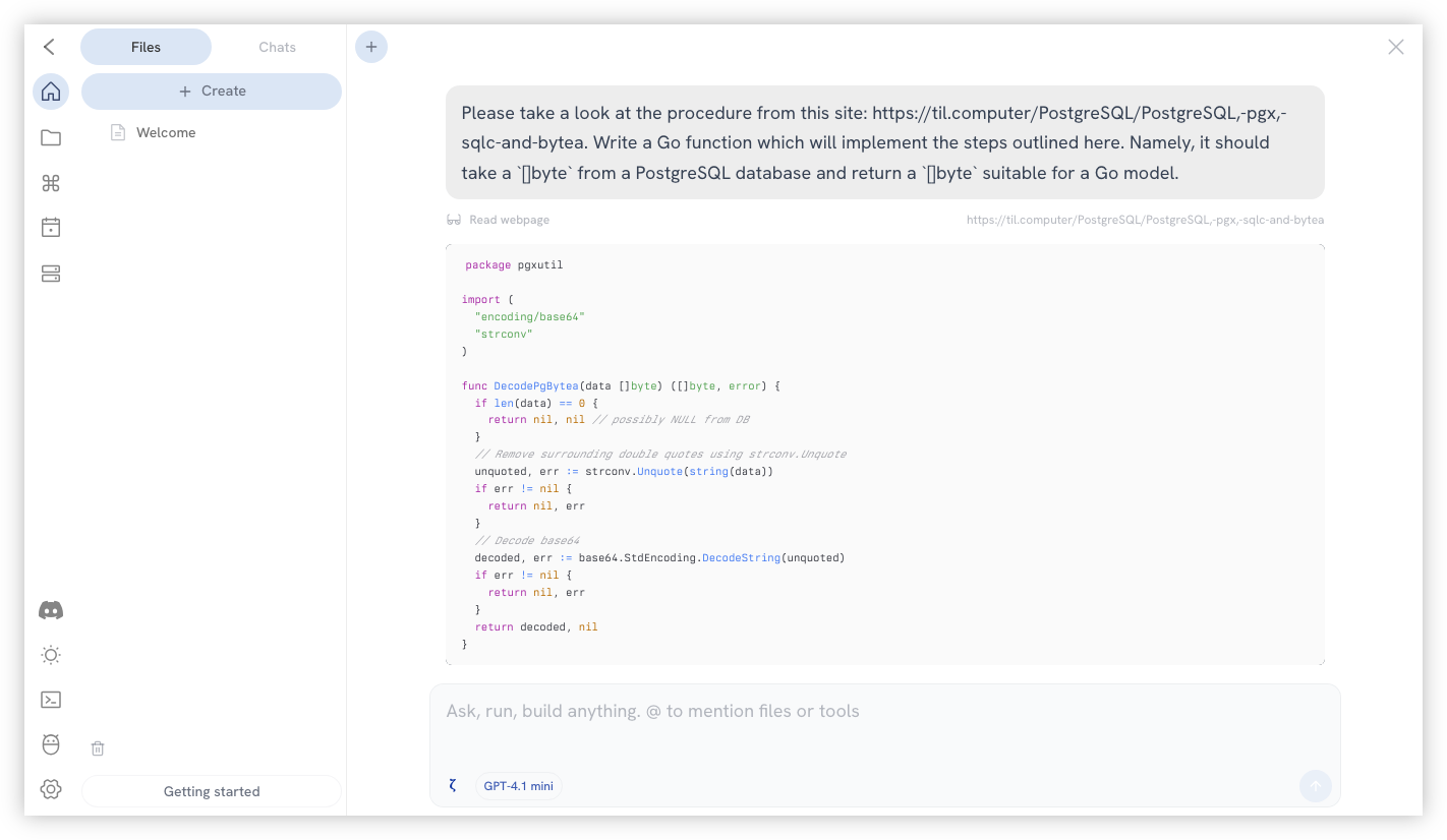
Granted that this is hardly groundbreaking. It’s using GPT 4.1 mini, so it’s likely I could’ve done the same thing straight from ChatGPT. But I think it’s a good first step in seeing what this service is capable of.
I also wonder if the model is actually consuming the post. I have nothing to support this other than doubt that the post would be in GPT 4.1’s training data. The URL can’t be more than a month old.
screenshots -
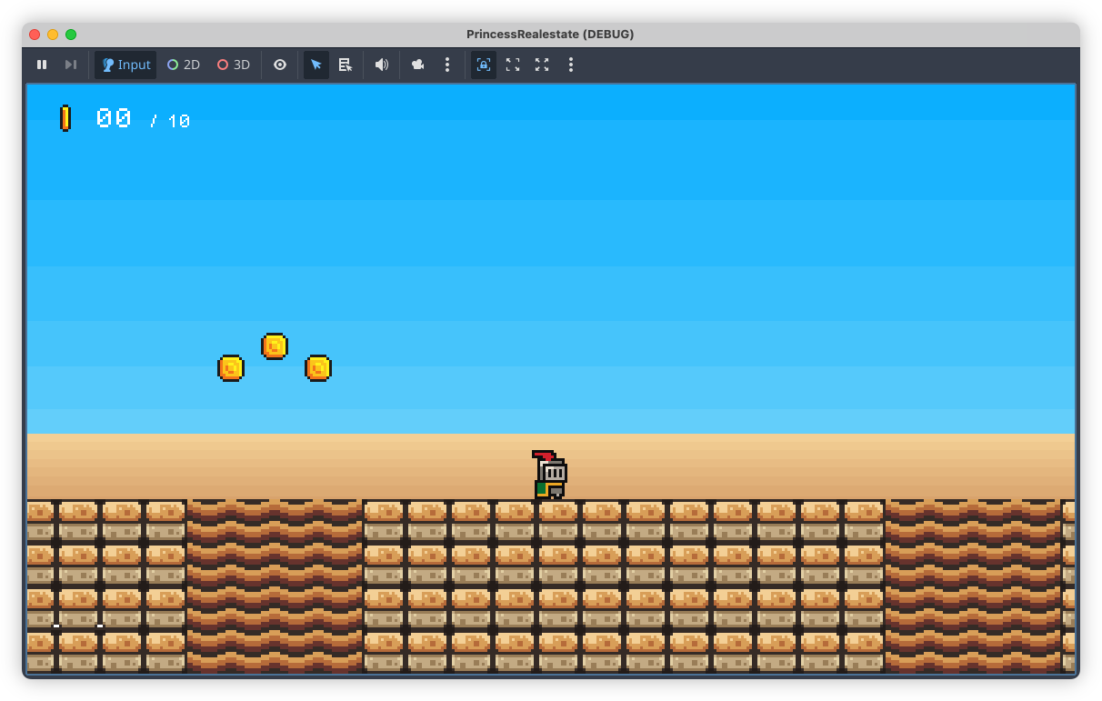
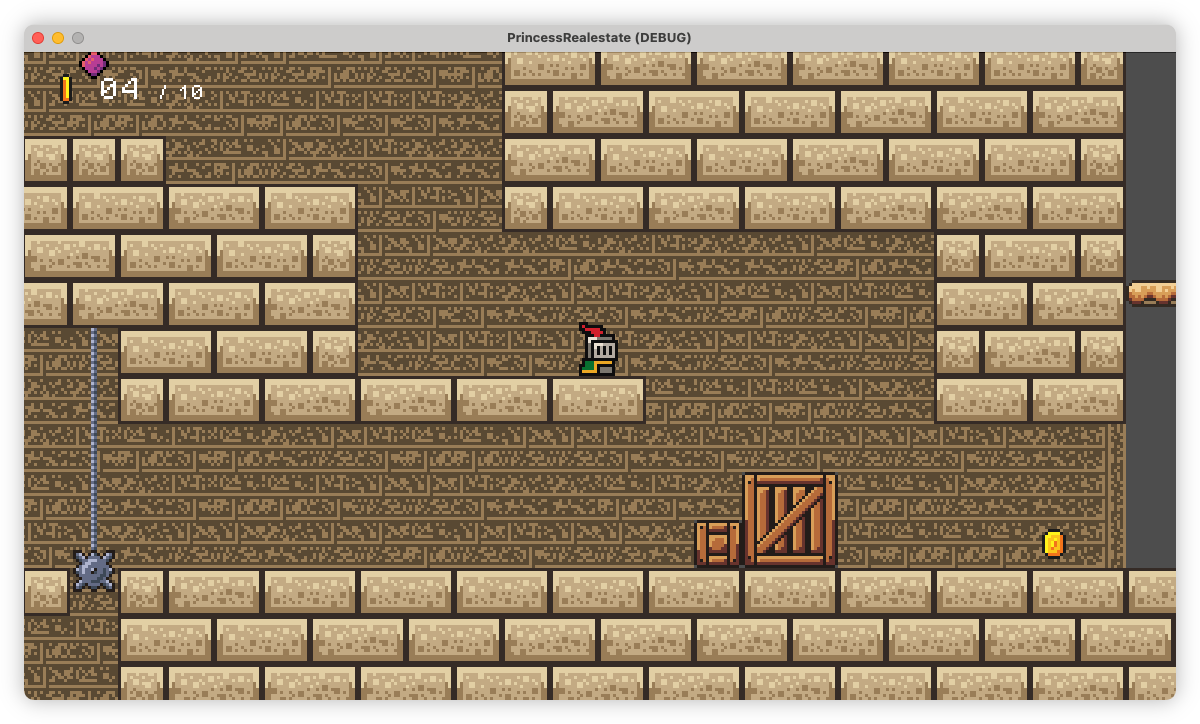
Starting to work on the background tiles. This is what I have so far. I hope it’s not too busy or distracting.
 devlog screenshots