
-
Why do I even buy umbrellas? They’re never in the bag when they’re necessary. 🌨️
-
A bit more work on my Godot game, mainly building out mechanic for world 3. Tonight it was building an old-style lift with a caged door that the player can use to travel between different heights. Turned out really well.
Animating the door was a slog, and if that was all I achieved this evening, I would’ve considered that a success. But I had a bit of time to code up the lift too. I was unsure of how to approach this at first: I knew I wanted to turn off player movement and collisions and move the player (and camera) along with the lift.
This turned out to be easier than I was anticipating. When the player enters the lift, all motion on the player is disabled (this was done by setting a “disable_motion” boolean which would break out of the players progress loop early if true) and the player node is reparented to the lift. The lift then moves to the target, taking the player with it. At the destination, the player’s original parent is restored and motion is enabled again, allowing the player to move freely. I also had to turn off camera motion smoothing before I reparented the player as it seems like some offset vectors were incorrect for a frame and it had the camera shoot to the right. This is done when the door closing animation plays, before the node is reparented which happens just before the lift moves.
There’s still work to do. The z-order seems to be messed up when the lift reaches it’s destination (the player appears in front of the doors as they open). And at the moment, the lift only goes in one direction. But I’m really happy with what was achieved tonight.
videos -
Bash scripts truly are the duct tape of the computing world.
-
We’re coming into that slightly annoying time of year where the mornings are too cold to travel to work without a coat, yet the afternoons are too warm to travel home with one.
-
🔗 Robert Birming: The world’s worst blogger
I moved my blog from Bear to Micro.blog because, as I put it, it “started to feel limited”. I had begun creating photo albums, a status log, and some other stuff. It became harder and harder to manage…
So I moved [to Micro.blog]. A place with great features for adding photo collections, logging books, writing both long posts and short ones without titles. All just a click away…
Now that I have all these possibilities, I can’t seem to do it. No matter how I try, it never feels right to mix things up. And when I tried running two blogs on the same platform, it just got confusing.
I can’t pretend to fully understand Robert’s feelings, but I that I’ve gone through similar feelings myself: wondering if this bit of content should be on this blog, or that one should be there, etc. And always looking at the next shiny thing glittering on the horizon: a new CMS I haven’t tried, a fresh theme. There’s always something else to look at.
And I think much of this is all a distraction from a worry that took me a while to acknowledge: is what I write of interest to anyone? If I were to write about this, will they get upset or board? Who am I to waste their time on writing about topics that are of no interest to my readers?
I’m trying to get better at not worrying too much about this. Although I can’t fully know what others are thinking, I have at least one data point that can provide me an answer to this, which is being a reader of blogs myself. And I’m aware that not everything I get from my feeds is going to interest me. That’s fine, I’ll just skip over that one post and wait for the next one. I’d probably prefer that over someone splitting their posts across multiple feeds and knowing that I’m only getting part of what they’re writing.
So if I were to provide some advice to Robert, it’s to try and simplify. Have a single site that others can subscribe to and write everything there. The hassle of deciding where to write isn’t really worth the worry. Plus your simplifying things for your readers, who want to read stuff from you. That’s why they’ve subscribed.
Anyway, like I said, I can’t pretend to fully understand the feelings. I definitely don’t think Robert is the “world’s worst blogger.” I enjoy reading his posts and I look forward to seeing them pop up in my RSS reader. I just hope this helps in some way. And I know how much easier it is to give advice than to follow it yourself. Go through my archive where I’ve spun out topics into separate blogs/CMS myself. All in all, keeping things simple is probably good advice for both of us.
links -
I’ve been really enjoying the soundtrack of Tunic recently. Would I go all the way to London to watch a symphonic rendition of it? Tempting. If I was in London, maybe. But, being halfway across the world…
-
Small change to the thirst mechanic for my Godot project. Switched from discrete thirst levels to a single timer that will tick down if the player is thirsty. This allowed for a change to how I indicate this to the player, replacing text messages that’ll be displayed at each thirst level with a gauge that shows up on the HUD.
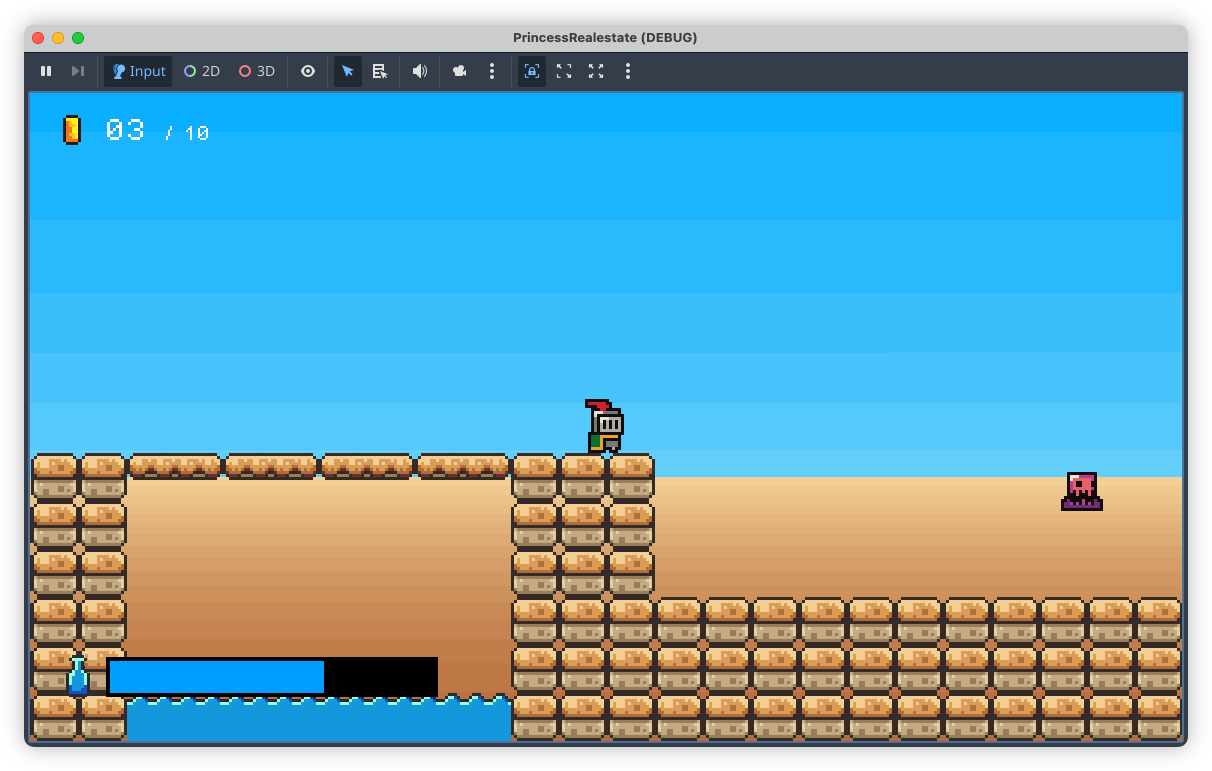
I thought that the messages would be enough, but after playing through with them, they turned out to be more of a hindrance. They didn’t communicate the player’s thirst level well enough: they show up for a few seconds, then disappear, leaving the player to wonder how much time they have. This information is now always present with the gauge. Plus, I think it gives more of a sense of urgency, in that a gauge that’s constantly ticking down will encourage the player to play a little faster in order to reach the next water bottle before they perish from thirst.
devlog screenshots -
Also, first impressions of Godot 4.5 after upgrading from 4.2.2: quite good. I like that tilemap layers are now proper nodes, where I can turn physics off and on from the designer. I can ditch a custom script that did that. What’s not as nice is that inactive layers are too transparent, and that there’s no way to adjust this. They’re so hard to see now. Hope that’s fixed soon.
-
More on that Godot project today. Finally bit the bullet and started working on proper backdrops. I’ve leaving the artwork until later (i.e. I’m procrastinating), today was all about the mechanics, trying to get parallax scrolling working. Fortunately Godot has built-in nodes to make this easy, although I did have to upgrade Godot to 4.5.
This is my first cut, some simple colour banding to represent sky and sand in one of the desert levels:
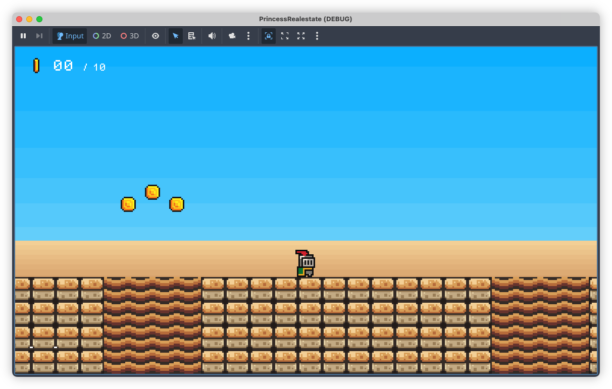
These two layers were added to the scene as Parallax2D nodes, each with a single Sprite child. Positioning the sprites was a little tricky. Godot suggests placing them at the origin, but what I didn’t understand was that the actual position of the sprite depends a lot on the scroll scale of the Parallax2D node. I added the sky layer without changing the scroll position and it took me a while before I discovered that it was appearing below the camera. Only after reducing the scroll scale to about 0.1 did it start showing up in the viewport (one nice thing about Godot 4.5 is that the “play scene” window includes debug options, allowing you to hijack the camera and move it around the scene).

I will need to introduce some detail in the backdrop layers soon. The bands are too simple and may induce some vertigo when the player is ascending to high platforms. Plus, it just looks boring. Not that they’re meant to be eye-catching but something a little more interesting would be nice.
devlog screenshots -
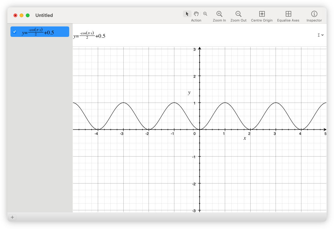
Just a reminder that MacOS comes with a grapher, and a pretty decent one at that. Came in handy when I wanted to visualise a few functions.
 screenshots
 -
That said, what makes for a compelling Go blog? I do see them around, yet I don’t subscribe to them. It’s difficult having topics that grab my interest. I can read about people building their own software all day, but I’m hardly interested in the actual code. Libraries are maybe a little more interesting, but only if they can be potentially useful to me. And no, I don’t care what performance multiplier your JSON parser has.
This is the disadvantage of writing about backend tech. You can easily enjoy the efforts of web frontend developers in a much more superficial way: go to their site, and start browsing. This is harder to do with Go bloggers. You have to check out their code, build it, and if it’s a library, use it. All activities that require one to be at a desktop, which is not where I tend to read such things.
-
I do wish more Go bloggers are on the Indieweb. Seems like this platform mainly attracts web frontend devs. Understandably, given that the tech is what they work in professionally. Most Go devs I encounter are still writing on Medium, of all platforms. Sigh.
-
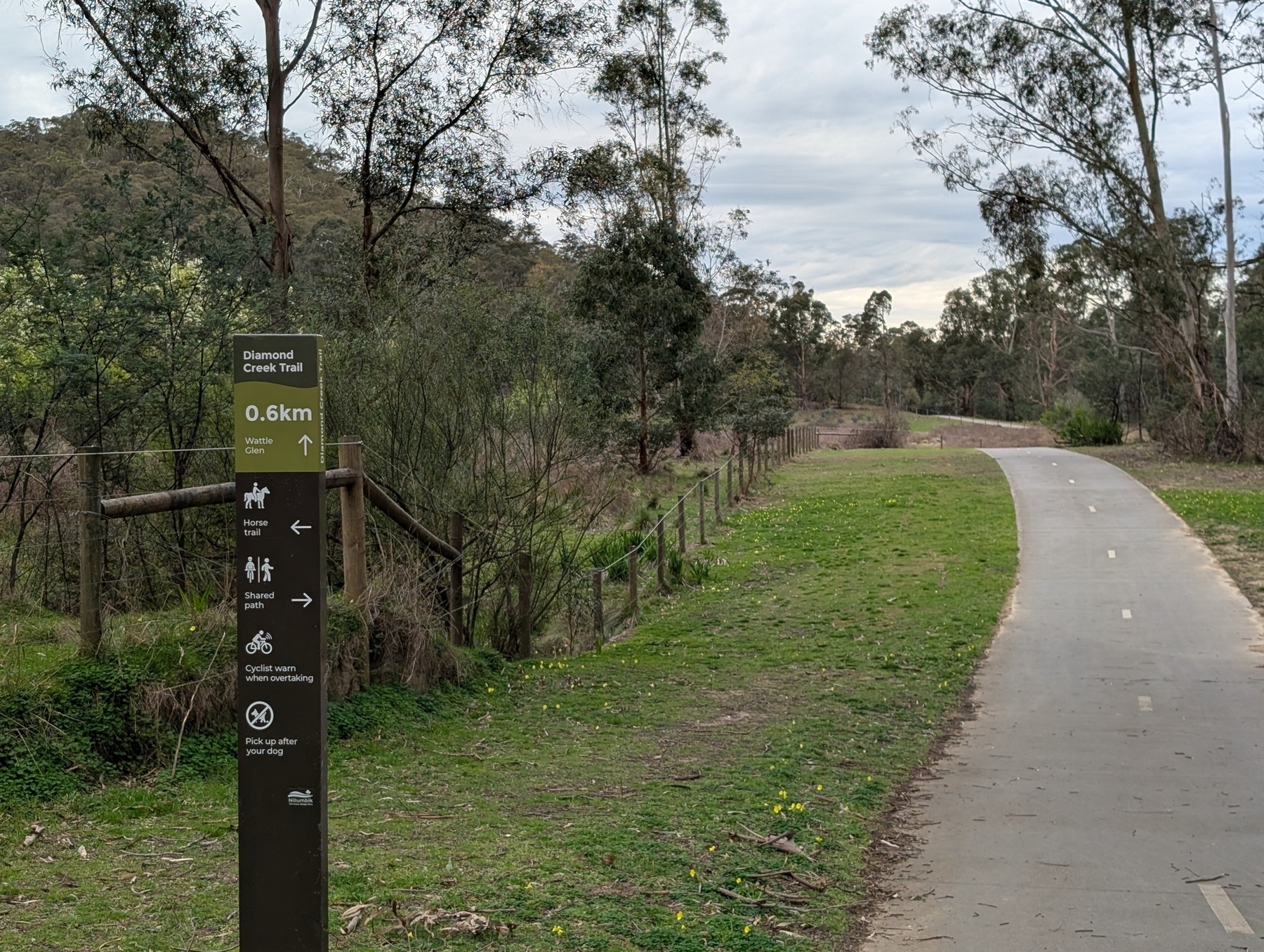
Took a train to Hurstbridge and walked the trail to Diamond Creek. Was rather grey, but the air was mild, so it made for good walking weather.
 photos
 -
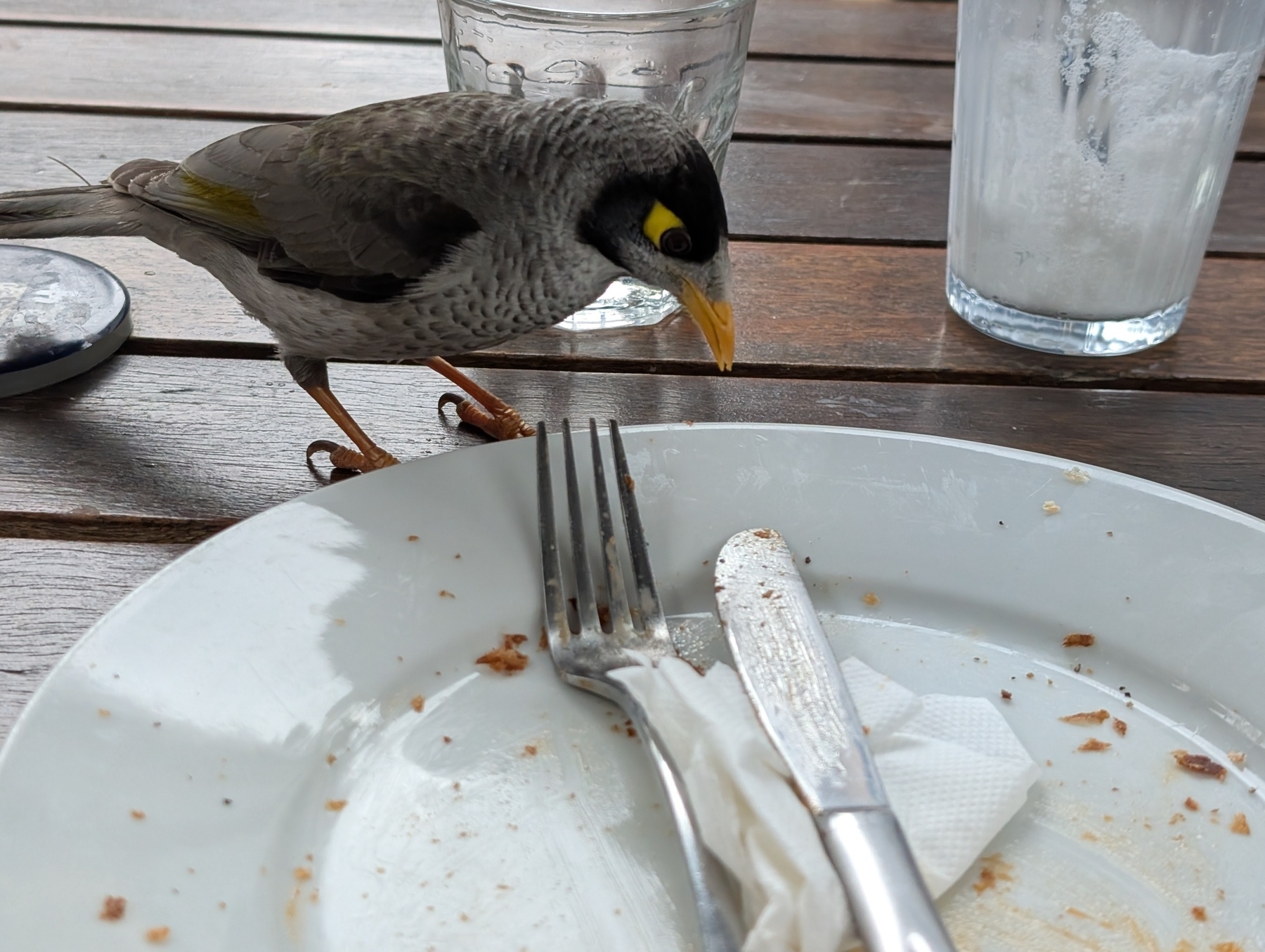
Speaking of lunch, maybe the next time the miners decide to swoop me they’ll remember that I’ve been rather nice to them.
 photos
 -
The cafe I’ve visited today has got this chicken sandwich on a “signature croissant scroll.” I was skeptical at first, but after trying it out, it works quite well. Very nice.
 photos
 -
Go to any bakery in the country round here and every one touts their “famous vanilla slice.” I’m sure every baker thinks their slice is amazing, but the maths just doesn’t work out. Maybe someone should lean into this fact and tout their “rather unremarkable vanilla slices.” 🙂
-
Consolidated my three existing online utilities — a world clock, two-letter country code browser, and Freelens logo maker — into a single tools site. I plan to use this for any new online utilities going forward. Felt good to do this. Gave me that sense of accomplishing something I was lusting over all morning.
-
documentation (n.) — written artefacts describing the workings, design, or operations of a software projects.
we should really fix our documentation (n. ph.) — common complaint from software engineers. Translates to one of:
- We should actually write some documentation
- We should find that message in Slack someone posted several months ago and put it in our wiki as documentation
- I hate using wikis/this wiki software and I rather this documentation is in our Git repository as Markdown files
- I’m to lazy to to checkout this Git repository to edit this Markdown files and I wish this documentation was in a wiki
- I can’t find anything in this wiki/Git repository and I wish things were organised the way I like
😜
-
It’s been 0️⃣ days since I had an issue with TLS certificates.
-
I really appreciate the split-screen feature in Obsidian. I use it all time. It’s so useful being able to reference two areas of the same note.
-
Looks like the “copy link text” pop-menu item is broken in Vivaldi: it’s present in the menu config but not in the menu itself. Hope it’s fixed soon. That’s such a useful option as it saved me from having to deal with all the unwanted whitespace when I select the link text manually.
Now I have to drag to select link text like an animal. 😉
-
Hosting's Not the Problem With Distributed Video
The central challenge of open-web distributed video lies in creating a user-friendly experience that can compete with the convenience of platforms like YouTube. Continue reading →
-
Small DevLog update today. Continuing to work on that Godot game. I got the bulk of the mechanics of level 2-1 built (it still needs dressing up), and I spent this evening mainly just play-testing it, and tweaking it. I think I may need to get someone else to play-test it though, just to make sure it’s not too hard. It’s significantly long, coming in at 10,560 units horizontally, and given how many new mechanics are involved, I’m a little worried about the difficulty curve. But I am happy about the mix of elements I do have. It doesn’t feel boring, which was the concern I had. There are some timing challenges, and I the pacing across the level feels fine. But I really should convince someone else to try it out.
devlog -
Murphy’s law of food condiments: if it can be spilt on your clothes, it will be spilt on your clothes (discovered this law this afternoon, to my embarrassment).
-
Murphy’s law of caches: if it can get out of sync, it will get out of sync.