-
I can’t see how OpenAI pivoting to a “super-app” would entice developers from moving away from the likes of Claude Code. Having a purpose-built TUI works perfectly here: I know where I launched it, I can have multiple sessions, etc. Plus, I’m already using the Terminal for building, Git, tailing logs, etc. Having one more tool in the same collection of windows is a small price on the old spacial awareness budget.
-
Oof! Jacket and beanie weather sort of snuck up on us. I’m a little unprepared for it. 🥶
-
You know, just because you did manage to deploy something on a Thursday doesn’t mean you’ve saved yourself from spending the weekend fixing said something. 😫
-
It’s said that the price of freedom is constant vigilance. In the same vein, the price of working software is constant paranoia. Is it working? Sure you tested it yesterday, but is it still working today? Maybe you should check. 😥
-
Tiny victories: I spelt “amalgamation” correctly on the first try. 🏆
-
Amusing how many podcasts are just interviews with people while they do X. Got me thinking about starting a podcast where I interview people about their work BUT, and here’s the hook, they clean my house. Will you learn anything new here that you wouldn’t from any of these other shows? Well, no, but I end up with a clean house, so it’s a win-win. 😛
-
🔗 Robert Birming: How to kill a blog
What can you do to prolong [your blog’s] life?
It’s very simple. Don’t go niche.
Blog about whatever you feel like. Some posts get more attention than others. It’s not important.
Love it! And so true.
-
Some people are just incapable of being quiet.
-
It just occurred to me that the ability to fully dog-food the software one is paid to work on is actually quite a small subset of software people are willing to spend money on building. Realistically, it could only be achieved for those working on consumer apps, or for tools used by other software developers. For anything else that serves a niche that requires it’s own set of skills, dog-fooding would be difficult to pull off. I’m paid to work on software for pro-videographers, yet I’m not a pro-videographers. My skills are in software development, not film or television.
So while the goal of dog-fooding is one to strive for, sometimes it’s just not feasible.
-
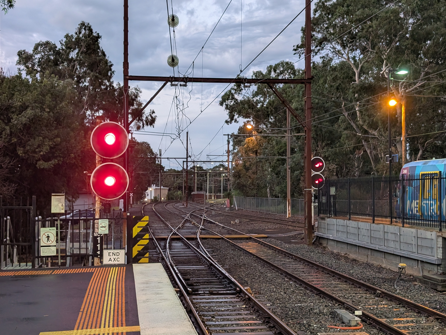
No level crossing is spared from the Level Crossing Removal Project. The one near my station is up for replacement. The rumour was that was to be replaced with the rail line going over the road. The issue, though, was it’s location: it’s right next to some stabling yards, where trains are kept when they’re not in use.

I was unsure what they were going to do about this. You could see from the photo that these stabling yards, along with platform 3 at the station, are accessed by a pretty broad flat junction. And I couldn’t see how they could keep this and elevate the rail line to cross the road. They could move the yard, but speaking to a driver while we were both waiting for our
coffeetrain, there isn’t a suitable place to move the yard to, unless they start taking parkland.Well, the proposal is in, and from the concept drawings, it looks like they’re planning to keep the yard:


So, okay. I guess they could find a way to do this. I would be interested in knowing what they do about access to platform 3 though. I can’t see them keeping the existing rail road that goes along the yard fence line. I’m guessing that they’ll need to reconfigure the junction in some way. Either that, or they scrap platform 3 altogether. It does see some use, and provides a good terminal for certain services, but maybe they could live without it? 🤷
Anyway, something to look forward to.
-
The whole thing about the government encouraging people to work from home to save petrol has left me, someone who takes public transport to work, with various feelings. 😏
-
🛠️ Simon Willison’s Tools: Cleanup Claude Code Paste
From Simon Willison:
Super-niche tool this. I sometimes copy prompts out of the Claude Code terminal app and they come out with a bunch of weird additional whitespace. This tool cleans that up.
Niche it may be, but I’ve been wishing for something like this for a few weeks now (occasionally Claude will fall over and I need to start a new session with the same prompt). Tried it today and worked like a charm.
-
Slack needs to improve their list feature. I want to use it more, but it’s so buggy. It’s slow; paste randomly places content in the row above the selected one; and entering the edit mode of a cell eats the first character, so all my cells say “0” when I’m trying to type “10”. Needs work.
-
🛠️ Sky — an Elm-inspired language that compiles to Go
Kind of striking seeing Go becoming the target of other languages. Here’s another one. Looks a bit like Haskell to my eyes.
Via: Hacker News
-
My vote for the forth company on Tech Mt. Rushmore: may be a strange one but I'm going to say Acorn Computers. Why? Because they came up with the first ARM processor and instruction set. Important for the iPhone and arguably the most important architecture for the foreseeable future.
-
Various shades of grey at the beach this morning. This one’s looking towards Phillip Island and Seal Rock.

-
🔗 Kaptur: Sora - A Solution Without a Problem
A fascinating exploration on the failures of Sora, why the engagement of AI-generated video wasn’t there, and what real video and photography has that the AI-generated counterpart just doesn’t.
Via: Om Malik
-
🛠️ Lisette — Rust syntax, Go runtime
A little language inspired by Rust that compiles to Go
This looks really interesting.
-
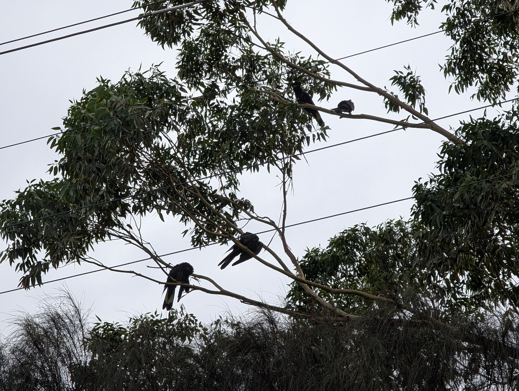
One thing Merricks Beach has plenty of is black cockatoos. Here’s a small flock I saw preening while on a walk. It’s not a great photo — I was shooting into the sun — but I hope you can make out the highlights on their tails.

-
Launching time.

-
🔗 The Axios supply chain attack used individually targeted social engineering
they scheduled a meeting with me to connect. the meeting was on ms teams. […] the meeting said something on my system was out of date. i installed the missing item as i presumed it was something to do with teams, and this was the RAT.
Ah, an interesting way to get someone to install something: throwing up an install prompt minutes before needing to join a meeting. Exploiting probably the most annoying aspect of video conferencing software.
-
Passed by an ibis and white faced herron while walking to beach this morning. Not something I typically see at a beach setting.

-
Greetings from Merricks Beach.


-
Pod coffee machines are like unhappy families: they’re all terrible, but each is terrible in their own way.
-
Saw this quote on a blog:
The discourse around this show is so weird. It’s either a masterpiece or a total slog.
What the show is is immaterial to the thought, which is that I wonder if the polarising posts occur more often because the more mundane ones don’t get written at all. It takes a certain emotional threshold to comment about something.