-
Old rail distance post found on the rail trail today, just outside of Loch. Only 95 km to Southern Cross station from here.

-
Walked part of the rail trail near Black Spur Creek. Was too slow to get a photo of the echidna but I did manage to get one of this white-necked heron. 🌲

-
Ok, breakfast is over. Time to leave the cafe and start my day-trip. South Gippsland is calling me. 🌲
-
It’s a bit of a shame to think that a piece of software that is “done” is considered abandoned. The constantly churning platforms these piece of software is running on doesn’t help. Operating systems are constantly being released with new standards, and security issues crop up and get fix. So it’s natural to assume that a software project that is never touched at all will break at some point.
But I think achieving “done” status for a piece of software is possible. We just need to defined “done” as not being required to change the code. You can still keep up with the platform if you’re still able to build the project, and I think the secret to achiving “done” this way is to be as close to the platform as you possiably can.
I guess the other requirement is choosing a platform that promises to maintain backwards compatability, both for the runtime and the developer tools. But those platforms certainty exist. Think about all those Unix C tools like “grep” or “awk” that haven’t really changed in 50 years, or all those websites from the late 90s that are still around. They’ve been built and deployed multiples times but I’m doubting people are making significant changes in those codebases.
Anyway, some random thoughts I had while browsing the web this morning.
-
I had all this work planned for the team to do while I was on leave. The minute I walked out the door, priorities changed and it was all put on hold. So I feel a little bad that I didn’t organise any backup tasks. Hope the team can occupy themselves over the next week. 😬
-
Idea For Syntax Highlighting for CSV Files
I may be one of the weird ones here where I find myself sometimes preferring to edit CSV files in a text editor. If the CSV file is small or simple enough, it can be a fair bit quicker to work in than opening a file in a table editor1. But I’ve never come across a text editor that has made this easy. Some of them give you the option to switch to a built-in table editor, but these are usually feature poor compared to text editing capabilities the application has (which makes sense, given that we are talking about text editors). Continue reading →
-
🧑💻 New post on TIL Computer: Slow NATS Go Subscribers
-
I knew I should’ve bought two licenses to CleanShot X when I had the opportunity to get it at a discount. 🤦♂️
Think of what I could’ve done with those $9 USD. 🤔

-
Five years ago, I wrote my first blog post. And despite the slow start, I’m extremely happy that I was able to keep it up since then. Blogging is not just what I do, it’s become part of who I am.
Here’s to the next five years, and hopefully many more. 🥂
-
I love the multi-carat support in Nova, Goland, and the other text editors that have it. I use it all the time. I wish it was built into every textbox I use, including the ones used by browsers and AppKit.
-
The view of the Stony Point line from Bittern station.


-
I finished my experiment with htmgo, building the worlds most inefficient world clock. It uses HTMX swapping to get the time from the server every second.
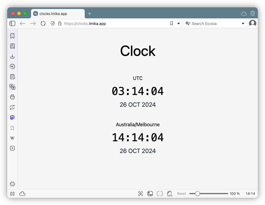
It’s an interesting framework. Not sure it’s fully ready yet (you can’t change the bind port, for example) but might be useful in the future.
-
Had my first taste using Tailwind, since the framework I’m playing with includes it by default. Can’t say I’m a fan of it. One good thing I can say about it is that it comes with some pretty decent defaults, but I think much of that could be replicated using a good quality reset stylesheet. The rest, such as styling elements with classes — which I’m guessing are processed in some way, since I don’t think HTML classnames support punctuation like slashes and brackets — and configuring everything using JSON doesn’t appeal to me. Might make sense for larger teams, where frontend developers are separate from UI designers, but it doesn’t make sense for my little crappy projects. I think I’ll stick with CSS.
-
🧑💻 New post on TIL Computer: psql Techniques
-
I get why authors build quickstart tools for their Go package, thinking they’ll be helpful, but I implore them to resist. Focus that effort in making your package easily importable as a library. That’s many times more helpful than forcing your users to integrate new tools into their tool-chain.
-
I hadn’t considered adding a /save page to this site. That is, not until someone at work asked me if I could provide them a referral link to Hetzner. I wasn’t qualified to get one — haven’t met the minimum spending limits yet — but I was able to share one from a /save page from a fellow blogger. So my co-worker got some sign-up credit and I got to feel good about helping someone I respect online.
I’ve since added a /save page to this site, and it’ll feature a referral link for Hetzner as soon as I’m allowed to get one.
-
An Alternative Arrangement to Cursor Movement in Terminal Applications
I appreciate why many programs support Vim’s navigation control, using HJKL to move the cursor. A classic case of a successful application, built in an earlier time, with an earlier keyboard layout, still making an impact in the software ecosystem today. But if I may make my pitch, I would suggest newer terminal applications consider using IJKL for cursor movement. Source image: Wikipedia, annotated by the author. Not only does it emulate the inverted T of the regular cursor characters — a more comfortable arrangement to me — but I find myself naturally resting my hand there due to my typing style, with my index finger on the J and my middle finger on the I. Continue reading →
-
I’m a little put off by Slack’s instance of hiding things it doesn’t think are relevant. Maybe it’s necessary for large Slack groups, but I’m happy to scroll a bit more if it means finding the channels I interact with infrequently. I’m recall those by where they are, rather than by their name.
-
I’m still blown away by how good PostgreSQL is. I’ve been writing queries all afternoon and it’s been handling them without breaking a sweat. Granted, it’s not a huge database so I shouldn’t expect anything else. But if we were to use DynamoDB instead, running the same queries would’ve been slower and involved more effort on my part doing the joins in code. So maybe what I’m actually blown away with is SQL.
-
This service I’m working on, one of the other things it’s responsible for is sending restart commands to this pool of workers. I named the command “restart”, and one of my co-workers was wondering if it was the same thing as resetting the workers. I was somewhat curious about this confusion. There’s no “reset” command, and I know for myself that if someone came to me to reset something, I’d take it to mean that it should be restored to some previous state. Resetting it to factory settings, for example.
But it got me thinking: are the terms interchangeable? I guess it’s not too ridiculous to think so. After all, PC’s in the ’90s came with “reset” buttons, not “restart” buttons. So it might be a little anachronistic, but do others still use “resetting” to mean restarting something?
So I did the most scientific thing that was within my power to do, and created a Mastodon poll:
And the results are overwealming: 6 out of 6 people who responded use the term “restart” over “reset”, with one additional replier saying that they use the term “reboot”.
So maybe this confusion was just a fluke, or maybe I’m reading too much into this. But it was an interesting train of thought, nonetheless.
-
Spent the morning looking into what was causing the service I’m working on to be performing so badly. Turns out that one of the reasons was just us being stupid but another was actually quite surprising.
Without giving too much away, the service I’m working on takes messages from a NATS Jetstream, and converts them to jobs to be sent to a pool of workers. The workers need to access an API to do the job, and the service I’m responsible for needs to setup the permissions so the worker can do so. This involves calling out to a bunch of other micro-services and producing a signed JWT to grant it access to the API. If the workers are fully utilised, then the service will send any incoming jobs to a queue. When a worker has finished a job, it will get the next one from the queue.
One of the responsibility of this service is to make sure the workers are doing work as much as possible. The pool of workers is fixed, and we’re paying a fixed price for them, so we’d like them to be in use much like an airline would like their planes to be in the sky. So one of the things I added was that the Jetstream handler was to try and send a new job to a worker first, before adding it to the queue to be worked on later. This means that the job could completely skip the queue if a worker is available to pick it up job then and there.
Turns out that this made a huge hit on performance. When the workers are all working on jobs, any requested work sent by this queue bypass logic would be refused, making all the prep work for preparing access to the API completely unnecessary. Time spent on calling the micro-service I can completely understand, but I was surprised to find that a significant chunk of prep work was spent on signing the JWT — a JWT that would never be used. This showed up on the CPU profile trace I took, but it also came through in the output of
topand the CPU status on the EC2 dashboard. The CPU was maxed out at 99%, and virtually all of that was spent on the service itself. CPU idle time, system time, and I/O wait time was pretty much at 0%.Taking out this queue bypass logic dramatically improved things (although the CPU is still unusually high, which I need to look at), and what I’ll eventually do is add a circuit breaker to the Jetstream handler, so that if no worker is available to pick up the job then and there, all the other jobs will go straight to the queue. There are a few other things we could do here, like raise the number of database connections and Jetstream listeners.
But I’m shocked that signing a JWT was having such an impact. One of my colleagues suggested building the service with
GOAMD64=v3, which I’m guessing would enable some AMD extensions in the compiled binary. I’d be interested to see if this would help. -
I generally don’t want to write about things going on at work, but sometimes it helps, and with the self-imposed rule of writing something a day, it’s usually the only thing worthy of comment. Classic case of the topic sometimes choosing you, rather than the other way around.
-
Seeing a problem at work where the performance of the service we’re working on is just not good enough. Tried bumping up the EC2 instance size and raising the DB connection pool to 20. But the pool won’t go higher than 7 connections.
So it’s either that the connection pool is misconfigured, or the NATS Jetstream client has too few listeners. I suspect it’s the latter. I don’t know what the default is set to, but if it’s a multiple of the number of CPU cores, I’m not sure how well that’ll play with AWS EC2.
So that’s the next thing to look at.
-
I enjoyed reading this post by Rohan Ganapavarapu. It’s fascinating getting the perspective of someone born after the early internet yet wishing they were there to experience it. The ending’s quite illuminating:
There is neocites, and a small community of people who share this philosophy about the web (and that are relatively young), but I have not met anyone my age, in the real world, that would choose to do something like this.
The majority of people (my age [of 18]) today would think sites like those (and, by extension, their creators) are weird.
I guess, here’s to the weird ones. 🥂
-
Finished work and now I’m having a quick dinner before heading off to a meetup. And I can’t lie: I’ve been nervous all day. 😬