-
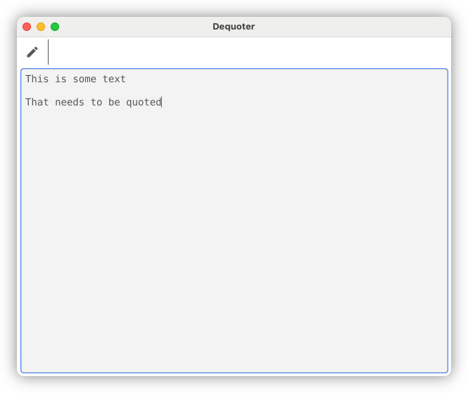
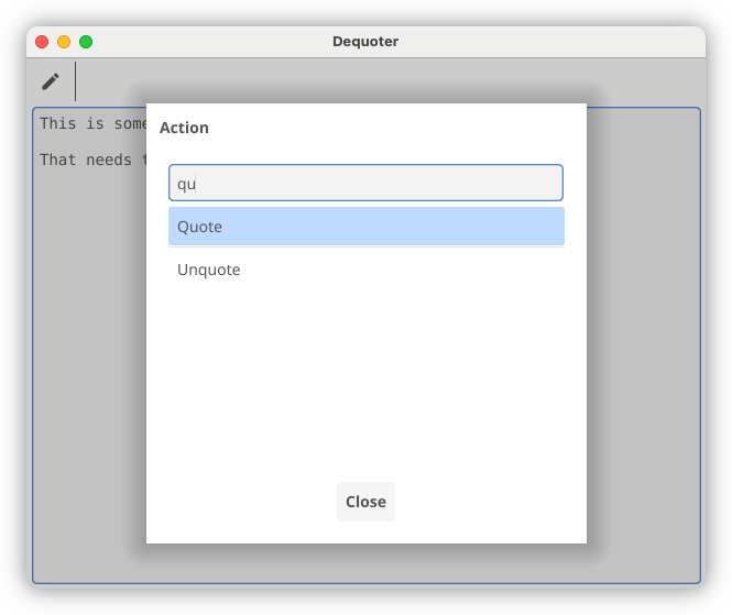
Go Feature Request: A 'Rest' Operator for Literals
Here’s a feature request for Go: shamelessly copying JavaScript and adding support for the “rest” operator in literals. Go does have a rest operator, but it only works in function calls. I was writing a unit test today and I was thinking to myself that it would be nice to use this operator in both slice and struct literals as well.
This could be useful for making copies of values without modifying the originals. Imagine the following bit of code:
Continue reading → -
I hear Robb and John are looking for a new term for the bringer of snacks for Ruminate. Allow me to throw my suggestion into the ring. It might be difficult to get at first, but trust me, it’ll make sense after saying it a few times.
Okay.
You ready?
Better strap in: it’s going to get a little mind-blowy around here.
Okay, here it is:
It’s snack-plier.
Get it? Snack…plier. The snacks supplier. What does a snack-plier do? They supply snacks. They are the snack supply person. Their whole purpose in their endeavour is to ensure the supply of snacks to those that are requiring snacks.
There it is: snack-plier. Yeah, I told you it’d be good. 😉
(Okay, I think I’ve embarrassed myself enough today. 😂)
-
Was talking to a fellow colleague today and he mentioned that he’s recently started a blog on Bear Blog. He was reluctant to share the URL to it though, which I can understand. I’m not in the habit of sharing mine with people I know.
Anyway, if J. C. happens to stumble upon this blog, hey! 👋
-
A Follow-Up To Mockless Unit Testing
I’m sure everyone’s dying to hear how the mockless unit tests are going. It’s been almost two months since we started this service, and we’re smack bang in the middle of brownfield iterative development: adding new features to existing ones, fixing bugs, etc. So it seems like now is a good time to reflect on whether this approach is working or not.
And so far, it’s been going quite well. The amount of code we have to modify when refactoring or changing existing behaviour is dramatically smaller than before. Previously, when a service introduces a new method call, every single test for that service needed to be changed to handle the new mock assertions. Now, in most circumstances, it’s only one or maybe two tests that need to change. This has made maintenance so much easier, and although I’m not sure it mades us any faster, it just feels faster. Probably because there’s less faffing around unrelated tests that broke due to the updated mocks.
Continue reading → -
Every so often, Goland gets into a weird state where it completely forgets about symbols from a certain package. It’s not every package, and the build might run perfectly fine. Yet when you try to do any code completion from this package, it says it cannot find symbols. It’s very strange.
Clearing the cache and restarting seems to be the only way to resolve this. I’m about to do this for the second time today.
-
It’s going to be a lovely day today. Perfect day to just sit in an office and do work. 🧑💻
-
Networking is hard. This remark applies to every form of networking you can think of.
-
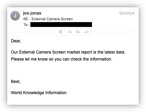
This day in work spam: anyone care for some “world knowledge information”? 😏
-
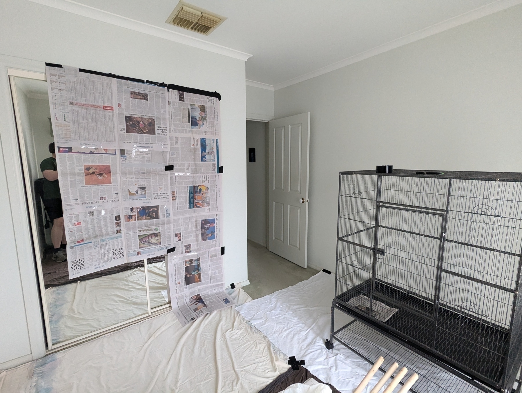
Preparing the second room for a couple of house guests that’ll be coming next week. 🦜
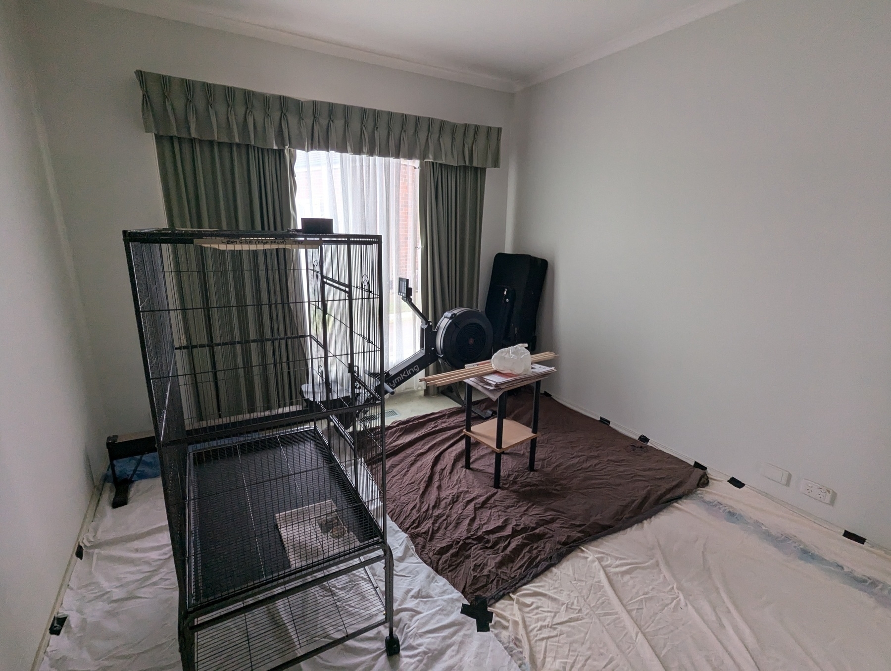
They get a little funny around mirrors so I’d had to cover the wardrobe with newspaper. Hope it holds.
 photos
 -
🔗 Major Windows BSOD issue hits banks, airlines, and TV broadcasters
Oof! I feel bad for all those Window sys-admins who’s weekend has just been ruined.
links -
Maybe the key to a happy career in software engineering is: keep the number of systems you have admin access to as low as you can. 😛
-
Had a go at recreating the last song Anders Enger Jensen wrote for 8 Bit Keys, since it’s one that I like quite a bit. Here’s a YouTube link to the original. This one was done in Logic Pro, and has a little more of the typical synth leads than the more brassy sound Anders Enger Jensen used.
music -
📺 Everybody’s Free (to Make Websites)
One word: this!
Edit: Kev Quirk shared a link to the post by Sarah Joy, who wrote the narration for this video.
media -
Learnt lots of fascinating things about how servers are catalogued in data centres today.
I learnt that when racks are advertised as “24U”, for example, that “U” refers to “unit”. Saying a device is a 2U means it takes up two units of vertical space. Something taking up “half a rack” means that it’s half the width of a unit, and there’s space to mount two of them across.
I also learnt that when numbering rack units, you start from the bottom, give that unit the number 1, and literally/metaphorically go up from there.
Finally, I learnt that the above is pretty much the only thing that’s standard about cataloguing server locations. There’s no standard for numbering devices going across the rack, and apart from floor numbers, room numbers, and maybe aisle and rack numbers — assigned by the data centre itself — you’re on your own to come up with your own standard for the rest.
So there’s plenty of opportunities for those keen to set internal standards for the organisations they work in. 😄
-
Got asked to come up with a way of representing some data today. Before diving into a design, I thought of finding out whether a standard existed. I couldn’t find one, and when I asked those in the know, they confirmed that no such standard exists. That’s good news! No chance of an accidental 927.
-
I got spam via Product Hunt today. First time as well. Completely forget I had an account there, until someone thought it would be a good idea to follow me while shilling their AI company.
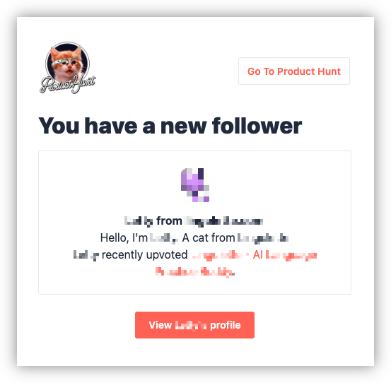
Yeah, ****. You would like me to post an uncensored screenshot of your follow, complete with company name, on my blog. 😎 -
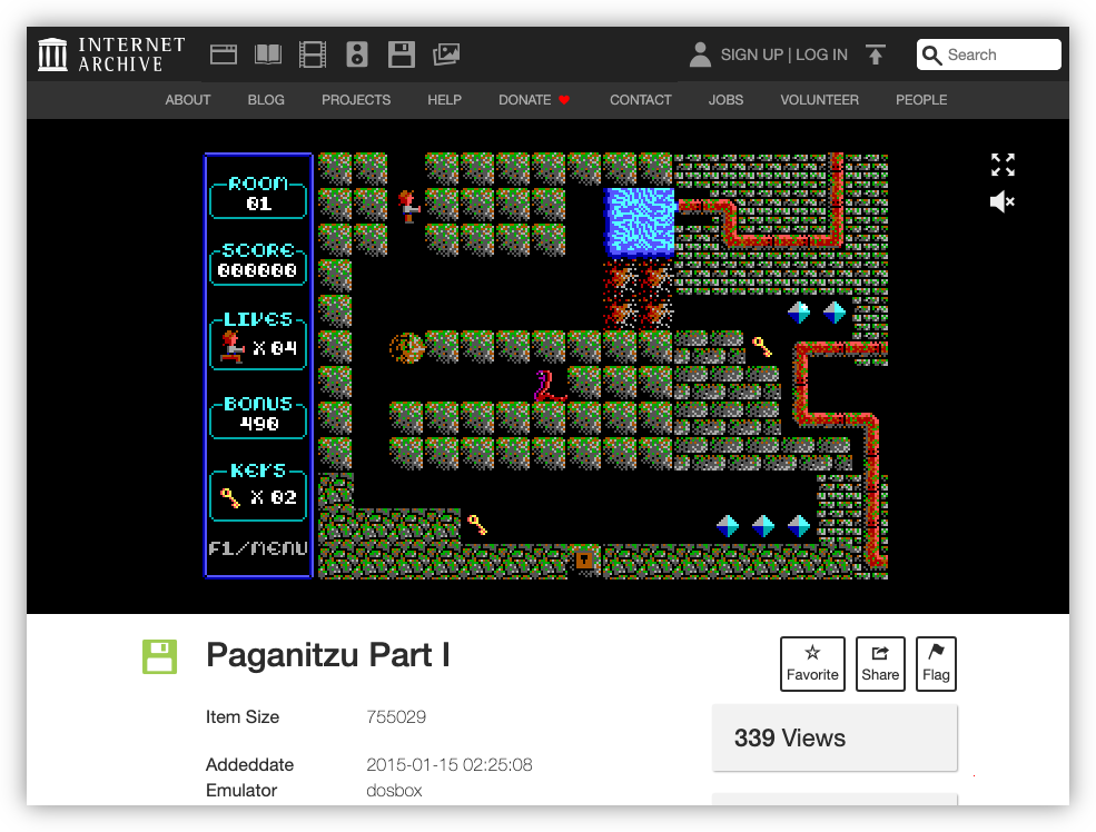
A bit more retro gaming this evening. Tonight, some Paganitzu, Part 1, or “Pagan” as I tended to call it, since that was the command to invoke it on the DOS prompt.
-
I don’t use Ghost, but I did sign up for it once, so I’m still getting the newsletters. And the latest one has got some interesting stuff. I’m not planning to employ someone for my “writing business” but I did find the list of recommended links to be pretty good.
-
One thing I’ll miss with hosting my own code is the ability to spin up a Codespace for a repository directly within GitHub. It won’t be difficult to setup a Code Server instance myself — I can do it in Pikapods — but keeping that separation between repositories was a nice feature. Ah well.
-
On the Easy Pit To Fall Into
From Matt Bircher’s latest post on Birchtree:
One of the hard parts about sharing one’s opinions online like I do is that it’s very easy to fall into the trap of mostly complaining about things.
This is something I also think about. While I haven’t done anything scientific to know what my ratio of posting about things I like vs. things I don’t, I feel like I’m getting the balance better. It might still be weighted too much on writing about the negatives, but I am trying to write more about things I think are good.
Continue reading → -
Test your browsers compatability of the Marquee element. No spoilers about whether it worked in mine. 😀
Via Scripting Notes.
links -
I knew it was a mistake to choose to eat breakfast outside. 🌧️
-
I’ve got a large writing task to do at work, so I’m trying out iA Writer. And I probably shouldn’t have because I know how expensive it is, and yet I think I’m growing to like it. It’s actually a really nice Markdown editor.
At first my developer brain resisted, saying “Ah, pish posh! Just use any old text editor you already have.” And if it was just a readme file or something, I’d probably turn to either Nova or GoLand1 to do this. But I already know that this task is going to involve a fair bit of writing, and I think the editor iA Writer uses would works better for this. It’s just feels better designed for prose: slightly larger font (although the default was way too large, and I had to reduce it), better line spacing, and handling line wraps in a nicer way than code editors.
I’ve got other writing tasks I need to do, so maybe it’s worth it in the end.
-
Obsidian would’ve been another option, but I’m hoping to keep this writing in a separate Git repository, away from my standard notes file. ↩︎
-