
Spent the day restyling the Dynamo-Browse website. The Terminal theme was fun, but over time I found the site to be difficult to navigate. And if you consider that Dynamo-Browse is not the most intuitive tool out there, an easy to navigate user manual was probably important. So I replaced that theme with Hugo-Book, which I think is a much cleaner layout. After making the change, and doing a few small style fixes, I found it to be a significant improvement.
I also tried my hand at designing a logo for Dynamo-Browse. The blue box that came with the Terminal theme was fine for a placeholder, but it felt like it was time for a proper logo now.
I wanted something which gave the indication of a tool that worked on DynamoDB tables while also leaning into it’s TUI characteristics. My first idea was a logo that looked like the DynamoDB icon in ASCII art. So after attempting to design something that looks like it in Affinity Designer, and passing it through an online tool which generated ASCII images from PNG, this was the result:
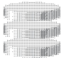
I tried adjusting the colours of final image, and doing a few things in Acorn to thicken the ASCII characters themselves, but there was no getting around the fact that the logo just didn’t look good. The ASCII characters were too thin and too much of the background was bleeding through.
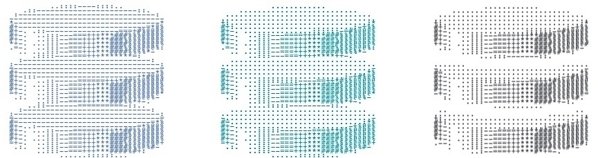
So after a break, I went back to the drawing board. I remembered that there were actually Unicode block characters which could produce filled-in rectangles of various heights, and I wondered if using them would be a nice play on the DynamoDB logo. Also, since the Dynamo-Browse screen consists of three panels, with only the top one having the accent colour, I thought having a similar colour banding would make a nice reference. So I came up with this design:

And I must say, I like it. It does look a little closer to low-res pixel art than ASCII art, but what it’s trying to allude to is clear. It looks good in both light mode and dark mode, and it also makes for a nice favicon.
That’s all the updates for the moment. I didn’t get around to updating the screenshots, which are in dark-mode to blend nicely with the dark Terminal theme. They actually look okay on a light background, so I can probably hold-off on this until the UI is changed in some way.