Some more work on that feed reader app. You know how I said that I wanted to hold off looking at appearances? Well, I abandoned that approach when I installed the app on my phone and tried viewing a few articles. And oof! There’s work to be done there.
First, it’s slow. Very slow. It’s taking a good second or two to pull feeds and entries from Feedbin. I was expecting this, and I’ve got a few plans on how to speed this up. But the biggest concern is the janky list scrolling. I mean, I wasn’t expecting the buttery smoothness of iPhone list scrolling, but I expected Flutter to be better than what I was experiencing. I’m hoping that it’s just because I was running a debug build, but part of me fears that Flutter is just not optimised for smooth list scrolling, favouring ease of development and a common runtime. I rather not change frameworks now, especially after spending an evening dealing with all the build issues, but I don’t want to live with this for ever.
But speed is not the biggest issue. The biggest offender was the feed reader view. The embedded web-view was only lightly styled, and it felt like it. The margins were all off, and I didn’t like the default font or colours. It made reading the article a bad experience to a surprising degree. I’ve dealt with rushed or poorly designed UIs in the past, but I didn’t have much tolerance for this. Not sure why this is, but I suspect it’s because I’ve been using feed readers that put some effort into the design of their reader screen.
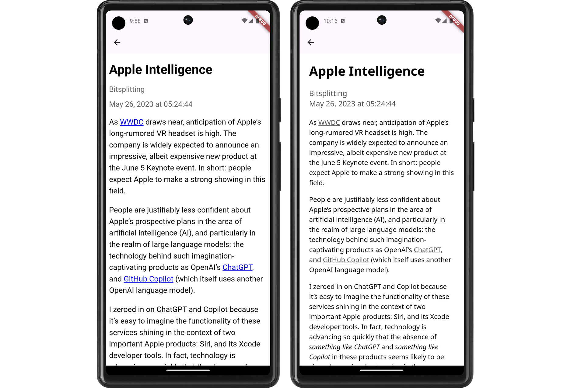
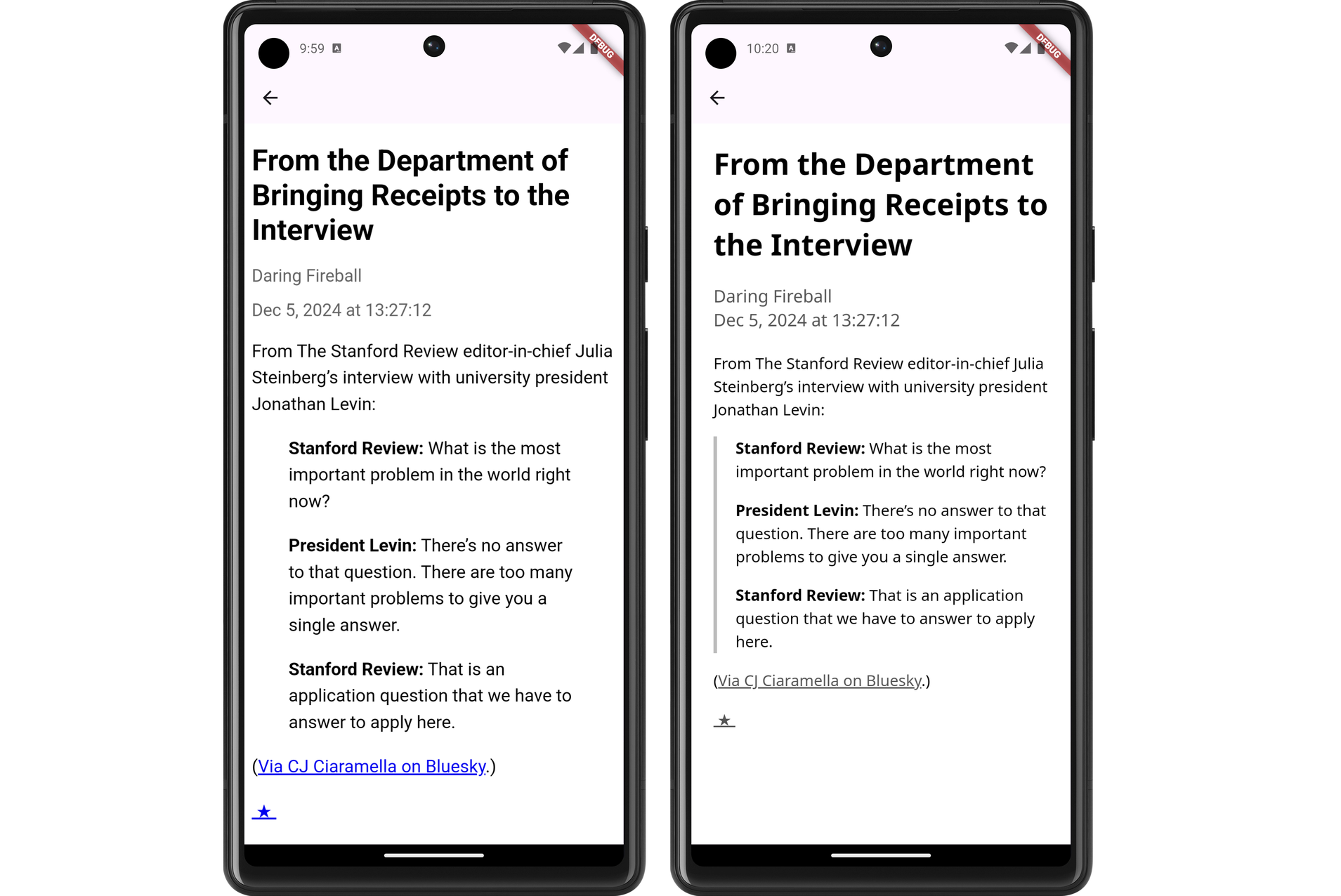
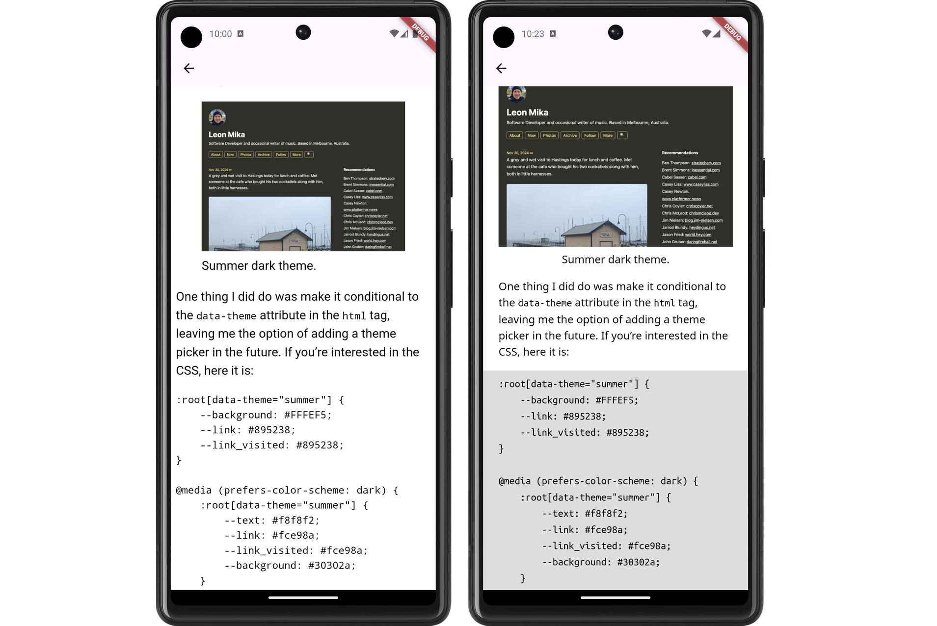
In any case, a couple of evenings ago, I decided to put some effort into the styling. I replace the body text font with Noto Sans and the fixed-font with Ubuntu Mono. I dropped the font-size a little to 1.05 em (it was previously 1.1 em, with felt a little big, and 1.0 em felt a little small). I bought the margins in a little. And I styled the block-quote, figure, and pre elements to an appearance that, despite being a little overused, felt quite modern.
The results look much better, at least to my eye (and my emulator). Here are some side-to-side comparison shots of the changes (left side is the unstyled version, while the right side has the new styling changes):


I still need to actually install this on my phone and try it out. I’m wondering whether I should do so after a bit more work syncing the read status with Feedbin. That’s a feature that’s keeping me on Feedbin’s PWA for now.