I recently got a new phone, a Pixel 9 Pro, which meant I needed to bring Alto Player up to date. I probably could’ve gotten away using the version I was using on my Pixel 6. But I didn’t have a binary build, and I needed to upgrade Gradle anyway, so I decided to spend a bit of time bringing it up to date to API version 35, the version used in Android 15.0. Fortunately it was only a few hours in total, and once I got it running in the simulator, I side-loaded it onto my phone and started using it.
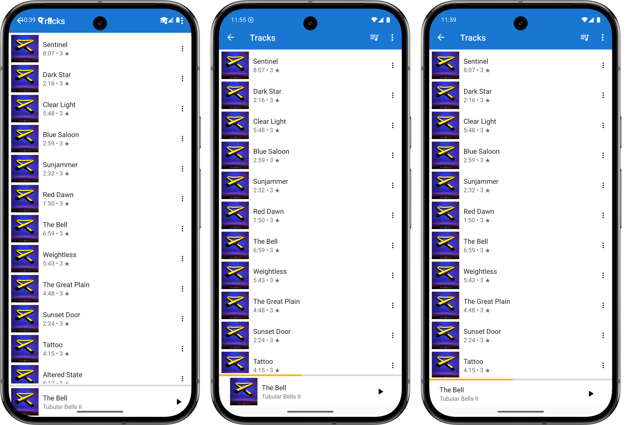
It worked, but there were some significant UI issues. The title-bar bled into the status bar, the album image in the Now Playing widget was cropped by the curved corners of the phone, and the media notification didn’t display playback controls.

I set about fixing these issues today, starting with the title-bar and Now Playing widget. These was an issue with the views not respecting the window insets, and after a quick Google search, I found this article showing how one could resolve this by adding a ViewCompat.setOnApplyWindowInsetsListener and reacting to it by adjusting the margins of the view.
val topLevelLayout = findViewById(R.id.top_level_layout) as CoordinatorLayout
ViewCompat.setOnApplyWindowInsetsListener(topLevelLayout) { v, windowInsets ->
    val insets = windowInsets.getInsets(WindowInsetsCompat.Type.systemBars())
    v.updateLayoutParams<ViewGroup.MarginLayoutParams> {
        leftMargin = insets.left
        bottomMargin = insets.bottom
        rightMargin = insets.right

        // applying a top margin here would work, but will not have the toolbar
        // background colour "bleed" into the status bar, which is what I want.
    }

    val t = v.findViewById<Toolbar>(R.id.toolbar)
    t.updateLayoutParams<ViewGroup.MarginLayoutParams> {
        // make the toolbar a little "narrower" than full height
        topMargin = insets.top * 3 / 4
    }

    WindowInsetsCompat.CONSUMED
}
It took a few attempts, but I managed to get this working. Just using the top inset for the toolbar margin made it a little larger than I liked, so I adjusted the height to be 75% of the inset. This means the toolbar will actually encroach into the area reserved for cut-outs like the front-facing camera. This is arguably not something a “real” Android apps should do, but this is just for me and my phone so it’s fine.
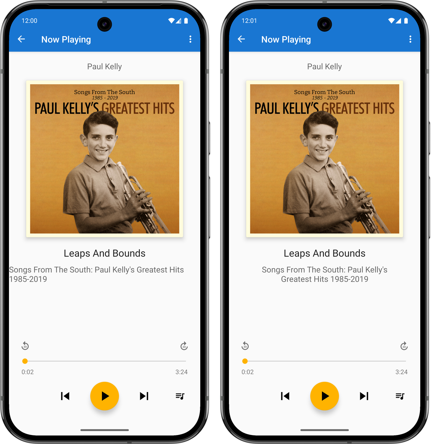
I went through a few iterations of the album artwork cutoff on the bottom right corner trying to find something I liked. I tried bringing in the horizontal margins a little, but I didn’t like the alignment of the album art in the player, particularly compared to the covers that appear in the track list screen. One thing I didn’t try was raising the bottom margin so that it would fit “above” the curve. But those corners curve in quite a bit, and doing this would sacrifice a lot of vertical space. So I settled on hiding the album art altogether. It’s a bit of a shame to loose it, but at least it looks neater now.
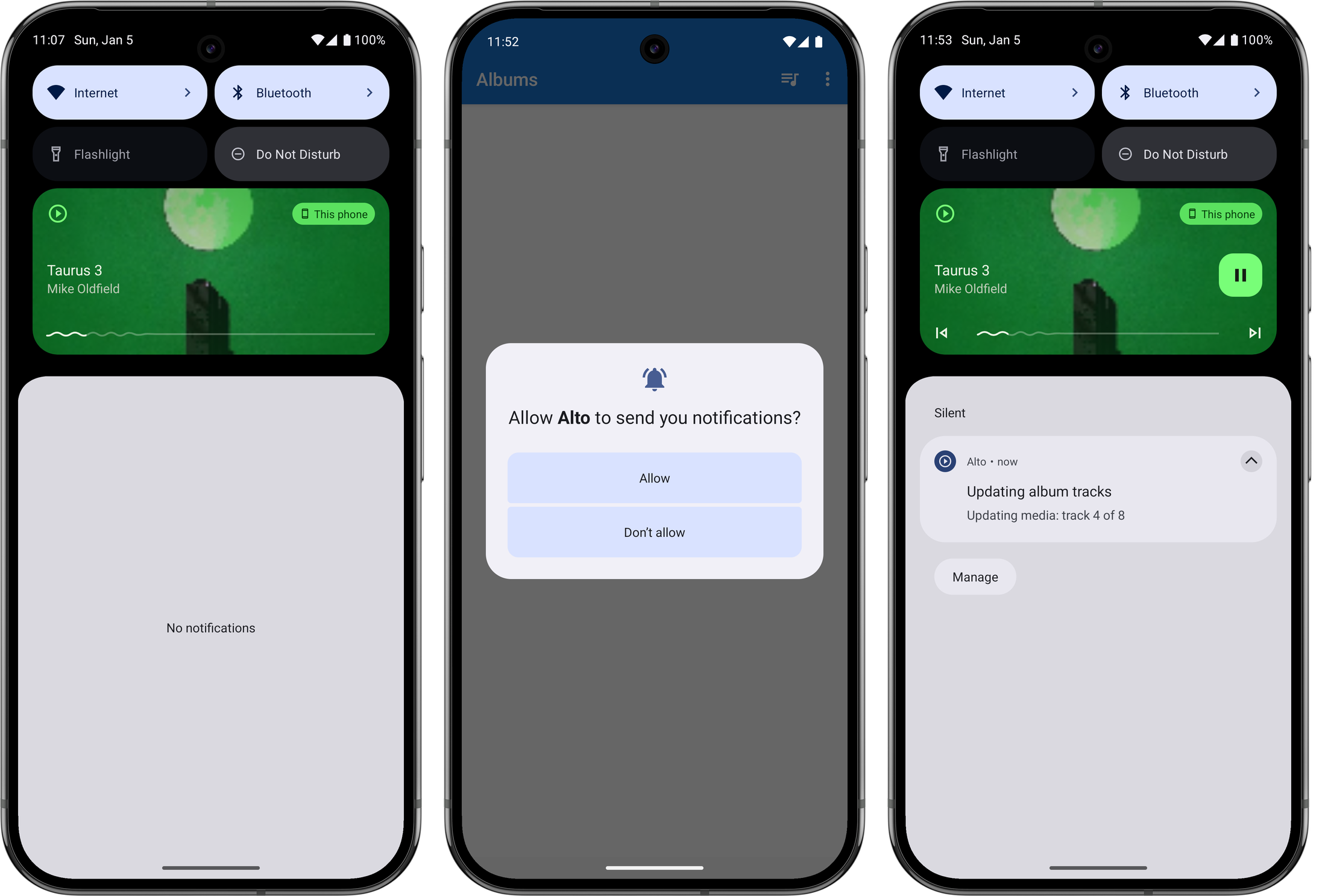
The next thing I looked at was fixing the playback controls in the media notification. After some investigating, I found that this was because I was not setting the available actions in the PlaybackStateCompat builder. This, if I understand correctly, is used to communicate to various systems the current state of the playing media: what the track name is, whether it’s playing, whether one can skip forward or back. I have my own types for tracking this information — which is probably not correct but I wasn’t completely sure as to what I was doing at the time with Android’s media stack1 — and when I needed to convert this to a type understood by the framework, I made instances of this builder without setting the available actions. Earlier versions of Android seemed not to care, and the controls always appeared on the notification. But I guess they changed that.

One other thing I needed to do was to explicitly ask the user permission to show a notification before I could publish one. This is also relatively new: my experience with Android goes back to the early days where these permissions were disclosed up front when the app was installed. But I can completely understand why they changed it, as it was easy to simply tap through those screens with reading them. I am wondering whether media playback notifications are in some way exempt from these permission checks, as I was actually getting one to appear before I made this changes. But I figured it was probably worth doing anyway, so I added this permission request on first launch. Arguably I should be asking for this permission when playback starts, but again, this is just for me.
One final thing I needed to address were long album titles. The text view displaying the the album title had a width that autosized to the title itself, and the start and end constraints were set such that it appears centred in the view. This worked for “normal” length titles but when the length became excessive, the text view would fill the entire width of the screen and the title will appear left justified.

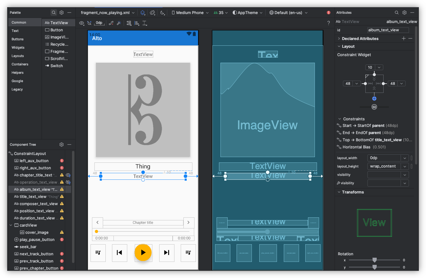
The fix for this was to set the text width to be calculated by the start and end constraints (setting layout_width to 0dp), bringing in the margins a little, and making the label text centre justified. I did this already for the track title, so it was easy to do this here too. Not sure why I didn’t do it earlier, or why I haven’t done it for the artist’s name yet.

This was all rushed, and I’ll admit I wasn’t 100% sure what I was doing. I was going down the route of trial-and-error to get this working, mixed in with web searches and a trip to ChatGPT. And yeah, the methods I used won’t make this a portable Android app that would work on every phone out there. But I’m reasonably happy with how it turned out.
-
This is still true to this day. ↩︎