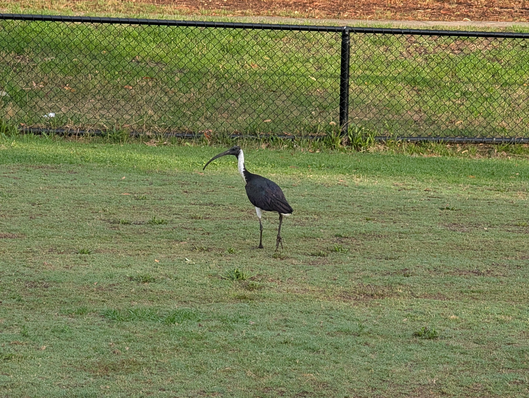
Spent the morning tidying up the categories on this blog. My first thought was, as it usually is, to build something to help me do this. But I ended up just doing it manually. I think was the right decision, as it proved to be quite a calming activity.

I have some thoughts on Manuel Moreal’s post on how linking out could result in server load:

If my site was big enough to cause problems, would then be my responsibility to be careful what I link to? […] My gut reaction tells me that it’s not really my responsibility to worry about the way other people run their sites but maybe I’m wrong and I should worry about that.

My view that if something online resonates with you, then it’s worth linking to. Not only are you spreading awareness of material you think is worth sharing, you’re giving signal to the creator that their material is resonating with others. To not do so, because you fear that a large amount of traffic might knock their server over feels like a decision made on too many assumptions about their hosting setup, or how they would react to such an event happing to them.

The stuff I post here barely goes anywhere, and I’m perfectly happy with that being the case. But there’s been a handful of times where things went wider and it’s always quite a thrill. I try to pay it forward by sharing links to things that I believe are worth sharing. To not, because I think it might cause an outage, feels like depriving others of that same thrill. Maybe “depriving” is too strong a word here, but it does feel like keeping something from them.

Using TLDraw at work and the inevitable “it would be cool if it did X” thoughts started entering my mind. But of course, adding X would lead to wanting Y, and it’ll eventually become bloated and cumbersome to use, eliminating the reason why I like using it. So no, it will NOT be cool if it did X.

📺 House of the Dragon: Season 2 (2024)

Title: House of the Dragon
Metadata: Season 2 (2024) - Ryan Condal, Score: Decent. Review: Another stunning production. But I had a bit of trouble staying engaged, largely because too many characters seemed driven by separate motivations. A complex plot isn't necessarily a bad thing, but it left me questioning the reason behind some of the characters' actions, and what their ultimate goals were (for example, Daemon). For that reason, this falls a notch below Season 1. But don't get me wrong: 'Decent' is still a good score, and near the conclusion, I found myself captivated once again.

Enjoying some chinotto. It’s a chinotto sort of evening me thinks.

A bottle and a glass of Stappi Chinotto are placed on a kitchen benchtop.

Christmas party at work tonight. Normally I don’t go to Christmas parties, and of course, this year will be no exception. (The idea of an end of year party doesn’t really fly with me while there’s still quite a lot to do).

So apparently all the boorish, anti-social passengers take to public transport after 4:45. Didn’t get this behavior when I left work on time. 😒

I plan to integrate UCL into another tool at work, so I spent last night improving it’s use as a REPL. Added support for onboard help and setting up custom type printing, which is useful for displaying tables of data. I started working on the tool today and it’s already feeling great.

A command line interface is displayed, showing help-related commands, usage, arguments, and details.

Would I pay $200 /month for ChatGPT Pro? 🤔

This morning I was thinking “no way,” but working through rebase conflicts got me thinking. If ChatGPT could trail through my Git history, and automatically resolve conflicts for me, that might be worth something. Maybe not $200 /month, but something.

If there’s one thing I’d like to see added to Go for 2025, it’s type parameter support on methods. It’s still not possible to do something like this:

Auto-generated description: A code snippet shows a Go language function with an error message indicating that a method cannot have type parameters.

Which is a real shame, as I’ve got some ideas on how I could use these. Building something like Java streams, for example.

Probably the most disobeyed sign in all of South Melbourne. 😏

A sign indicates that cycling on footpaths is prohibited with a red circle and a line through a bicycle symbol.

I wish it was possible to style the carat shape in CSS. There may’ve been a future where that would’ve been possible, if CSS Tricks is any indication. But based on what I found elsewhere, I think that’s off the table for now. A pity. Would’ve been good to have a text field with a block-shaped caret.

I think a key to my continued use of Obsidian at work is that I’ve configured it to launch at startup. I wonder if I did likewise on my home desktop, I’d still be using Obsidian for personal notes too.

I can’t see a future in which we all program in one computer language. Such a language would be a “jack of all trades, master of few.” I really like Go, but I bristle at the thought of having to use it for things like command shells, configuration, or querying a database.

Speaking of JavaScript frameworks, I do appreciate the person who put together this “project website” for vanilla JS. Got a chuckle from it.

Via HTMX.

🔗 If Not React, Then What?

Quite the condemation of React and “frameworkism” in frontend web development. I’m not a frontend guy, but I do poke through the code from time to time, and it’s mindboggling how complicated it is. And for what? Is it for any specific engineering decision that are relevant to us? Or is it just because “Facebook does it?”

Speaking of which, if you read anything from this post, read the “But” section. An excellent set of rebuttals for why React may not be a good default choice.

Oh, and also the first footnote. I had no idea that some of React’s design decisions came about because of IE 6. The ghost of Microsoft’s shitty browser continues to haunt us all.

Green grass in summer.

A lush green field stretches under a partly cloudy sky, bordered by trees and featuring a tall tree standing prominently on the right.

In other building-small-things-for-myself news, I spent a bit of time this morning on the image processor for Blogging Tools. The big new change was adding support for working with multiple source images, instead of just one. This made way for a new “Phone Shot” processor, which arranges multiple screenshots of phone apps in a row, while also downscaling them and proving some quick crops and distribution options.

This should reduce the vertical size of mobile app screenshots I post here, something that’s been bothering me a little.

Some more work on that feed reader app. You know how I said that I wanted to hold off looking at appearances? Well, I abandoned that approach when I installed the app on my phone and tried viewing a few articles. And oof! There’s work to be done there.

First, it’s slow. Very slow. It’s taking a good second or two to pull feeds and entries from Feedbin. I was expecting this, and I’ve got a few plans on how to speed this up. But the biggest concern is the janky list scrolling. I mean, I wasn’t expecting the buttery smoothness of iPhone list scrolling, but I expected Flutter to be better than what I was experiencing. I’m hoping that it’s just because I was running a debug build, but part of me fears that Flutter is just not optimised for smooth list scrolling, favouring ease of development and a common runtime. I rather not change frameworks now, especially after spending an evening dealing with all the build issues, but I don’t want to live with this for ever.

But speed is not the biggest issue. The biggest offender was the feed reader view. The embedded web-view was only lightly styled, and it felt like it. The margins were all off, and I didn’t like the default font or colours. It made reading the article a bad experience to a surprising degree. I’ve dealt with rushed or poorly designed UIs in the past, but I didn’t have much tolerance for this. Not sure why this is, but I suspect it’s because I’ve been using feed readers that put some effort into the design of their reader screen.

In any case, a couple of evenings ago, I decided to put some effort into the styling. I replace the body text font with Noto Sans and the fixed-font with Ubuntu Mono. I dropped the font-size a little to 1.05 em (it was previously 1.1 em, with felt a little big, and 1.0 em felt a little small). I bought the margins in a little. And I styled the block-quote, figure, and pre elements to an appearance that, despite being a little overused, felt quite modern.

The results look much better, at least to my eye (and my emulator). Here are some side-to-side comparison shots of the changes (left side is the unstyled version, while the right side has the new styling changes):

Auto-generated description: Two smartphone screens display an article titled Apple Intelligence by Bitsplitting, discussing Apple's upcoming product announcement.
Demonstration of the new font and link colouring choices.
Auto-generated description: Side-by-side comparison of two smartphone screens displaying an email titled From the Department of Bringing Receipts to the Interview, featuring text from a Stanford Review interview with President Levin.
Demonstration of the changes to block-quotes. Having a line down the left-sided is a pretty common style, but it's one I like.
Auto-generated description: Two mobile screens showing a website with a summer dark theme, including CSS code for customizing the theme's appearance.
Demonstration of code blocks and figures with captions.

I still need to actually install this on my phone and try it out. I’m wondering whether I should do so after a bit more work syncing the read status with Feedbin. That’s a feature that’s keeping me on Feedbin’s PWA for now.

My poor work laptop has not seen a shutdown in two weeks. So many Vivaldi, Terminal, and Goland windows open. Not to worry, laptop. Soon they’ll all be closed and you can rest until Monday (or until I start you up over the weekend to check how a migration is progressing).