
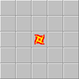
Attempting to design an app icon for a Chips Challenge fan game I’m working on. Going for something that looks like the fireball sprite in the original game with a hint more realism and tinted in the colour blue. For reference, here’s the original fireball sprite:
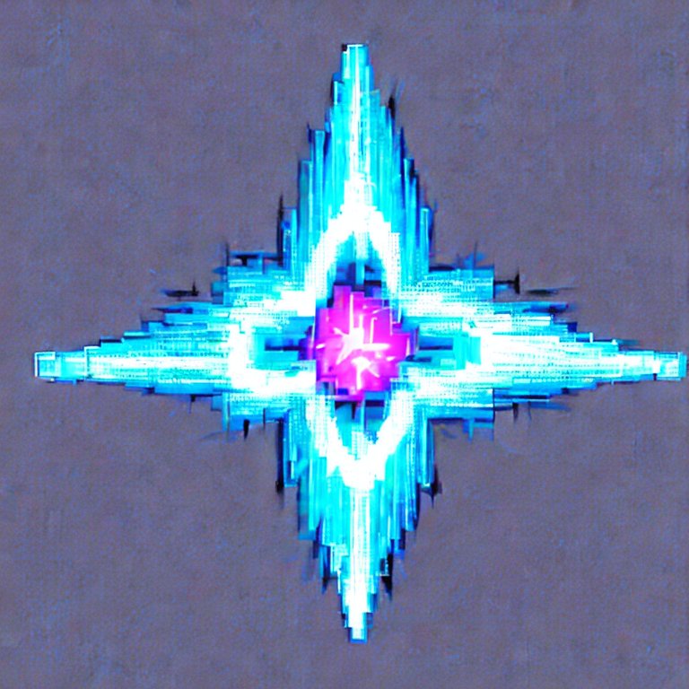
And here’s my attempt:
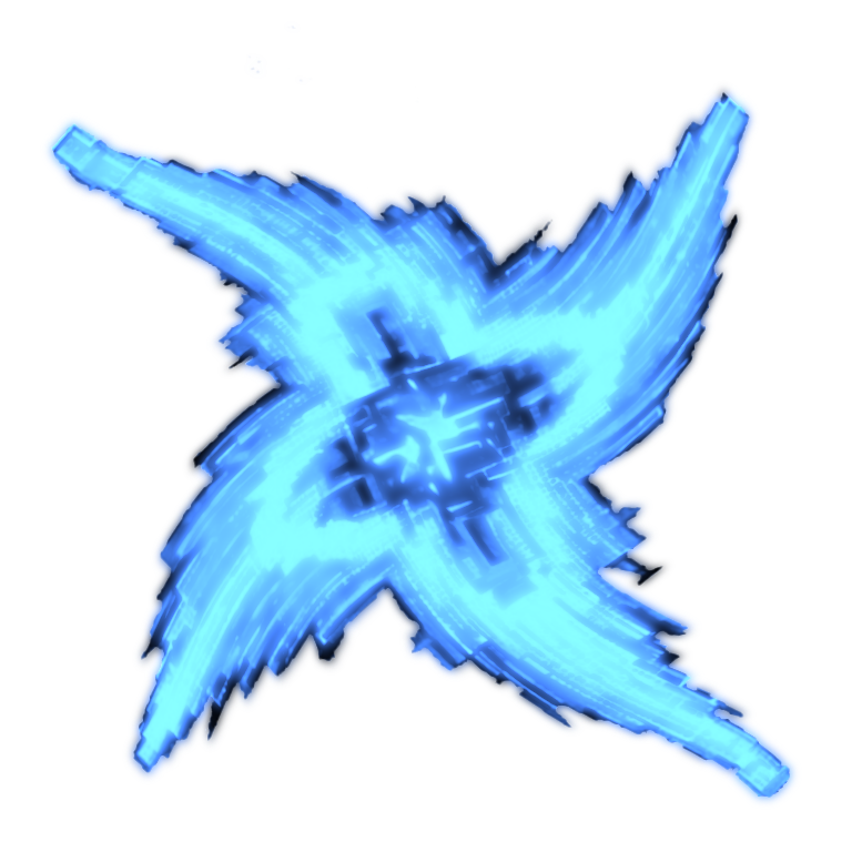
I started with Stable Diffusion to get the base image:
Then imported into Acorn to rotate it, colourise it, and distort it to look a bit closer to the original sprite.
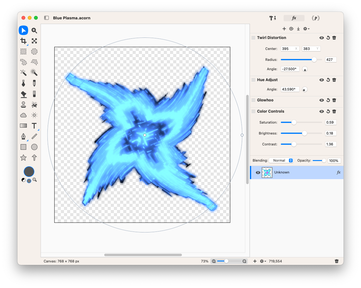
Desaturating the original image got rid of the purple centre, then applying the Glowhoo and Hue Adjust effect recolourised it to the blue I was looking for (I’m not sure what the Glowhoo effect does, but it seems to adjust the colour based on the pixel intensity, so it was good enough for what I wanted). Finally, I added a Twirl Distortion effect to achieve the slight warp in the star.
And yeah, it’s not going to win any design awards, but it’s good enough for now.
Oh, and just for kicks, here was my first attempt of producing the sprite using Affinity Designer.
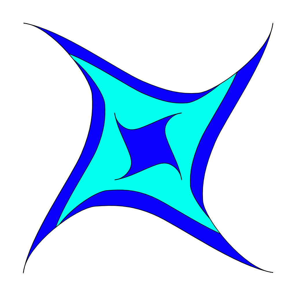
That’s definitely not going to win any design awards. 😂