Wish TLDraw offered a cylinder shape. I know my needs are quite niche, but I really like using this app for back-of-the-napkin architecture diagrams of software systems, and having a cylinder shape to represent a database or queue would really come in handy.
Playing around with Vintage Logo this morning. HT to @odd and @mandaris for posting a link to this iOS app. Theyβve got some very nice logo templates here, including this art deco one featuring a bird in flight.
Used it to make this logo, which I call: lodgings for the evening.
I can’t for the life of me remember how to create a child page in Notion’s mobile app. Why do they hide that option with the bullets and headings? Couldn’t the New Page button be context specific, instead of creating a new top-level page wherever you press it?
Reliving my European trip through my posts here. They’ve started to appear on my On This Day page.
I sometimes wonder if I should’ve posted more at the time. I deliberately kept to my usual pace of one or two posts a day, mainly because others suggest that it’s usually not a great idea posting loads of photos of your trip on social media, lest you make people jealous about what you’re currently doing. Although, when they say “social media” they mean Instagram or TikTok and not Micro.blog, although one could make the case that’s still kinda, sorta, if-you-squint-and-tilt-your-head social media, maybe?
Ah well, doesn’t matter. I think I made to right call: living the moment instead of spending all my time working out whether something was post worthy. Plus, I’ve still got loads of photo and journal entries that I could turn into blog posts. Maybe one day I will.
Adjusting my SQL code formatting preferences at the moment, and it just feel soβ¦ byzantine. There’s probably close to 200 different settings here (I stopped counting after 100) and hunting through them trying to find the one that controls whether parenthesis should appear on the same line as the CREATE
statement is so time-consuming.
It would be nice for editors to provide a way to “learn” a code formatting style. They can present you with some sample code and say to you, “format this the way you’d like to see it and we’ll learn from that.” There can be several of these samples, presented to you one at a time, each one intended to answer a particular question about how the style should be. For example: one might have a dramatically narrow page width, forcing the user to break long lines.
From that, they can build a profile that will be used to configure the formatter. The configuration will essentially be the same as what’s used by formatters today β and can be transferred or checked into source control like a regular config file. It’ll just come from this learning routine, rather than the user poking through piles of checkboxes and pickers spread across 8 different tabs (I counted those as well).
Could this be something an onboard LLMs can actually do? Not sure. But if code editors are looking for “AI” features to add to their product, this might be one worth considering.
Side Scroller 95
I haven’t been doing much work on new projects recently. Mainly, I’ve been perusing my archives looking for interesting things to play around with. Some of them needed some light work to get working again but really I just wanted to experience them.
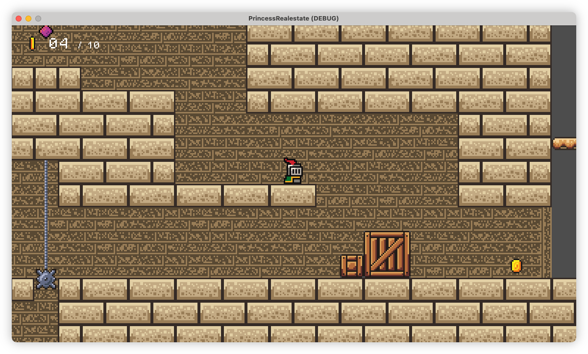
I did come across one old projects which I’ll talk about here: a game I called Side Scroller 95.Β And yes, the “95” refers to Windows 95.
This was a remake of Side Scroller, a QBasic game I made back in the day. Having played around with Delphi programming after a while, and finding a bunch of DirectX 7 components, I set about recreating this game.Β I’m not sure why I decided to remake this game vs. making something new. Was it because it was simple enough to try, or I found the levels interesting? Maybe? I can’t really say.
Anyway, there wasn’t much to this game from the beginning. All the movement was cell based, with the usual assortment of solid tiles, hazards, and keys and locks (no pickups though). I eventually added a simple enemy as well: a robot which just went from left to right.
This project really showcases my crappy art skills at the time (I wish I could say they improved, but that would be a lie). The tiles and sprites were creating using MSPaint. This was back in the day when MSPaint was actually quite usable for pixel art, where drawing a rectangle actually rendered a rectangle then and there, rather than product an object which could be moved around (it’s just not the same now). The backgrounds were made by making gradients in Microsoft Word, taking a screenshot, and cropping them. And the sound effects were taken from the PC version of Metal Gear Solid (the WAV files were just sitting there on the file system).
The game itself is pretty unremarkable, although I would say that one
attribute that I really enjoyed doing is adding level scripts. These
were Pascel scripts β interpreted by a Delphi control I found β that
intercepted events, such as triggers or timeouts, and modified the level
in some way. This was done late in the project, so it wasn’t used much,
but it did make for some unique level-specific elements in the later
levels. An example of one of the level scripts is provided below. This
added platforms which ascended one cell at a time when activated. I
forget most of what the built-ins did but I believe the OnActivateX
hooks fired when a switch was triggered and the OnTimedEventX
fired
when a timer elapsed.Β
unit LevelScr;
uses SSUTIL;
const
INT_STX = 0;
INT_STY = 1;
INT_EDX = 2;
INT_EDY = 3;
INT_CURX = 4;
INT_CURY = 5;
procedure LevSetupMove(sx, sy, ex, ey: integer);
begin
SetStackInteger(INT_STX, sx);
SetStackInteger(INT_STY, sy);
SetStackInteger(INT_EDX, ex);
SetStackInteger(INT_EDY, ey);
SetStackInteger(INT_CURX, sx);
SetStackInteger(INT_CURY, sy);
end;
procedure OnActivate1(tag: integer; ison: boolean);
begin
case tag of
1: LevSetupMove(6, 9, 6, 5);
2: LevSetupMove(18, 9, 18, 4);
3: begin
LevSetupMove(20, 19, 20, 16);
Level.SetTile(21, 18, 52);
end;
4: LevSetupMove(11, 23, 11, 19);
5: LevSetupMove(10, 23, 10, 17);
6: LevSetupMove(9, 17, 9, 15);
7: LevSetupMove(9, 15, 9, 13);
8: LevSetupMove(9, 13, 9, 11);
end;
SetupTimer(1, 2, 1, true);
end;
procedure OnActivate2(tag: integer; ison: boolean);
begin
case tag of
1: LevSetupMove(20, 20, 20, 16);
end;
SetupTimer(2, 2, 1, true);
end;
procedure OnTimedEvent1(event: integer);
var cx, cy: integer;
begin
cx := StackInteger(INT_CURX);
cy := StackInteger(INT_CURY);
if ((cx = StackInteger(INT_EDX)) and
(cy = StackInteger(INT_EDY))) then
begin
ResetTimer(1);
end
else
begin
Level.SetTile(cx, cy, 12);
cy := cy - 1;
Level.SetTile(cx, cy, 13);
SetStackInteger(INT_CURX, cx);
SetStackInteger(INT_CURY, cy);
PlaySound(11, false);
end;
end;
procedure OnTimedEvent2(event: integer);
var cx, cy: integer;
begin
cx := StackInteger(INT_CURX);
cy := StackInteger(INT_CURY);
if ((cx = StackInteger(INT_EDX)) and
(cy = StackInteger(INT_EDY))) then
begin
ResetTimer(2);
Explode(cy, cx);
end
else
begin
cy := cy - 1;
Level.SetTile(cx, cy, 0);
SetStackInteger(INT_CURX, cx);
SetStackInteger(INT_CURY, cy);
PlaySound(11, false);
end;
end;
end.
One other hallmark of this project was completely gutting all the hard-coded logic and moving it into a game definition file. I build a pretty simple “game designer” tool which managed all the artwork, tile and sprite definitions, and also had custom logic implemented using that same Pascal interpreter I was using for the level scripts. I never used it for anything than the “Side Scroller” game, apart from a recreation of the File Platform game I also built way back when.
Again, nothing about this was remarkable, and for a long time I had no way to get this working. But thanks to Whisky I managed to launch this for the first time in ages and have a play. I don’t know when I’ll be able to do so again, nor whether it’s a good use of my time to try, so I recorded some screencasts of the gameplay which you can see here:
- The Test Level Set β used to test the level script feature.
- The Additional Level Set β these were the levels that really made use of level scripts, including the one listed above.
The desire to move away from cell-based movement and physics continued my drive in making platform based games in Delphi. I eventually managed to build such a game, which I will talk about once I can get it working again.
Coding like it’s 2003.
Poking around WinWorld this morning and found a working copy of Borland Delphi 7. Works perfectly in Crossover.
Bulk Image Selection
Some light housekeeping first: this is the 15th post on this blog so I thought it was time for a proper domain name. Not that buying a domain automatically means I’ll keep at it, but it does feel like I’ve got some momentum writing here now, so I’ll take the $24.00 USD risk. I’d also like to organise a proper site favicon too. I’ve got some ideas but I’ve yet to crack open Affinity Design just yet.
Anyway, I’ve been spending some time on Photo Bucket on and off this past week. I’ve fully implemented the new page model mentioned in the last post, and hooked it up to the switcher in the “Design” admin section. I’ve also built the public gallery and gallery item page.
They’re a little on the simplistic side. That’s partly due to my minimalistic design sensibilities, but it’s also because I haven’t spent a lot of time on the public pages yet. I probably shouldn’t leave it too late, lest my impressions on how it looks drops to the point where I loose interest in working on this again. It’s a challenge, but I guess my counterΒ is that I’ll probably be spending more time in the admin section, so as long as the experience is good enough there, I can probably go by with a very basic public site for now (but not for ever). Now that galleries can be shown on the landing page, I’d like to organise another deployment so that I can start showing images in galleries. But before I do, I’ll need an easy way to move all the existing images into a gallery. Clicking into 25 individual imagesΒ just to select which gallery they should belong to doesn’t sound desirable to me. So I spent some time adding batch operations to the image admin page. The way it works is that by pressing Shift and clicking the images, you can now select them and perform batch operations, such as add them to a gallery (this is the only one I have now).
I do like how the selection indictor came out. It’s got some DaVinci
Resolve vibes (I’ve been using DaVinci Resolve recently to edit some
videos so I may have been inspired by their design language here) but I
think I might need to use another highlight colour though: I think the
black bleeds too easily into the images. Also, while I was recording the
demo, I realise I broke the ability to rearrange gallery items. I may
need to fix that before redeploying. Clicking “Gallery” brings up a
model similar to the one used in the individual image page.Β It work’s
slightly differently though: instead of choosing whether the images
appear in the gallery or not, this one is used to choose which galleries
to add the selected images to.
I’m not sure that this is the best modal for this. It was quick to add,
but I get the feeling that using the same model in slightly different
ways could confuse people. So I might do something else here. An idea I
have is a modal more like the following:
The idea is that all the galleries will be listed like before, but will have a three-segmented button to the right. The centre button will be selected by default, and will show how many of the selected images are currently within that particular gallery. To the left will be the option to remove those images from the gallery, and to the right will be the option to add all the remaining selected images to the gallery. These are identified with the number of the selected images each gallery will have when the user clicks “Save”: 0 for none, and the number of selected images for all. For good measure is an option to add all the selected images into a brand new gallery. This will require some backend work so I haven’t started work on this yet. Not sure if this too will be a bit confusing: may need some additional text explaining how it all works. I’m hoping that users would recognise it as operating similar to the Gallery model for a single image.
Trying out the new audio narration feature for Micro.blog that Manton just announced. If you’re hearing me read these words out aloud, then I guess you could say that it’s working. I doubt that I’d do this for many of the posts I write here, even the long form ones. It’s not really conducive to how I write here: I’m hardly Ben Thompson. And I usually find myself having to take several takes just to record something decent (I’m already up to take seven or something).
But who knows? Maybe I’ll do it more often than I expect. And in either case, it’s nice to have the option.
Anyway, I suppose Matt will eventually release an update to Tiny Theme to support this properly. But to tide me over until then, I’ve added the following microhook to include a play button on the post byline:
<!-- layouts/partials/microhook-post-byline.html -->
<a href="{{ .Permalink }}" class="post-date u-url">
<time class="dt-published" datetime="{{ .Date.Format "2006-01-02 15:04:05 -0700" }}">{{ .Date.Format "Jan 2, 2006" }}</time> β
</a>
{{ if .Params.audio -}}
{{ with .Params.audio -}}
<span class="byline-separator"></span>
<script type="text/javascript" src="https://micro.blog/narration.js?url={{ . }}"></script>
{{ end }}
{{ end }}
I also add a bit of styling to add a nice bullet separator between that and the date:
span.byline-separator {
display: inline-block;
}
span.byline-separator::after {
content: "β’";
padding-left: 7px;
padding-right: 3px;
color: var(--accent2);
}
div.microblog_narration_button {
color: var(--link);
}
(Oh, it looks like Manton has updated the Markdown parser to support code fences in the posts screens. That’s great.)
I will admit that it’s a bit of a rush job: I wanted to add this as quickly as possible. But I guess it’ll do until someone with better design skills improves on this.
It’s nice seeing tools add support for inline Mermaid diagrams to Markdown, almost like it’s a de-facto standard. Obsidian supports it out the box, and I just discovered that Gitlab does as well. If this continues, I may never need to do another sequence diagram in a vector drawing tool again. β¨οΈ
Coding standards at work calls for US English in our codebase. So I’m typing words like “color,” “initialize,” and “data center.” And it pains me. I know that’s irrational but, you know, I never claimed to be rational when it comes to things like this.
At least the spell-checker’s on my side.
π¨βπ» New post on Web over at the Coding Bits blog: Obsidian PDF Styling Improvements
Hearing that Microsoft Recall uses an AI model trained to observe the GUI, it all feels soβ¦ bizatine to me. Might be that my experience is coloured by previous attempts at UI automation testing but surely there’s a better way to do this at the API layer.
Well, I guess it includes a collective action problem to solve, too.
And it doesn’t guarantee all that sweet, sweet shareholder investment cash that seems to drive most decisions to turn to AI features recently (this “stock-price driven development” is one of the reasons why I try to avoid working at public companies).
Don't Leave User Experience For Later
DDH wrote a post yesterday that resonates with me. This is how he opens:
Programmers are often skeptical of aesthetics because they frequently associate it with veneering
I doubt DHH reads this blog, but he could’ve address this post directly at me. I’m skeptical about aesthetics. Wellβ¦ maybe not skeptical, but if we’re talking about personal projects, I do consider it less important than the functional side of things. Or at least I did.
He continues:
Primary reason I appreciate aesthetics so much is its power to motivate. And motivation is the rare fuel that powers all the big leaps I’ve ever taken in my career and with my projects and products. It’s not time, it’s even attention. [sic1] It’s motivation. And I’ve found that nothing quite motivates me like using and creating beautiful things.
He was mainly talking about the code design, but I think this extends to the project’s UI and UX. Particularly if you’re building it for yourself. Maybe especially if you’re building it for yourself.
And this is where my story begins. From the start I’ve been putting off any task that would improve the user experience on one of my side project. I considered such tasks unnecessary, or certainly less important than the “functional” side of things. Whenever faced with a decision on what part to work on next, the user experience work was left undone, usually with a thought along the lines of “eh, it’s UI stuff, I’ll do it later.”
But I think this was a mistake. Since I was actually using this tool, I was exposed to the clunky, unfinished UI whenever I needed to do something with it. And it turns out no matter how often you tell yourself that you’ll fix it later, a bad UI is still a bad UI, and it affects how it feels to use it. And let me tell you: it didn’t feel good at all. In fact, I detested it so much that I thought about junking it all together.
It was only when I decided to add a bit of polish did things improved. And it didn’t take much: just fixing the highlights of the nav to reflect the current section, for example. But it was enough, and the improved UI made it feel better to use, which motivated me to get back to working on it again.
So I guess the take away is similar to the point DHH made in his post, which is if something feels good to use, you’re more likely to work on it. And sure, you can’t expect to have a great user experience out of the box: I’ll have to work through some early iterations of it as I build things out. But I shouldn’t ignore user experience completely, or defer it until “later”. If it’s something I’m using myself, and it doesn’t feel good to use, best to spend some time on it now.
-
Should there be a “not” here? “It’s not even attention?” ↩︎
I used Micro.blogs find and replace for the first time today, to change a bunch of links to point to a new domain. Worked like a charm. I really like these sorts of power features; the ones that you don’t use everyday, but when you need it, and they deliver, it makes your job a whole lot easier.
Kind of had it with Lime and the other dockless scooters. I’m sure most users are fine, but a large number of them are inconsiderate pricks that I just want the whole enterprise to close. If you use these services, then I implore you: stand your bike/scooter upright and do not block the path! π³
Sometimes in life, when you’re faced with a task you don’t know to solve, the best way to make forward progress is to close your eyes and just start with something, anything, even if it’s not the best or even a good idea.
So watch out Dev cluster. I’m going to YOLO this! πββοΈ
Two Months Doing Weeknotes
It’s been a bit over two months since I’ve started writing weeknotes at work, and I’m sure you’re all on the edge of your seat dying to know how it’s going. Well, I’m please to say that, on net, it’s been quite helpful.
Now, I’ve gotta be honest here: doing weeknotes is not quite a decision that’s completely my own. We’re technically required to write these notes and submit them to our managers1. But I was so bad at doing this. Most weeks I submitted nothing at all, and when I did write something, it was little more than three or four dot points with a Jira ticket number and a summary.
So I guess you could say the decision I made here was writing “good” weeknotes. And I think putting some effort in the notes I wrote was the right decision to make. I managed to clear the first hurdle, which was developing a routine. First thing Monday morning, after booting my laptop and before I grab my (second) coffee, I sit down for 15-30 minutes and write out what I achieved last week and what I plan to focus on for the week ahead. I switched away from dot points to writing prose. It’s not very interesting prose β it’s little more than “last week I did this, this week I’ll do that” β but I think it makes for a better record of what I was working on. I hear that others keep their weeknotes open during the week so they can add to them as things crop up, sort of like a live journal. I tried this for a little bit, but the day-to-day tasks I work on are not particularly interesting. I think the weekly summary works.
I think there’s still areas for fine tuning this, particularly around the content itself. As useful as the weekly record of work could be, I think including some thoughts of designing a task or opinions on how we do things could also be beneficial, or at least interesting. I do know that my manages read these notes, as I’ve received questions from them about them. And although I’ve yet to actually need to reference previous notes I’ve written (it’s only been two months after all) I’m guessing that’ll just come with time as well.
So this is definitely something I will continue (again, partly because I have to).
Oh, and I did end up using the blogging feature in Confuence for this. First time I used it for anything, actually.
-
I do know the reason why we do this. I’m not entirely sure I can say, but I can tell you that it’s not (entirely?) for monitoring performance. ↩︎
Got gallery.folio.red back up this morning. Took longer than I hoped, since the cert expired and renewing it was delayed due to the Lets Encrypt outage. Also fought with the bugs in Photo Bucket during the upgrade. But the import worked and the site’s back up again, so all’s well that ends well.
The Site Page Model
I opened up Photo Bucket this morning and found a bunch of commits involving pages. I had no idea why I added them, until I launched it and started poking around the admin section. I tried a toggle on the Design page which controlled whether the landing page showed a list of photos or galleries, and after finding that it wasn’t connected to anything, it all came flooding back to me. So while what I’m going to describe here isn’t fully implemented yet, I decided to write it down before I forget it again.
So here is where the story continues. Now that galleries have been added to the model, I want to make them available on the public site. For the first cut, I’m hoping to allow the admin (i.e. the site owner) the ability to switch the landing page between a grid of photos or a grid of galleries. This is that single toggle on the “Design” page I was talking about earlier:
Oh, BTW: I finally got around to highlighting the active section in the admin screen. I probably should’ve done this earlier, as deferring these “unnecessary aesthetics tasks”Β does affect how it feels to use this β and whether or not I’m likely to continue working on it.
Anyway, if this was before the new model I would’ve implemented
this as a flag on the Design
model. But I’d like to start actually
building out how pages on the site are to be modelled. What I’m
thinking is an architecture that looks a little like the
following:
The site content will be encoded using a new Page
model. These Pages
will be used to define the contents of the landing page (each site will
have at least this page by default) along with any additional pages the
user would like to add. Galleries and photos will automatically have
their own pages, and will not need to have any specific Page models to
be present on the site. How these will look, plus the properties and
stylings of the site itself, will be dictated by the Design
model.
Each Page instance will have the following properties:
- Slug β the path the page is available on. For the landing page, this will be `/`.
- Type β what the page will contain.
- other properties like title, description, etc. which have yet to be defined.
The “page type” is probably the most important property of a Page, as it will dictate what the contents of the page will be comprised of.Β The following page types will be supported at first:
- Photos β grid of all the photos managed on the site.
- Galleries β grid of all the galleries managed on the site.
The user will probably not have much control over how these pages will
look, apart from styling, footers, etc. which will live on the Design
model. But I’m also thinking of adding a page type which would just
produce a standard HTML page from a Markdown body. This could be useful
for About pages or anything else the user may want to add to their site.
I haven’t thought about navigation but I think choosing whether to
include the page on the site’s nav bar would be another useful
property.
The result would be a sitemap that could look a little like the following, where all the user defined pages reference automatically created pages:
And this is what that single toggle should do. It should change the page type of the landing page between photo list and gallery list.
As you can probably guess, there’s currently no way to add additional pages at the moment. But I’m doing this work now so that it should be easier to do later.