-
A bit more on the Godot game this morning, this time working on background tiles artwork. Made some grey masonry tiles for the end castle sequences. Also tried some background rocks for underground areas. I’m pretty rubbish at anything organic, but they didn’t turn out too bad.
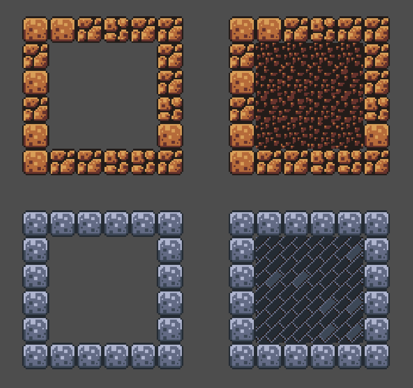
Right side has the background tiles surrounded with their complementary foreground tiles on the left. devlog screenshots -
It pains me that Forgejo’s CI “pipeline running” animation spins anti-clockwise, as if you’re going backwards in time. A metaphor, perhaps? Services get undeployed, binaries go back to the source code, projects return to their seeds of ideas. 🤔💭
Oh, build’s done. Never-mind. 😀
 screenshots
 -
Was looking at how I could add hazards to my Godot project, such as spikes. My first idea was to find a way to detect collisions with tiles in a
TileMapin Godot. But there was no real obvious way to do so, suggesting to me that this was not the way I should be going about this. Many suggested simply using anArea2Dnode to detect when a play touches a hazard.I was hesitant to copy and paste the scene node I had which handled the collision signal and kill the player — the so-called “kill zone” scene —but today I learnt that it’s possible to add multiple
CollisionShape2Dnodes to anArea2Dnode. This meant I needed only a single “kill zone” scene node, and just draw out the kill zones over the spikes as children. The TileMap simply provides the graphics.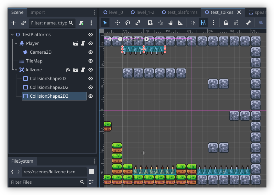
This discovery may seem a little trivial, but I’d prefer to duplicate as few nodes as a can, just so I’ve got less to touch when I want to change something.
-
Tried opening my Godot project this morning and was greeted with the following error:
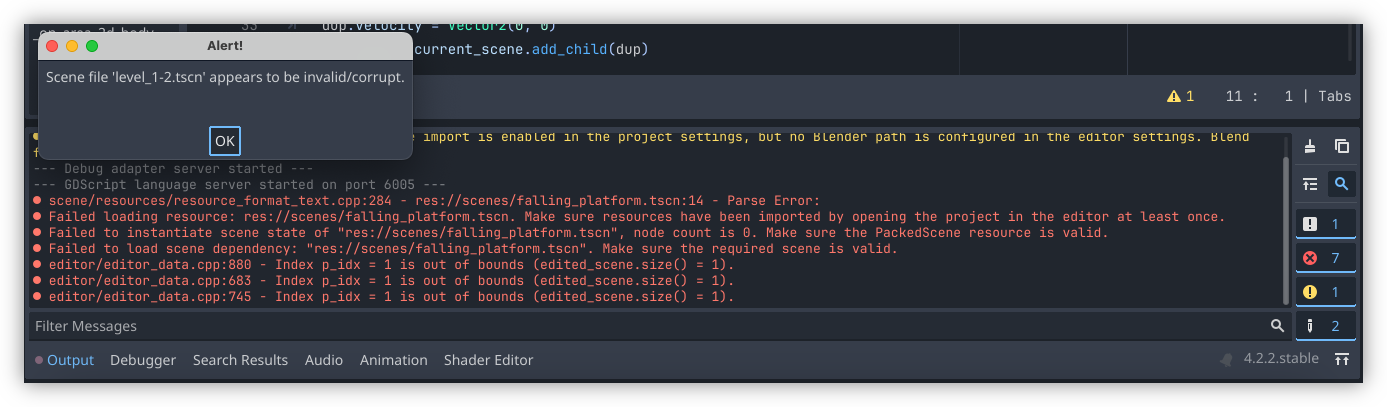
scene/resources/resource_format_text.cpp:284 - res://scenes/falling_platform.tscn:14 - Parse Error:
Failed loading resource: res://scenes/falling_platform.tscn. Make sure resources have been imported by opening the project in the editor at least once.
Failed to instantiate scene state of "res://scenes/falling_platform.tscn", node count is 0. Make sure the PackedScene resource is valid.
Failed to load scene dependency: "res://scenes/falling_platform.tscn". Make sure the required scene is valid.
Traced it back to the technique I was using to respawn the falling platform. Looks like Godot didn’t like the two preloads I included:
# file: scripts/falling_platform.gd

@onready var FallingPlatform = preload("res://scenes/falling_platform.tscn")
@onready var FallingPlatformScript = preload("res://scripts/falling_platform.gd")
This resulted in a parse error and Godot thinking the level scene was corrupted. In retrospect, this kinda makes sense. What I doing was technically a circular dependency, where the scene and script was trying to preload itself. I was hoping Godot was smart enough to recognise this, but I guess not.
So I had to change the respawn code. I modified it to make use the duplicate method. Here’s the revised version:
func respawn():
    var dup = self.duplicate()
    dup.global_position = init_global_position

    # Duplicate also copies the velocity so zero it out here
    dup.velocity = Vector2(0, 0)
    get_tree().current_scene.add_child(dup)
After some limited testing, this seems to work. One good thing about this approach is that it looks like duplicate copies the script, so I no longer need to do anything special here.
So I guess the lesson here is don’t try to preload the script within itself.
devlog screenshots -
Adventures In Godot: Respawning A Falling Platform
My taste of going through a Godot tutorial last week has got me wanting more, so I’ve set about building a game with it. Thanks to my limited art skills, I’m using the same asset pack that was used in the video, although I am planning to add a bit of my own here and there.
But it’s the new mechanics I enjoy working on, such as adding falling platforms. If you’ve played any platformer, you know what these look like: platforms that are suspended in air, until the player lands on them, at which point gravity takes a hold and they start falling, usually into a pit killing the player in the process:
Continue reading → -
Running PeerTube In Coolify
A guide for setting up a basic PeerTube instance on Coolify using a docker-compose file. Continue reading →
-
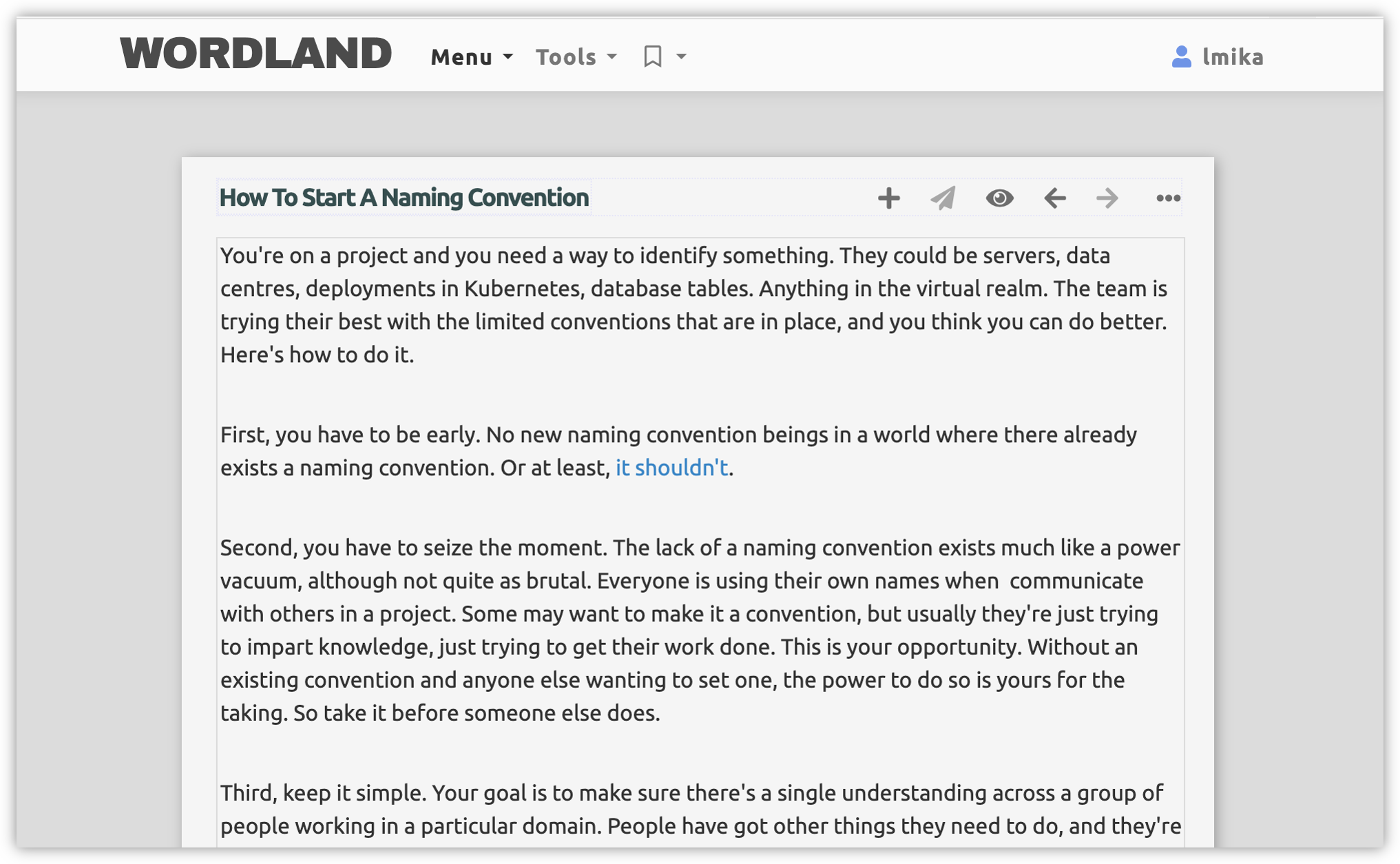
Gave Dave Winer’s Wordland a try today. I like it. It’s quite a nice writing environment to work in. Wrote a couple of long form posts in it, along with a few that were a paragraph or two, and the editor felt great to use. Does a good job growing with the length of the piece too.
 screenshots
 -
Making A Small Two-Letter Country Code Lookup Page
A small evening project where I made a simple site designed for Vivalidi’s sidebar to quickly lookup two-letter country codes defined in ISO-3166-1 alpha 2. Continue reading →
-
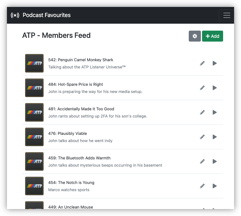
Dusted off Podcast Favourites (last commit 25 April 2022) and fixed a longstanding issue of thumbnails being lost when they’re changed in the feed. Editing the feed properties will now force a refresh of the thumbnail URLs. Didn’t need to change anything else, which was a nice change.
-
🔗 Prefer Numbered Lists to Bullets
Good arguments for using numbered listed instead of bullets in chat communication. I don’t disagree with any of them. I will say that tend to preferred bulleted lists simply because the chat apps I use tend to make using numbered lists more difficult than it should be. Slack, for example, only starts a “real” numbered list when it detects you type
1.. And once you’ve started, there’s no way to skip ordinals within the same numbered list.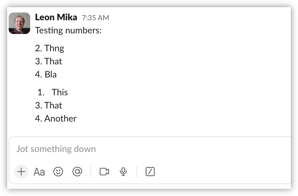
Note that "1. This" the only "real" numbered list, and has a different appearance. Even Obsidian’s implementation is not perfect. Despite making it easy to start a numbered list at an arbitrary ordinal, it’s still not possible to skip ordinals.
It’d be simpler if they didn’t try to automatically make “real” numbered lists at all.
Via: Jim Nielsen
links screenshots -
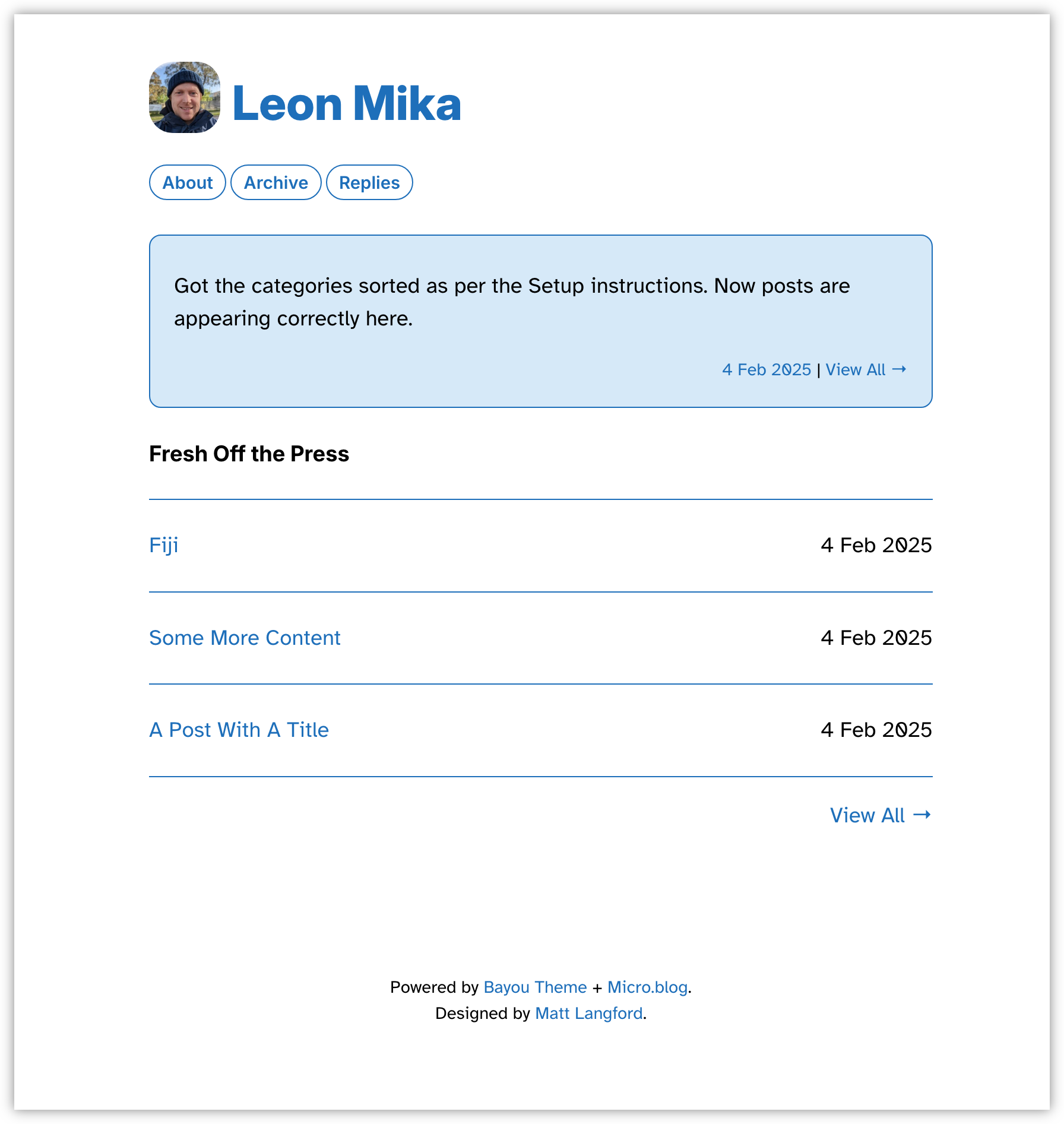
Trying out Bayou theme by @Mtt on a test blog. Lots to like about it, especially the idea of having the latest micro-post appear in the form of a status message. Very unique.
 screenshots
 -
Finding that styling a page with
min-height: 100vhcauses the need to scroll when I open the page in Vivaldi Mobile, asvhdoes not recognise vertical space taken up by toolbars. What I actually want is100dvh(i.e. dynamic view-height) which does. Found this slide helpful (source and via).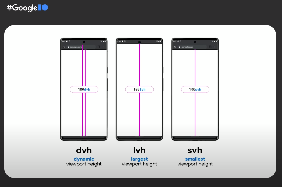 screenshots
 -
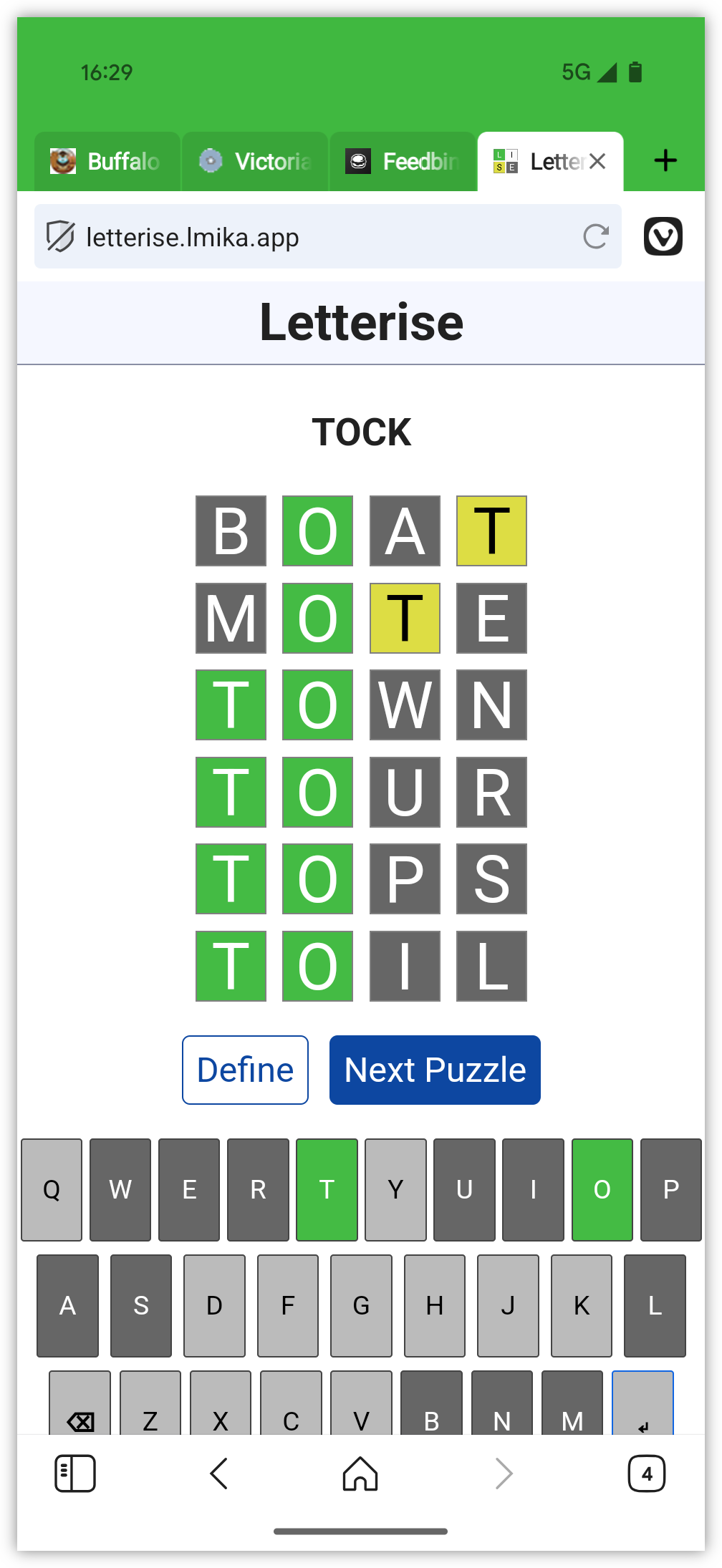
This week’s distraction: building a Wordle clone. No particular reason for doing this other than I felt like building one, although I did miss the small time waster of the original Wordle, and watching a game show with my parents that had a similar concept just made those feelings stronger. Main difference between this and Wordle classic: board randomly selects between 4-letter, 5-letter, and 6-letter words; no daily limit or social-media sharing when you guessed the word correctly; and the biggest one: UK English spelling.
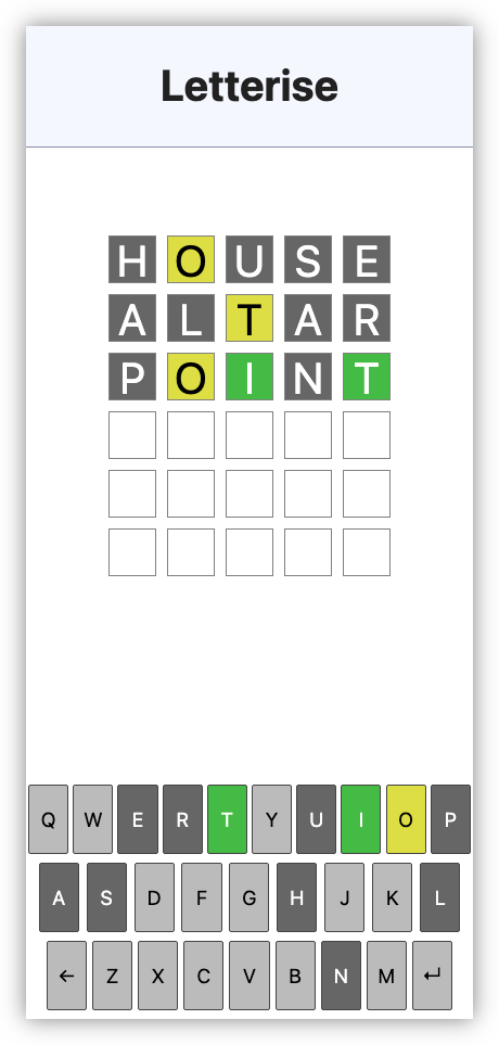
Some remarks on how this was built: I used 11ty to build the static site. It originally started as just a HTML page with some JavaScript, but I wanted to leave the option open for bundling and minifying the JS with Stimulus. The dictionary I got from Hunspell, which is apparently the spell checker Apple has based their work on. There is a little bit of Go to filter and sort the dictionary of words. The words are in sorted order for the binary search algorithm to check if a word exists or not. The puzzle order is predetermined and was done by “shuffling” the indices in a separate array. Base styles are, of course, from simple.css.
If you’re interested in checking it out, you can find it here. Just be aware that it may not be as polished as much of the other stuff you find out there. Turns out that I can tolerate a fair few shortcomings in things that I build for my own amusement.
devlog screenshots -
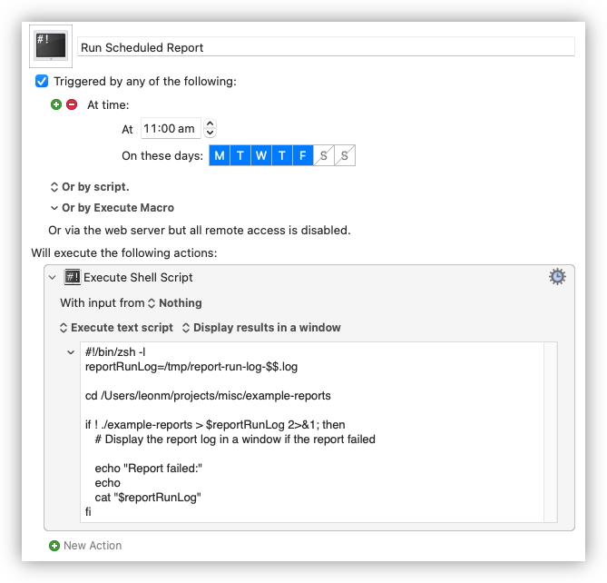
Keyboard Maestro is coming into its own as a way for scheduling recurring tasks. I’ve just set one up for a daily report I need to run. It’s little more than a shell script so I probably could’ve used crontab to do it, but is so much easier configuring and testing it in Keyboard Maestro.
 screenshots
 -
I recently got a new phone, a Pixel 9 Pro, which meant I needed to bring Alto Player up to date. I probably could’ve gotten away using the version I was using on my Pixel 6. But I didn’t have a binary build, and I needed to upgrade Gradle anyway, so I decided to spend a bit of time bringing it up to date to API version 35, the version used in Android 15.0. Fortunately it was only a few hours in total, and once I got it running in the simulator, I side-loaded it onto my phone and started using it.
It worked, but there were some significant UI issues. The title-bar bled into the status bar, the album image in the Now Playing widget was cropped by the curved corners of the phone, and the media notification didn’t display playback controls.
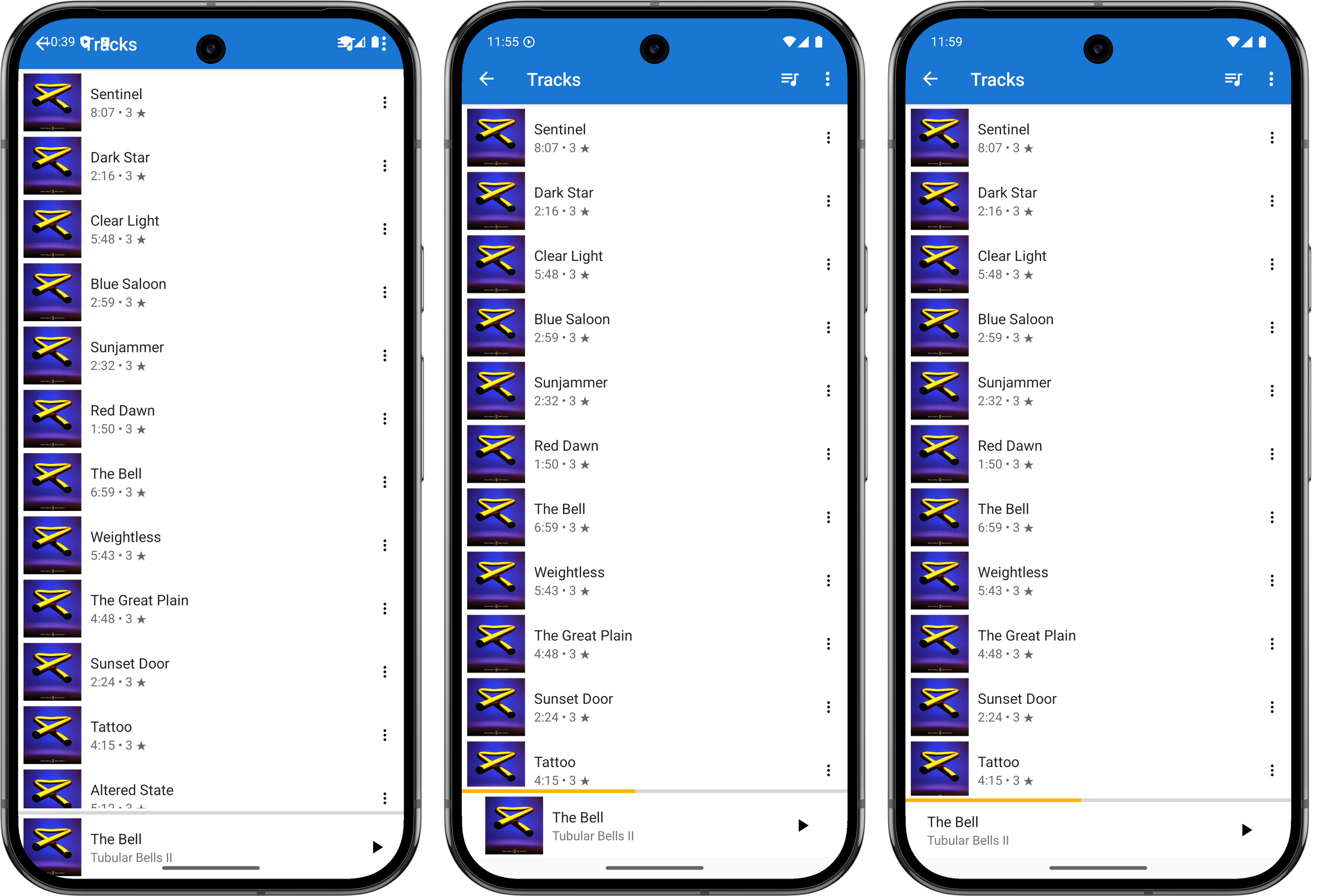
Evolution of the window insets, from left-to-right: before any changes, version with the album cover and margin, final version with no album art. I set about fixing these issues today, starting with the title-bar and Now Playing widget. These was an issue with the views not respecting the window insets, and after a quick Google search, I found this article showing how one could resolve this by adding a ViewCompat.setOnApplyWindowInsetsListener and reacting to it by adjusting the margins of the view.
val topLevelLayout = findViewById(R.id.top_level_layout) as CoordinatorLayout
ViewCompat.setOnApplyWindowInsetsListener(topLevelLayout) { v, windowInsets ->
    val insets = windowInsets.getInsets(WindowInsetsCompat.Type.systemBars())
    v.updateLayoutParams<ViewGroup.MarginLayoutParams> {
        leftMargin = insets.left
        bottomMargin = insets.bottom
        rightMargin = insets.right

        // applying a top margin here would work, but will not have the toolbar
        // background colour "bleed" into the status bar, which is what I want.
    }

    val t = v.findViewById<Toolbar>(R.id.toolbar)
    t.updateLayoutParams<ViewGroup.MarginLayoutParams> {
        // make the toolbar a little "narrower" than full height
        topMargin = insets.top * 3 / 4
    }

    WindowInsetsCompat.CONSUMED
}
It took a few attempts, but I managed to get this working. Just using the top inset for the toolbar margin made it a little larger than I liked, so I adjusted the height to be 75% of the inset. This means the toolbar will actually encroach into the area reserved for cut-outs like the front-facing camera. This is arguably not something a “real” Android apps should do, but this is just for me and my phone so it’s fine.
I went through a few iterations of the album artwork cutoff on the bottom right corner trying to find something I liked. I tried bringing in the horizontal margins a little, but I didn’t like the alignment of the album art in the player, particularly compared to the covers that appear in the track list screen. One thing I didn’t try was raising the bottom margin so that it would fit “above” the curve. But those corners curve in quite a bit, and doing this would sacrifice a lot of vertical space. So I settled on hiding the album art altogether. It’s a bit of a shame to loose it, but at least it looks neater now.
The next thing I looked at was fixing the playback controls in the media notification. After some investigating, I found that this was because I was not setting the available actions in the PlaybackStateCompat builder. This, if I understand correctly, is used to communicate to various systems the current state of the playing media: what the track name is, whether it’s playing, whether one can skip forward or back. I have my own types for tracking this information — which is probably not correct but I wasn’t completely sure as to what I was doing at the time with Android’s media stack1 — and when I needed to convert this to a type understood by the framework, I made instances of this builder without setting the available actions. Earlier versions of Android seemed not to care, and the controls always appeared on the notification. But I guess they changed that.
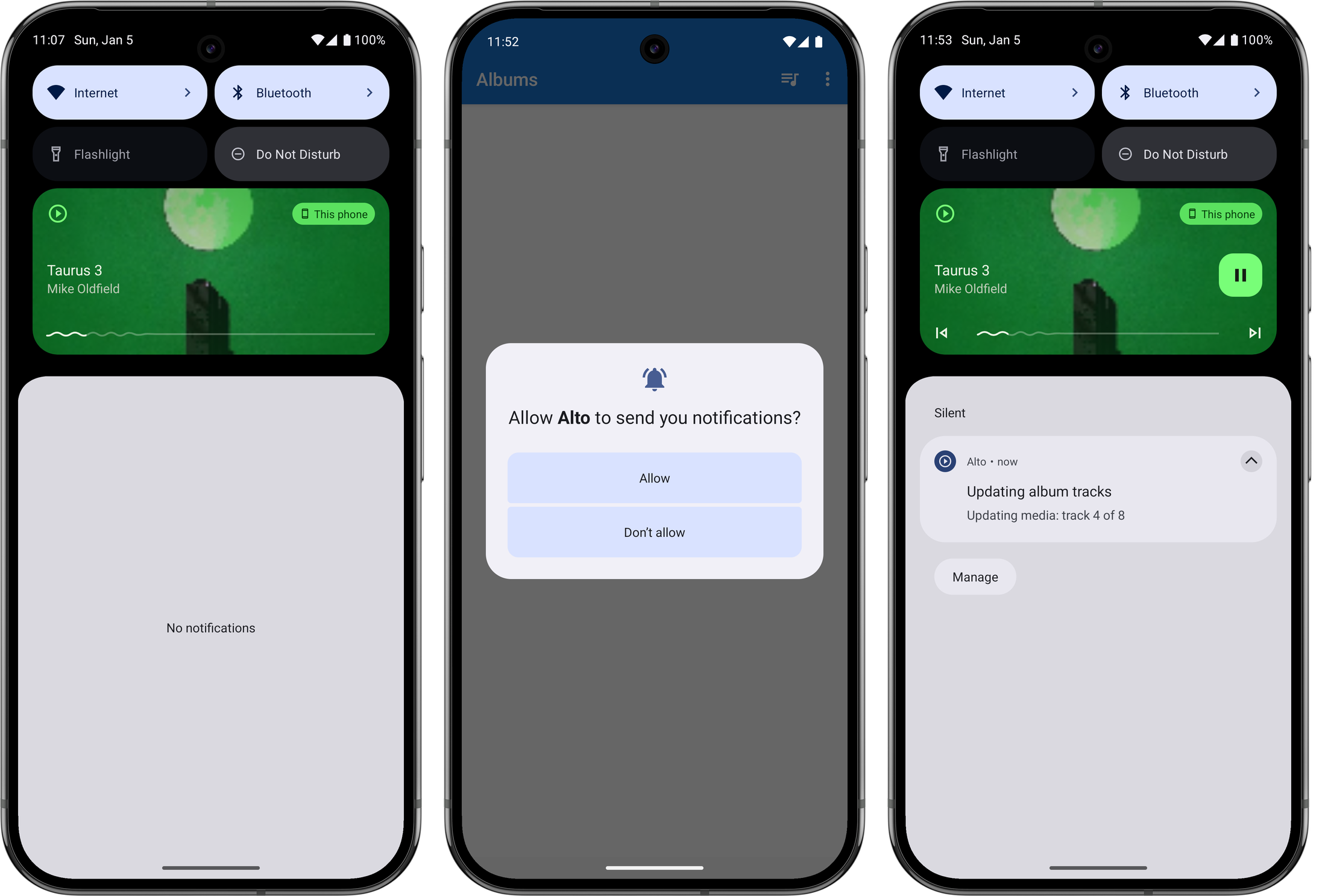
Evolution of the playback notification, from left-to-right: before any changes, the request to show notifications upon first launch (this is defined by the system), the playback notifications with controls again. One other thing I needed to do was to explicitly ask the user permission to show a notification before I could publish one. This is also relatively new: my experience with Android goes back to the early days where these permissions were disclosed up front when the app was installed. But I can completely understand why they changed it, as it was easy to simply tap through those screens with reading them. I am wondering whether media playback notifications are in some way exempt from these permission checks, as I was actually getting one to appear before I made this changes. But I figured it was probably worth doing anyway, so I added this permission request on first launch. Arguably I should be asking for this permission when playback starts, but again, this is just for me.
One final thing I needed to address were long album titles. The text view displaying the the album title had a width that autosized to the title itself, and the start and end constraints were set such that it appears centred in the view. This worked for “normal” length titles but when the length became excessive, the text view would fill the entire width of the screen and the title will appear left justified.
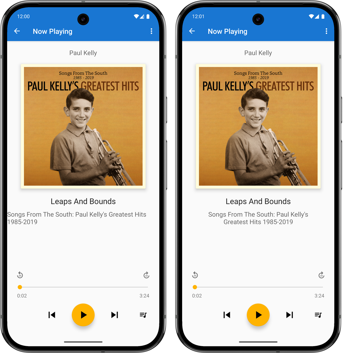
Before (left) and after (right) shot of the fixed album title. The fix for this was to set the text width to be calculated by the start and end constraints (setting
layout_widthto0dp), bringing in the margins a little, and making the label text centre justified. I did this already for the track title, so it was easy to do this here too. Not sure why I didn’t do it earlier, or why I haven’t done it for the artist’s name yet.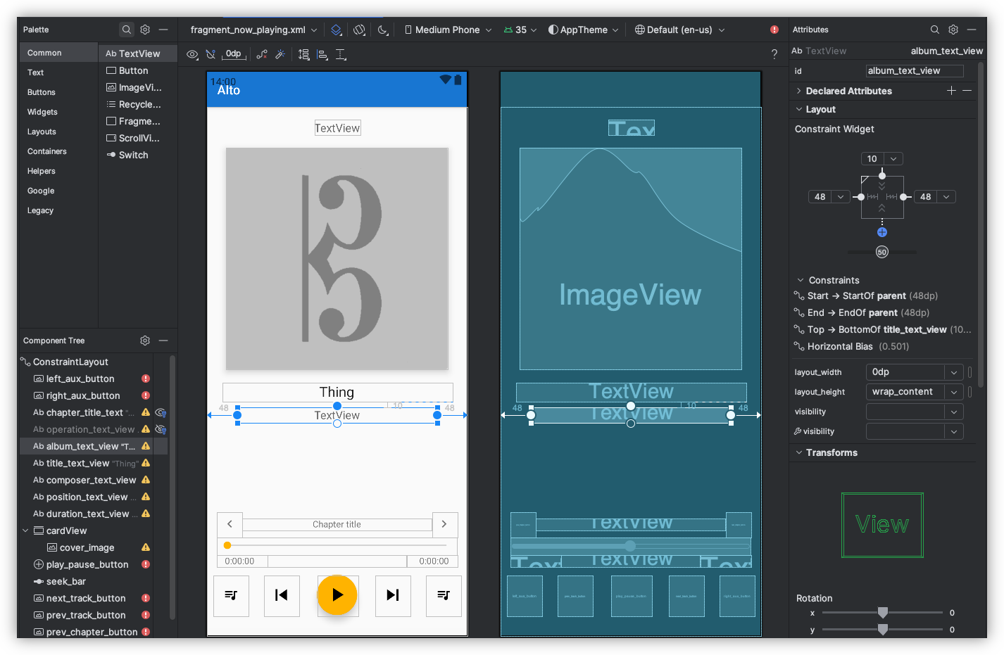
This was all rushed, and I’ll admit I wasn’t 100% sure what I was doing. I was going down the route of trial-and-error to get this working, mixed in with web searches and a trip to ChatGPT. And yeah, the methods I used won’t make this a portable Android app that would work on every phone out there. But I’m reasonably happy with how it turned out.
-
This is still true to this day. ↩︎
devlog screenshots -
-
Thanks for my new found fondness of buying mainstream music instead of streaming it, I needed a way to get these albums into Alto Catalogue. There exists a feature for fetching and importing tracks from a Zip referenced by a URL. This works great for albums bought in Bandcamp, but less so for any tracks I may have on my local machine.
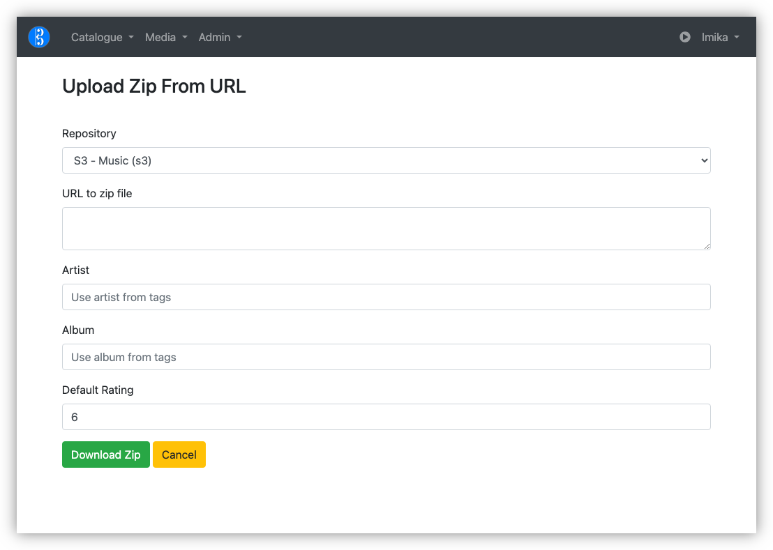
I’ve managed to get Alto Catalogue building again after updating Webpack and a few NPM packages, so in theory, I could add an Upload Zip file action. But there’s more to this than simply accepting and unpacking a Zip file. I have to read the metadata, maybe even preview the tracks that will be imported, just in case I’m importing something I rather not (I did see this once, where zipping a bunch of tracks in the Finder introduced duplicates). This already exists for Zip files that are downloadable online.
I had a though about what my options are, until I remembered that I had a Gokapi instance running in Pikapods. So I tried using that to temporarily host the Zip file with a publicly available URL that could be read by Alto Catalouge.
The only problem is my internet upload speed is sooooo sloooooow. The Gokapi instance is hosted in Europe, and I suspect the instance itself is a little underpowered. So uploading 100 MB Zip files would take a fair bit of time: maybe 15-30 minutes. When I tried doing this via the web frontend, the connection timed out.
Fortunately, Gokapi has an API and one of the methods allows you to upload a file in “chunks,” which Gokapi will assemble back into the original file. Even better is that this chunking can be uploaded in parallel.
So I built a CLI tool which made of this chunking API to upload the Zip files. Once the upload is complete, the tool will display the hot-link URL, which I can copy-and-paste into Alto Catalogue.
The whole process isn’t fast (again, slow upload speeds). But it works, and I can use this tool to queue a bunch of uploads and let it do its thing while I’m doing something else. I really like tools that do this, where you’re not forced to babysitting them through the process.
There are a few limitations with it. It doesn’t allow for an awful lot of customisations on the lifecycle of the uploaded file. And the tool stalled out once when my computer went to sleep, and I had to start the upload from scratch. I could probably add something to track the chunks that were successful, allowing one to continue a stalled upload. If this happens frequently, I may look more into adding this.
But even so, this could be a useful addition to my use of Gokapi for transferring temporary files. If you think this might be useful to you, you can find the tool here.
-
Home Screen Of 2024
It’s just turned 3:00 in the afternoon, and I was alternating between the couch and the computer desk, racking my brain on what to do. With no ongoing projects — a few ideas have been bouncing around, yet none has grabbed me so far, and I had nothing else in a state where I could just slip on some music or a podcast and work on — and seeing a few others make similar posts on their blogs, I’d figured I talk about my home screens.
Continue reading → -
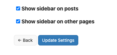
Released version 1.2.0 of Sidebar for Tiny Theme. In this version, the sidebar can now be configured to appear on pages other than just the home page. Options include showing it on the pages of posts, or pages other than posts. With both on, the sidebar will now appear on all pages of the site.
 screenshots
 -
Thought I’d have another go at looking at BoxedWine for making an online archive of my old Delphi projects. They’ve been some significant improvements since the last time I looked at it. They don’t run fast, but that’s fine. As long as they run.
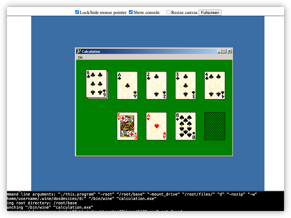
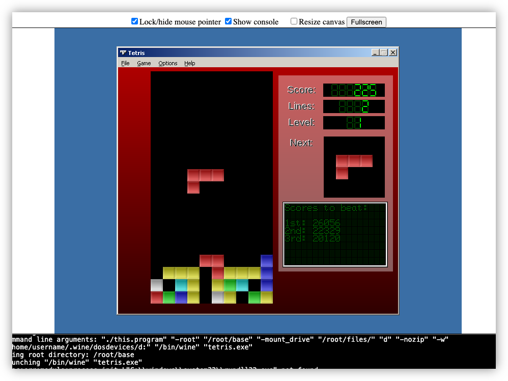 screenshots old-projects
 -
That Which Didn't Make The Cut
I did a bit of a clean-up of my projects folder yesterday, clearing out all the ideas that never made it off the ground. I’d figured it’d be good to write a few words about each one before erasing them from my hard drive for good.
I suppose the healthiest thing to do would be to just let them go. But what can I say? Should a time come in the future where I wish to revisit them, it’d be better to have something written down than not. It wouldn’t be the first time I wished this was so.
Continue reading → -
I’m not a fan of the changes Google made to their Weather app. It assumes you’re interested in saving every location you search for as a favourite, which is not how I use search. And horizontal scrolling for the 10 day forecast? With no date?
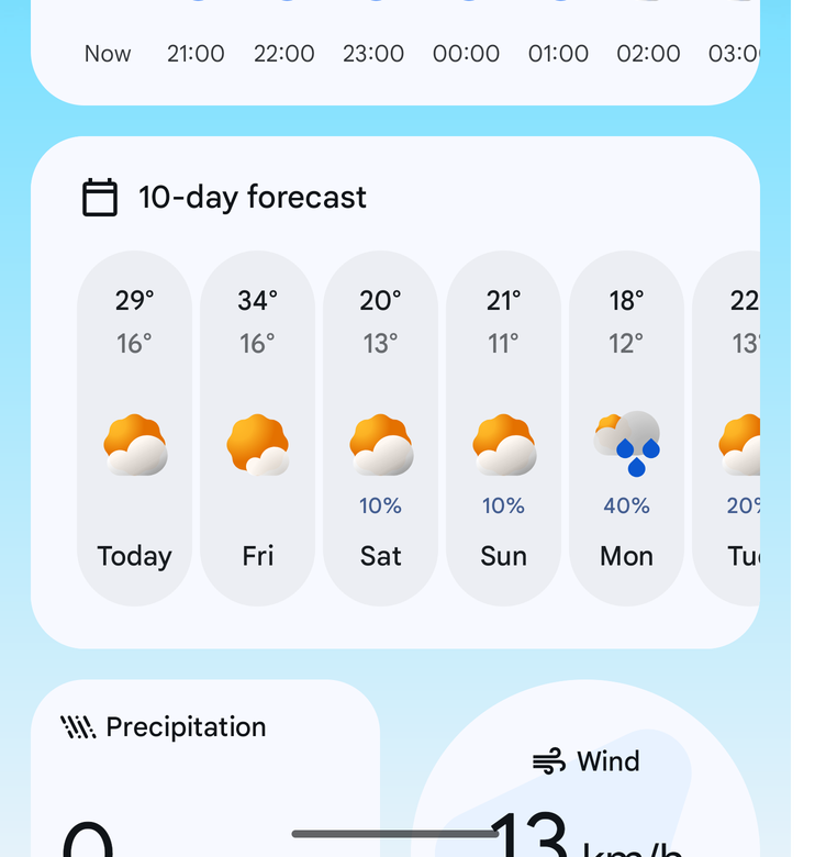
No, sorry. This is a step backwards in design.
screenshots -
Exploring Godot to see if I could use it to make a card game. I got this far:
Yep, I’m on a roll. 😄
Might need to work through a couple Godot tutorials first, just so that I understand the basics.
devlog screenshots -
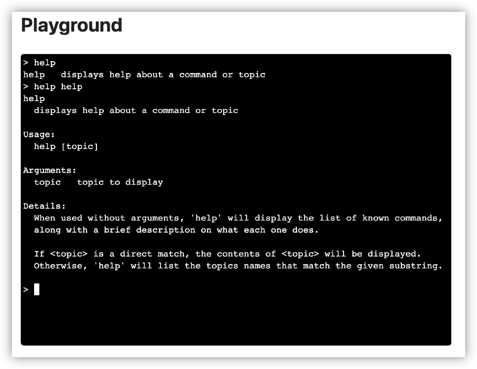
I plan to integrate UCL into another tool at work, so I spent last night improving it’s use as a REPL. Added support for onboard help and setting up custom type printing, which is useful for displaying tables of data. I started working on the tool today and it’s already feeling great.
-
If there’s one thing I’d like to see added to Go for 2025, it’s type parameter support on methods. It’s still not possible to do something like this:
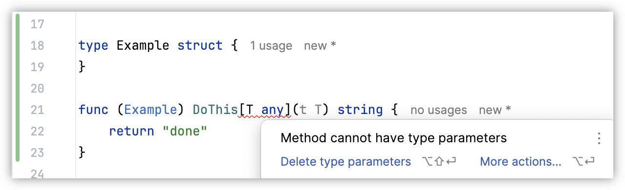
Which is a real shame, as I’ve got some ideas on how I could use these. Building something like Java streams, for example.
screenshots -
Some more work on that feed reader app. You know how I said that I wanted to hold off looking at appearances? Well, I abandoned that approach when I installed the app on my phone and tried viewing a few articles. And oof! There’s work to be done there.
First, it’s slow. Very slow. It’s taking a good second or two to pull feeds and entries from Feedbin. I was expecting this, and I’ve got a few plans on how to speed this up. But the biggest concern is the janky list scrolling. I mean, I wasn’t expecting the buttery smoothness of iPhone list scrolling, but I expected Flutter to be better than what I was experiencing. I’m hoping that it’s just because I was running a debug build, but part of me fears that Flutter is just not optimised for smooth list scrolling, favouring ease of development and a common runtime. I rather not change frameworks now, especially after spending an evening dealing with all the build issues, but I don’t want to live with this for ever.
But speed is not the biggest issue. The biggest offender was the feed reader view. The embedded web-view was only lightly styled, and it felt like it. The margins were all off, and I didn’t like the default font or colours. It made reading the article a bad experience to a surprising degree. I’ve dealt with rushed or poorly designed UIs in the past, but I didn’t have much tolerance for this. Not sure why this is, but I suspect it’s because I’ve been using feed readers that put some effort into the design of their reader screen.
In any case, a couple of evenings ago, I decided to put some effort into the styling. I replace the body text font with Noto Sans and the fixed-font with Ubuntu Mono. I dropped the font-size a little to 1.05 em (it was previously 1.1 em, with felt a little big, and 1.0 em felt a little small). I bought the margins in a little. And I styled the block-quote, figure, and pre elements to an appearance that, despite being a little overused, felt quite modern.
The results look much better, at least to my eye (and my emulator). Here are some side-to-side comparison shots of the changes (left side is the unstyled version, while the right side has the new styling changes):
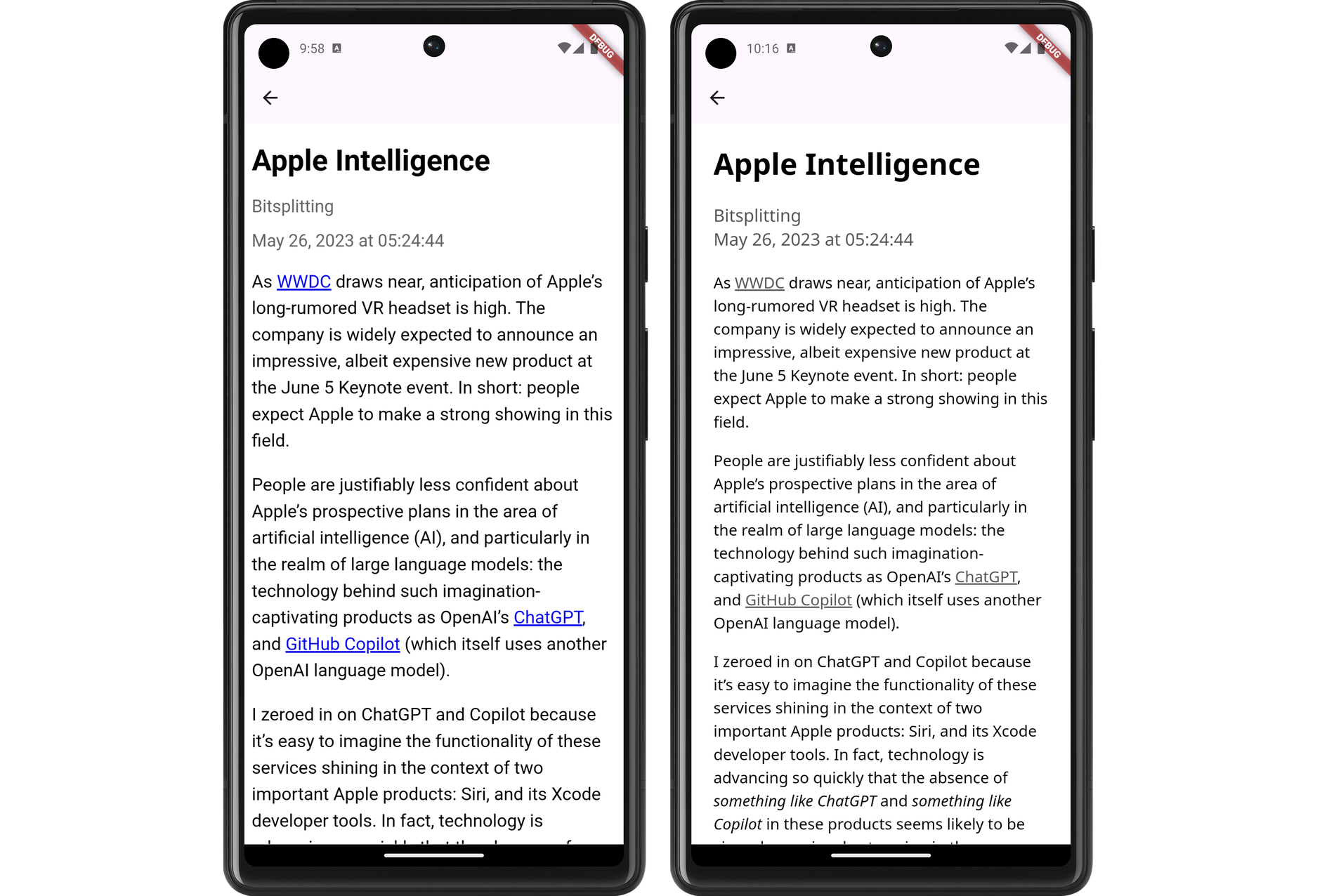
Demonstration of the new font and link colouring choices. 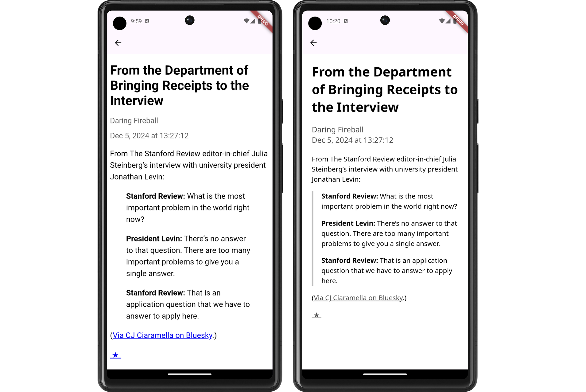
Demonstration of the changes to block-quotes. Having a line down the left-sided is a pretty common style, but it's one I like. 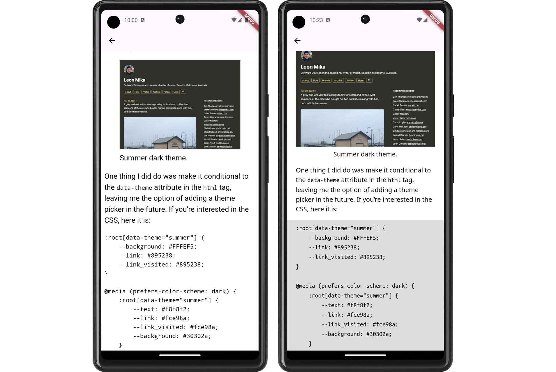
Demonstration of code blocks and figures with captions. I still need to actually install this on my phone and try it out. I’m wondering whether I should do so after a bit more work syncing the read status with Feedbin. That’s a feature that’s keeping me on Feedbin’s PWA for now.
devlog screenshots -
Spent the last few evenings continuing work on a Flutter-based RSS feed reader. This project is now further along then my previous attempts at doing this. I’m at the point where feeds and feeds items are being fetch from Feedbin and displayed in a list view:
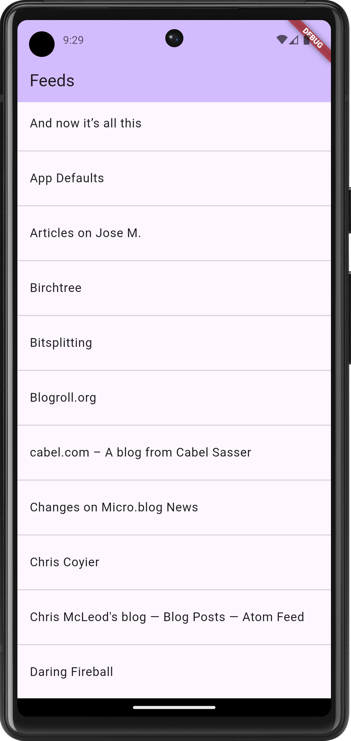
The beginning of the feed list 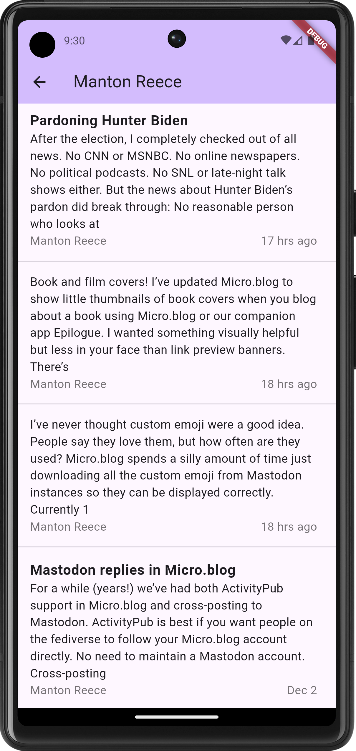
The feed item list. Title-less posts are to be fully supported, with a bulk of the summary shown in the list. Titled posts should have a smaller summary. The aesthetics are taking a bit of a back seat in favour of functionality for now; I haven’t even changed the default accent colour. But the infrastructure is there: tapping a feed will bring up the entries for that feed. This is using named routes for navigation, and cubits for state management. It’s a bit more work upfront, but it does make for a neater codebase.
The biggest challenge so far was getting the actual reader view working. I hoping to use the webview plugin, but when I tried adding it, I ran into a bunch of Gradle errors. These were either class version errors or dependency errors, depending on what I tried to fix it (I didn’t get screenshots, sorry). I eventually stumbled upon this Flutter Gradle plugin migration guide, and following this, along with upgrading Java to OpenJDK 25, got Gradle working again.
But I was still getting build errors. The first couple were Gradle plugins
com.android.applicationandorg.jetbrains.kotlin.androidthat needed to be updated. Easy stuff. And then I got this error message:Execution failed for task ':webview_flutter_android:compileDebugJavaWithJavac'. > Could not resolve all files for configuration ':webview_flutter_android:androidJdkImage'. > Failed to transform core-for-system-modules.jar to match attributes {artifactType=_internal_android_jdk_image, org.gradle.libraryelements=jar, org.gradle.usage=java-runtime}. > Execution failed for JdkImageTransform: /Users/leonmika/Library/Android/sdk/platforms/android-34/core-for-system-modules.jar. > Error while executing process /Users/leonmika/Applications/Android Studio.app/Contents/jbr/Contents/Home/bin/jlink with arguments {--module-path /Users/leonmika/.gradle/caches/8.10.2/transforms/575ccd1a7426c0be21d9fe3a81898be3-05a021da-a1a7-409f-a30a-bba769b57371/transformed/output/temp/jmod --add-modules java.base --output /Users/leonmika/.gradle/caches/8.10.2/transforms/575ccd1a7426c0be21d9fe3a81898be3-05a021da-a1a7-409f-a30a-bba769b57371/transformed/output/jdkImage --disable-plugin system-modules}Running a web search on the error revealed this Stack Overflow answer, which resolve it. There were still a few complaints about the the NDK version but after all that, the app finally launched with the web-viewer.
The web-viewer, with a "hello world"-ish test HTML document I still need to actually render the entry, plus style the HTML a bit. The immediate goal after this, once the reader view, is getting this on my phone to start playing with it. It’s just barebones for now, but I find that the sooner I can start using a project myself, the more likely I am to keep at it.
devlog screenshots -
Oh, it turns out it’s an older style of referencing targets and is no longer supposed to be used. That’s a shame.
 screenshots
 -
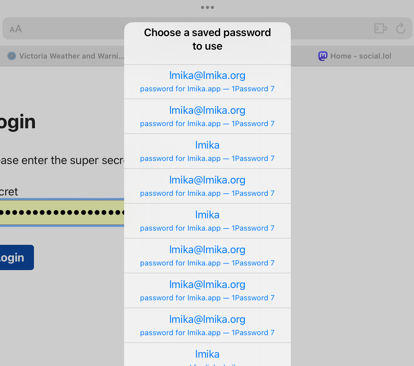
Now that my 1Password subdomain woes with Android Vivaldi has been tamed, it’s time to turn my attention to Safari:
 screenshots
 -
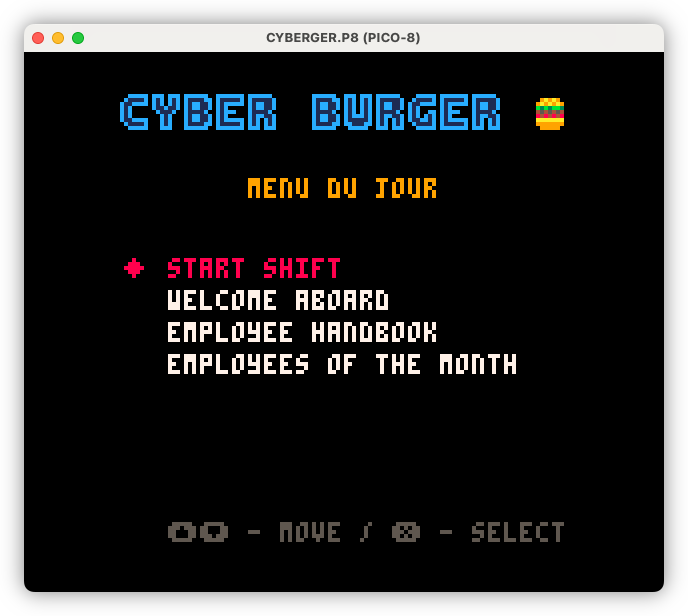
Building out the meta elements of Cyber Burger, including the “menu du jour” a.k.a. the main menu. I’ve used food-service terms for the menu items to maintain the theme, but there is a button to switch them over to more conventional names should it be too unclear.
 devlog screenshots
 -
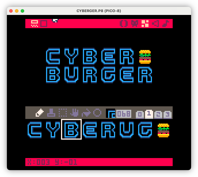
Title design this morning. Trying to get as close as I can to the Cyberspace Raceway font as my pixel art skills will allow for.
 devlog screenshots
 -
I don’t use Wordpress so this war between Matt Mullenweg and WP Engine is little more than #internet-drama to fuel my amusement. But Matt’s recent actions in this battle have started dragging users into the crossfire, and this is something I absolutely do not like. First by the blocking access to the plugin directory for those using WP Engine, and now by adding childish, your-with-me-or-agents-me UI elements on the wordpress.org login page:
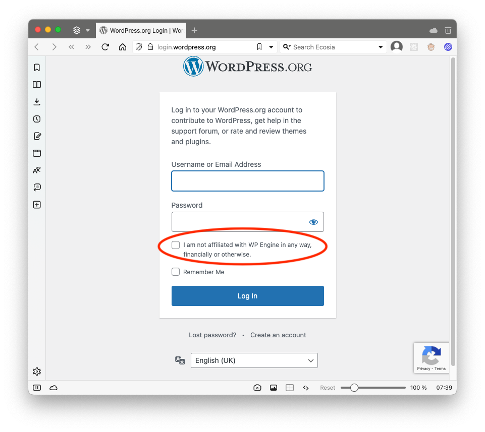
I had to see it for myself to believe it. Granted, this looks to be a login form for plugins and forums, not actual blogs. But even so, Matt, is this necessary? You may have had a reason for going after WP Engine for some reason. I have no idea what those reasons are, and quite frankly, I no longer care. You start making changes to things in service of your war, I loose all respect for you.
I may not use Wordpress, but I do use software that’s now owned by Automattic, like Pocketcasts, and seeing this makes me uneasy. What’s to say that these won’t be used in a similar way in the future?
Edit: Part of me wonders now whether this checkbox was added in jest. No evidence to support that apart from seeing various posts on Mastodon (I don’t have evidence to support that it wasn’t added in jest). If so, then I am a fool for taking the bait and getting worked up about this. It is an indication of how vicious this fight looks to me though, where adding such a checkbox would seem like a genuine escalation.
screenshots -
I’ve spent the last week working on a small puzzle game called Coasters, where you presented with two images and a clue, and you need to guess the word or phrase. One puzzle a day, sort of like Wordle. I’ve got 10 puzzles ready to go and I may add more but no promises. Check it out if you like.
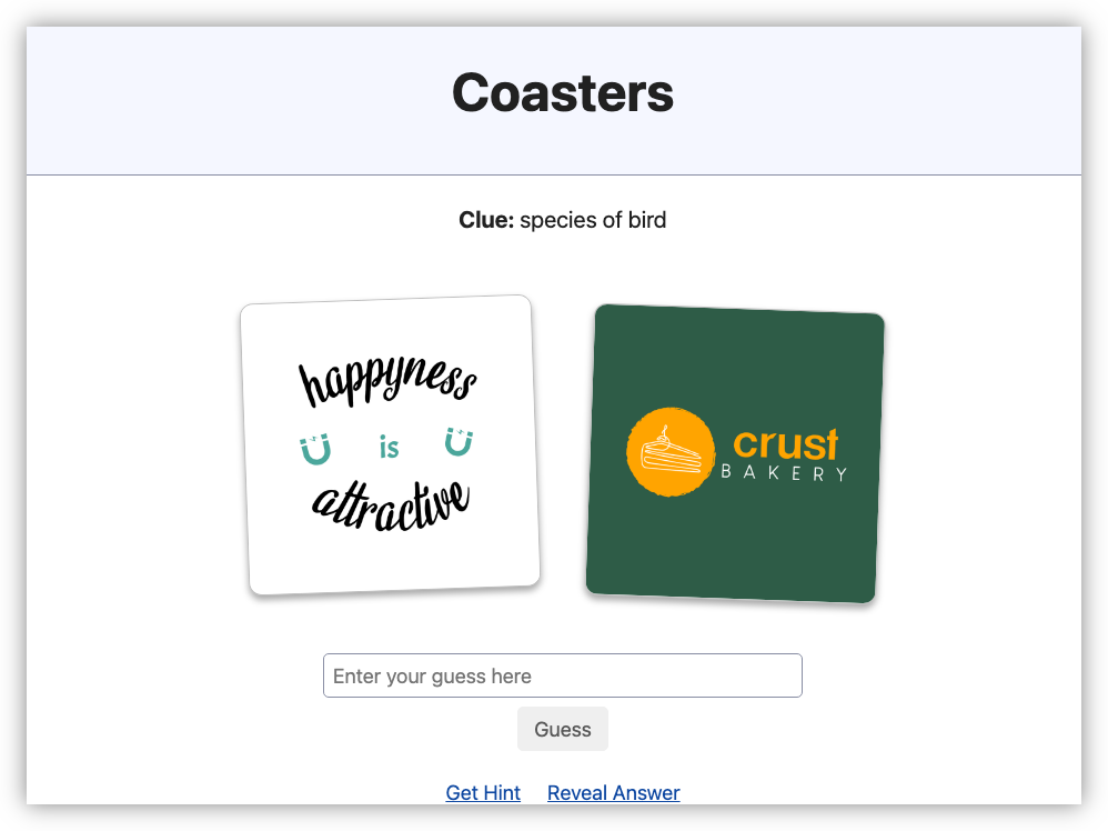 devlog screenshots
 -
I enjoyed reading Kev Quirk’s post about building a simple journal. I’m still using Day One, but I am still thinking of moving off it. So I was inspired to build a prototype similar to Kev’s, just to see if something similar works for me. Built using Go instead of PHP, but it also uses Simple CSS.
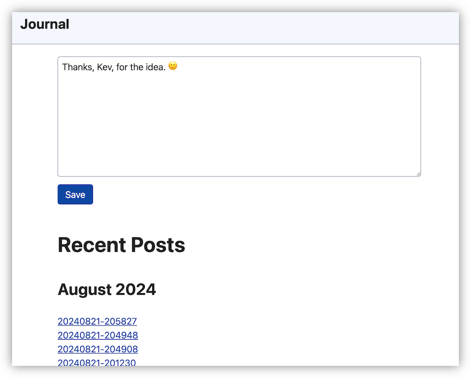 devlog screenshots
 -
Reddit’s decision to allow only Google to index their site will probably mean I’ll be seeing them far less often than I do — which is almost never anyway, and generally from the results of a search. So I’m recording this screenshot, which I call “Reddit in the results”, for posterity.
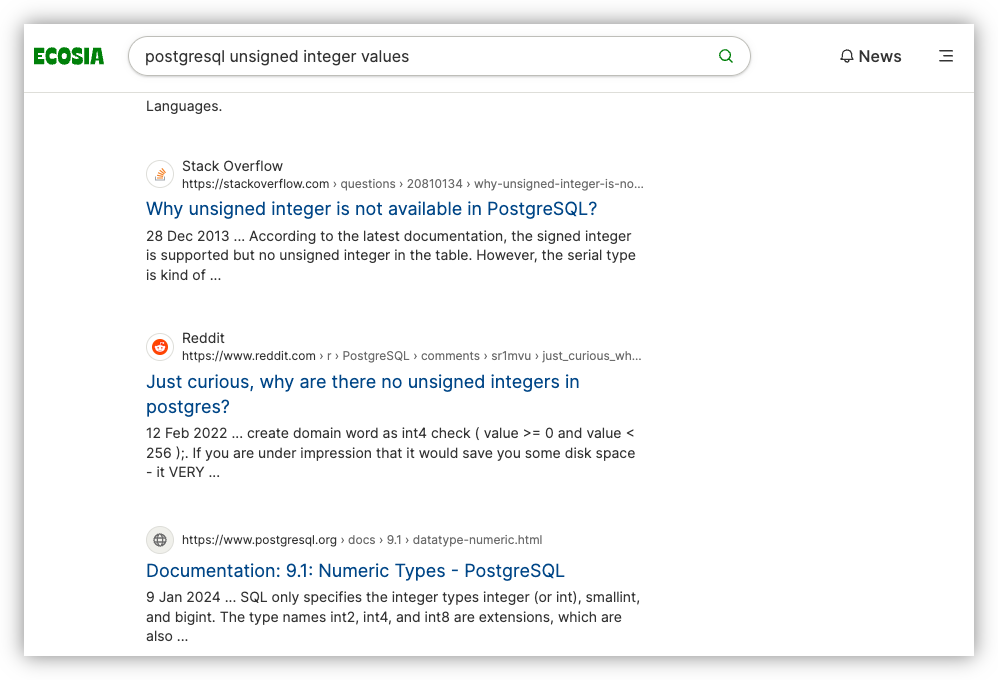
Edit: Turns out Ecosia sources some of their index from Google, so these Reddit links will likely remain in my searches. I guess that makes this post unnecessary. I’m going to keep it up though, for posterity of my unnecessary effort to post for posterity. 😄
screenshots -
Mark the date. First successful CI/CD run of a Go project running on my own Forgejo instance, running in Hetzner. 🙌
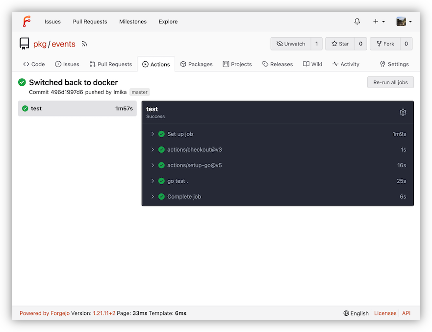 screenshots
 -
Speaking of bad UIs, volià: my first attempt at building something with Gio:
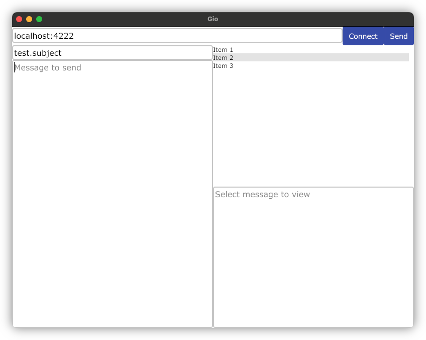
It doesn’t do anything now, but I’m hoping this will be something I can use to test NATS. I will say Gio shows promise. Not a huge range of controls to use, but having everything run in a single memory address is nice.
other-artefacts screenshots -
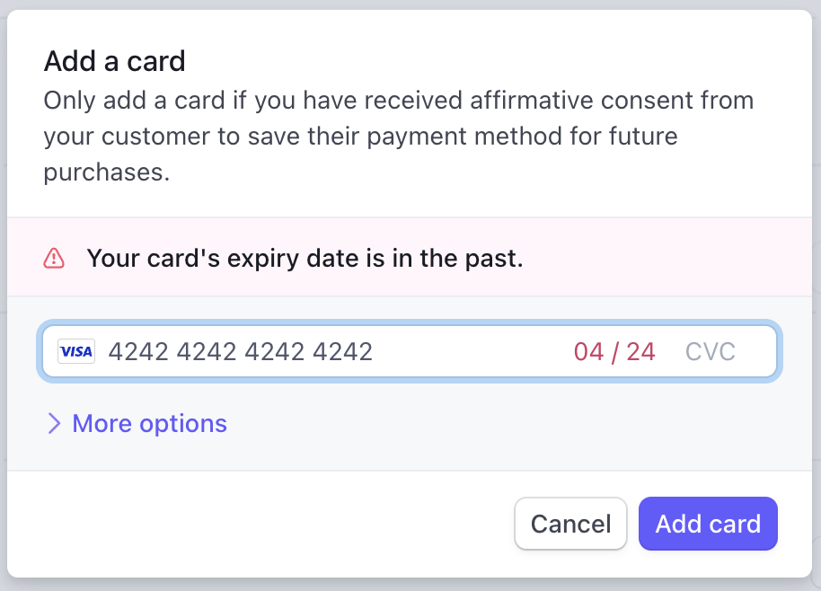
For the last few years, I’ve been using 4/24 as the expiry date of test credit cards within Stripe. Well those days are literally in the past now.
 screenshots stripe