
-
📘 Devlog
CSVTool - A Vibe-coded CSV Editor
One of the fun aspects of these new code agents is seeing what they’re capable of producing just form the prompt, so called “vibe-coding.” There are some that are definitely all in on the concept: I’m thinking of Steve Yeggie and his Gas Town work. As for myself, I still prefer to be a bit more hands on. But it’s still amusing to see what these agents are capable of just from the prompt.
Continue reading → -
🖼️ Gallery
Newport Workshops Open Day
-
PostgreSQL Docker and "No space left on device"
Dealing with PostgreSQL Docker complaining about “No space left on device” Continue reading →
-
📘 Devlog
3rd March 2026
Oof! Everyone’s building blogging CMS’s now, apparently.
Since starting work on this project, I saw one other announce their own CMS that was vibe-coded with Claude. No shame in that: making something that works for you is part of the joy of participating in the Indie-web. I did take a brief look at it, and dismissed it because it was written in PHP. Yes, I am a snooty developer that looks down on those using PHP (it’s just so annoying to deploy; although credit to this person, they did prepare a Docker container).
Continue reading → -
📘 Devlog
Hello
This is the inaugural post of Devlog, where I'm planning to write on what I'm working on. This post was created using Weiro, a new blogging CMS I've been working on. This post is little more than a test to see if the deployed version of Weiro is working. I'll post more about Weiro in later posts. For now, I just want to make sure this is being published correctly.
Continue reading → -
The Colour of Production
On the colour-coding system used for different development environments. Continue reading →
-
🦆 Dialogue
LLM Auto-complete Is…
Duck: You writing code?
Author: Documentation.
Duck: And you're using an…
Author: IDE? Yes, I am.
Duck: Do you have that…
Author: LLM-powered auto complete? I do, yes. And it's fine, although it does seem like the IDE's…
Duck: Always trying to finish your sentences?
Author: Yes. It can be quite…
Continue reading →What to Talk About When You're Talking About Your Side-Business
80% Done 80% Well
Yeah, this one’s about that “Something Big is Happening” blog post. Continue reading →
On Post Timestamps
Some thoughts of using dual timestamps for blog posts to differentiate between the publication date and the date of the event, considering the implications for chronological feeds and user experience. Continue reading →
📘 DevlogMicro apps - Some Score Cards
In the spirit of maintaining a document of what I’ve been working on, and being somewhat inspired by Matt Birchler’s posts about his micro apps, I’d thought I’d document on some of the small apps I’ve worked on recently.
The fact of the matter is that I’ve been building quite a few of these apps over the course of the summer, primarily in response to a specific need I have at the time. I haven’t written about them before, mainly because there didn’t feel like there was much to say. Some were vibe coded, and saying that I “made” them didn’t feel correct. Others were made by hand, but they were super simple and there was no real challenge in making them at all. In either case, being able to say “I made it” is difficult as the amount of effort spent in making it is quite low, and that doesn’t make for interesting blog posts. Would a post saying that “I went to work today” be worth reading if that’s what I do every weekday?
Continue reading →HV #old Submission
My submission for Hemispheric View’s request for fun and interesting computer peripherals. Continue reading →
📘 DevlogGame For Niece — More Art and Cropping Ebitengine Images
Drew some more artwork and started integrating it into the game. Replaced the previous bus image I got from an image search with one I created myself using Affinity Designer:
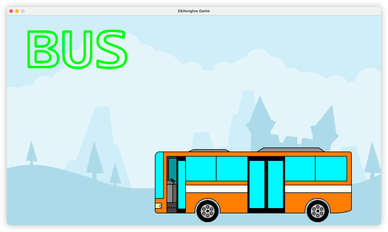
It’s orange, just like the busses round here, although this one has a plainer livery.
I’ve not integrated the car just yet: I’m hoping to finish off the animations for the bus first. But I’m so glad I embraced Affinity Designer for this. I’m surprise I haven’t considered it sooner. The whole image is designed as a whole, then I export each component — body, door, wheels — as a separate PNG and recompose it in the code, giving me the means of animating each component. I’d imagine this is a pretty typical workflow: and I’m surprise I haven’t considered this sooner too.
Continue reading →On Apple's Icons for Their Creator Studio Bundle
Apple’s new app icons fail to clearly convey their functions, leaving users confused about their purposes. Continue reading →
Some More Thoughts on Apple's Ability to Make Vision Pro Content
Apple may struggle to produce the innovative Vision Pro content desired due to its reliance on established production practices and the pressure to justify substantial investments in video production. Continue reading →
I Heart M Down
Too Much HTML
Components, reusability, and cues from existing code in an unfamiliar project. Continue reading →
About The Journey
A preference for the engineering process over the finished product leads to limited use of coding agents for project development. Continue reading →
2025 Retro
No, not the good retro: the “agile” one. I felt that I didn’t have enough material for a comprehensive “year wrapped” post, but I did want to be a little reflective on what was . So it seemed fitting to use an approach favoured by software teams, where the points are brief, and the action items are never followed up.
Keep Doing
- Public goal keeping: Documenting my goals, and when I achieve them, on this blog was a massive success. It wasn’t easy, but I did manage to get out more, and I have a new standing event that I didn’t at the start of the year. An I attribute that to being public about what I want to achieve. It turns out that being public about your goals tends to keeps them in mind more often. You’re more likely to follow up on them as a result. So definitely more of this in 2026.
- Getting out more: I would like to continue this in 2026, or at least keep it up. Going to boardgames every second Wednesday is a good start, but I think more of this would be good for me.
Do More
- More reading: Seriously, way more reading this year. I didn’t finish anything new last year, and the only books I did pick-up were ones I read already. I may need to be a little stricter about when I ought to have finished something.
- More building in public: In sort, making more of my work available to others. I tend to be afraid of being on the hook for supporting such work, but the support load of the projects that I did release last year (a couple of Micro.blog plugins) wasn’t so bad, and I think I’d like it more if I know others are enjoying my work. Doesn’t have to be everything, but just something to keep in mind.
- Travel: This is probably more of a wish rather than a goal, but it would be nice to get out into the world. I barely did any of that last year.
Do Less
- Unhealthy vices: More healthy eating, less YouTube, basically. This is probably more of a wish rather than an actual goal, but it is something that’s been on my mind, and I do need to improve here. I probably should track some metrics here.
- Going with the flow in my career: The career rut continues and I am wondering whether I should move on. But I’m really not sure what I’d like to do. I still enjoy working with the technology (or, more generally, on the product development side) so the idea of going into a more managerial position doesn’t appeal to me. But moving up the corporate ladder is difficult for one that doesn’t want to take on such a role. So would a sideways shift work? Contracting? A new job? All these questions I really need to get a handle on, and not let these career moves just “happen.” That won’t lead to a career I want to lead.
Achievements
- 1,073 blog posts.
- 1 blog post that somewhat went viral, and is still getting hits from Hacker News.
- 3 project releases:
- Two Micro.blog plugins, plus a silly quiz about ISO standards.
- 18 domain names, that’s 5 less than this time last year.
- 40th rotation around the sun.
There are a few other things I’d like to do this year that I’ll keep private, but I think this is a good start.
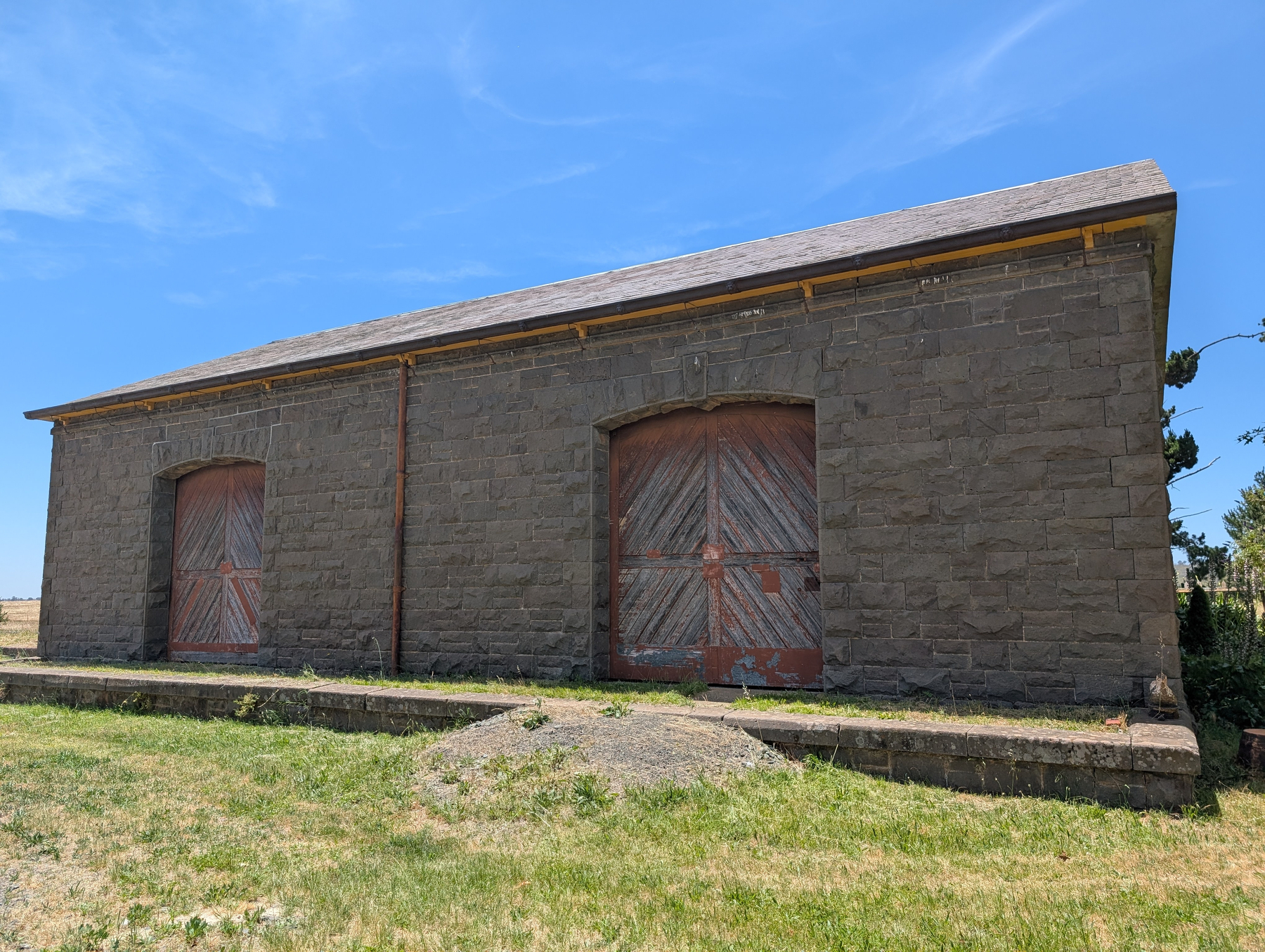
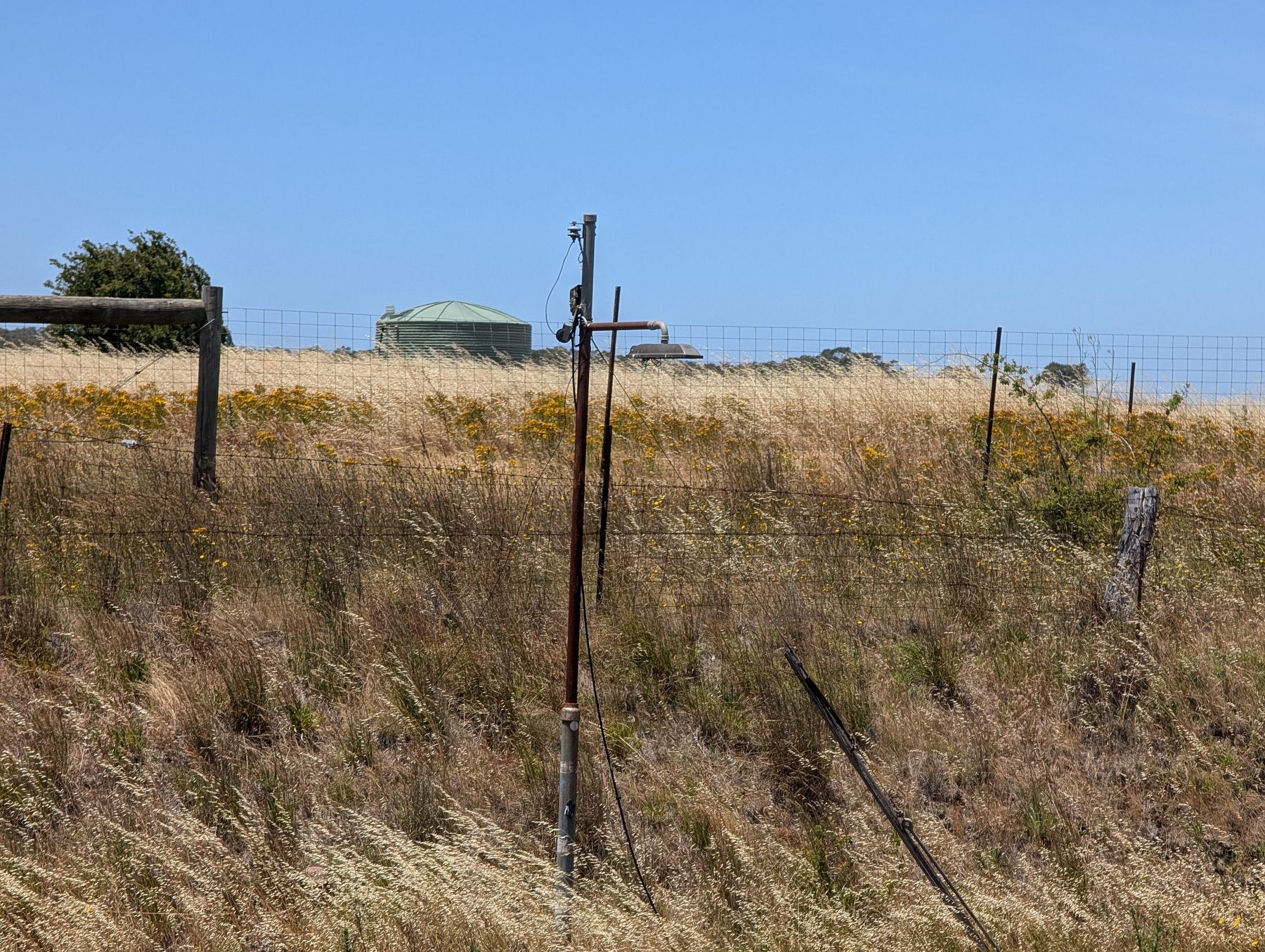
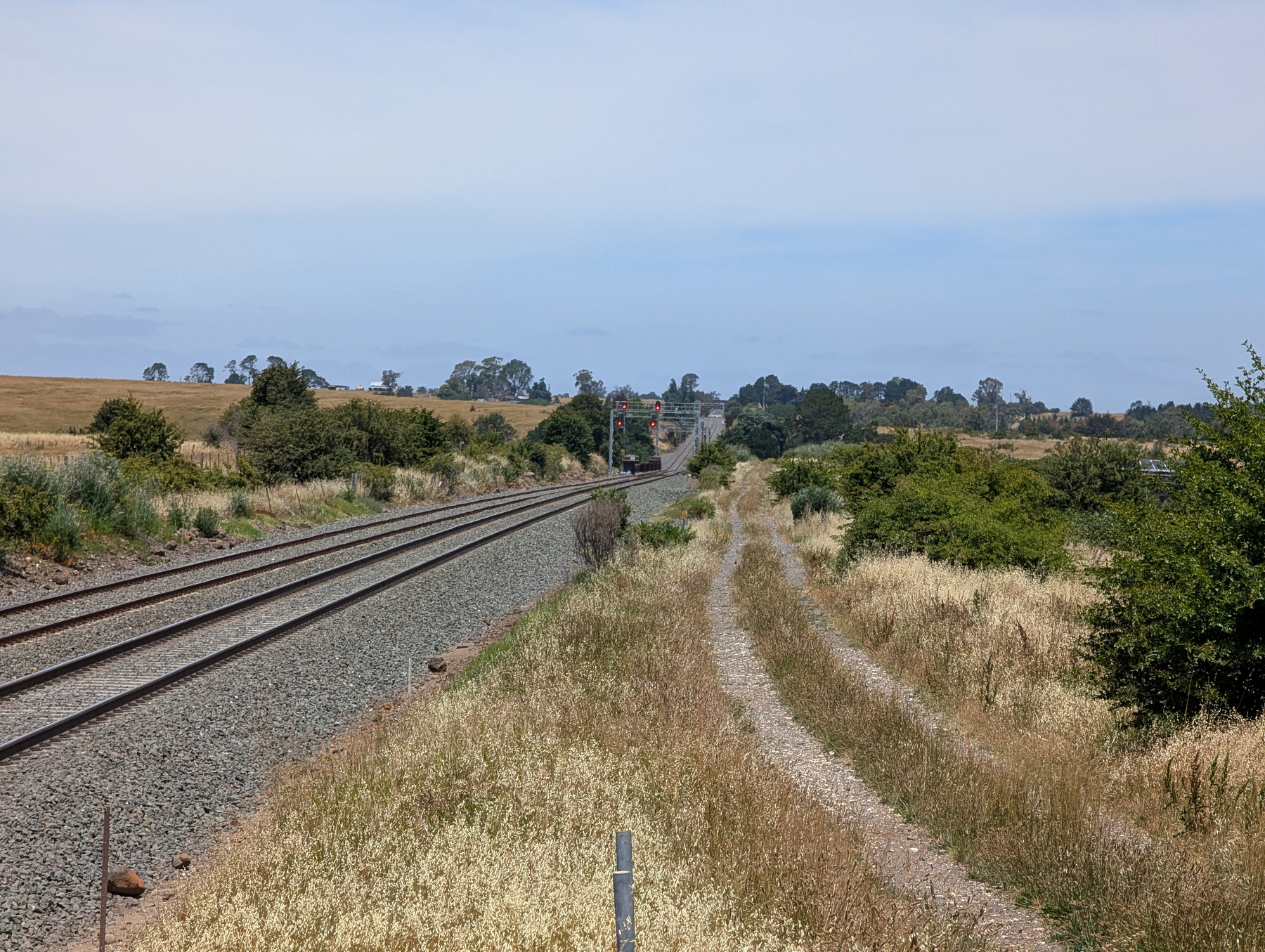
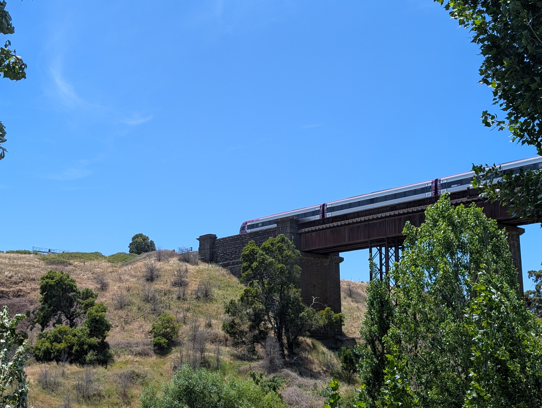
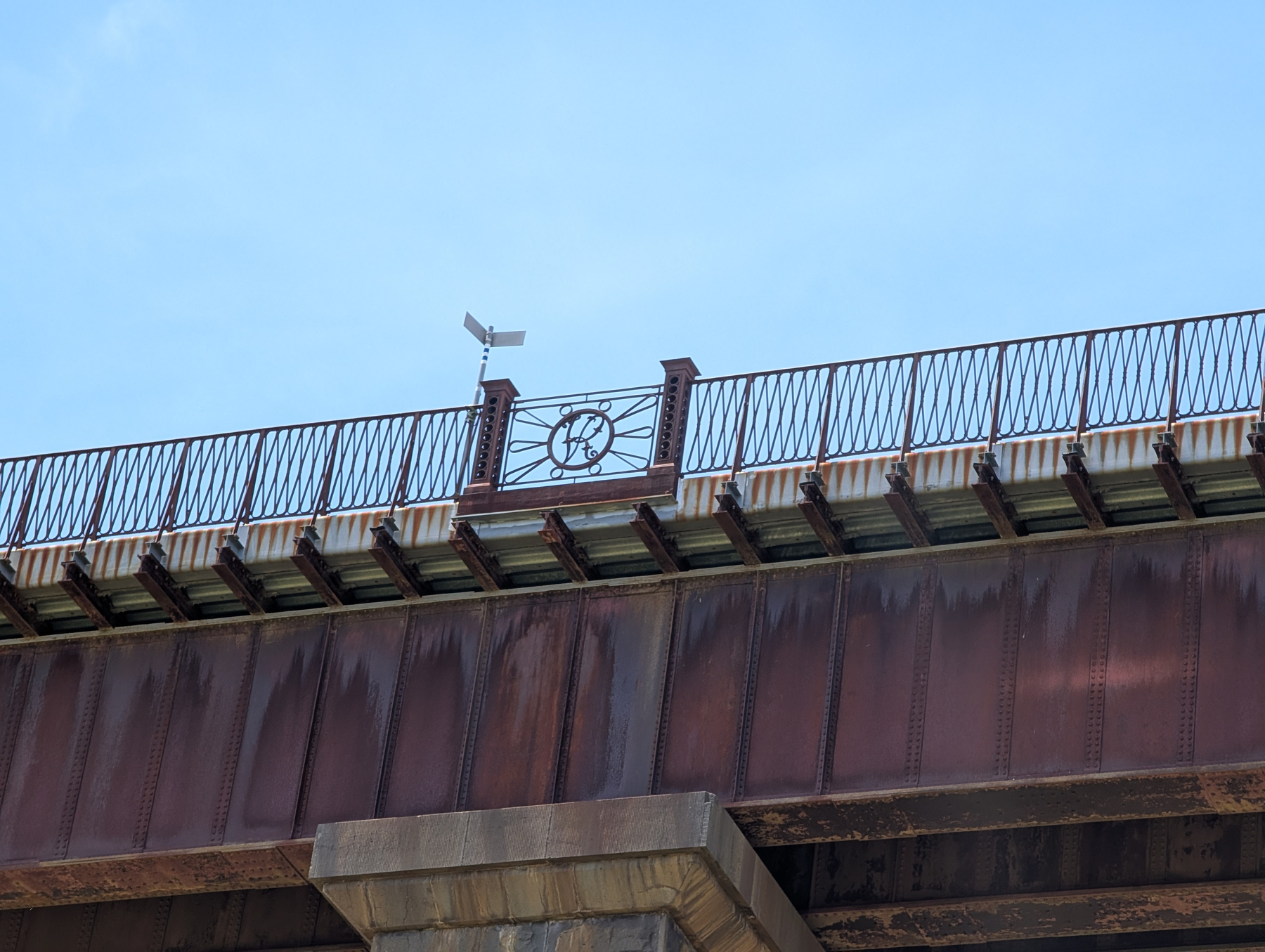
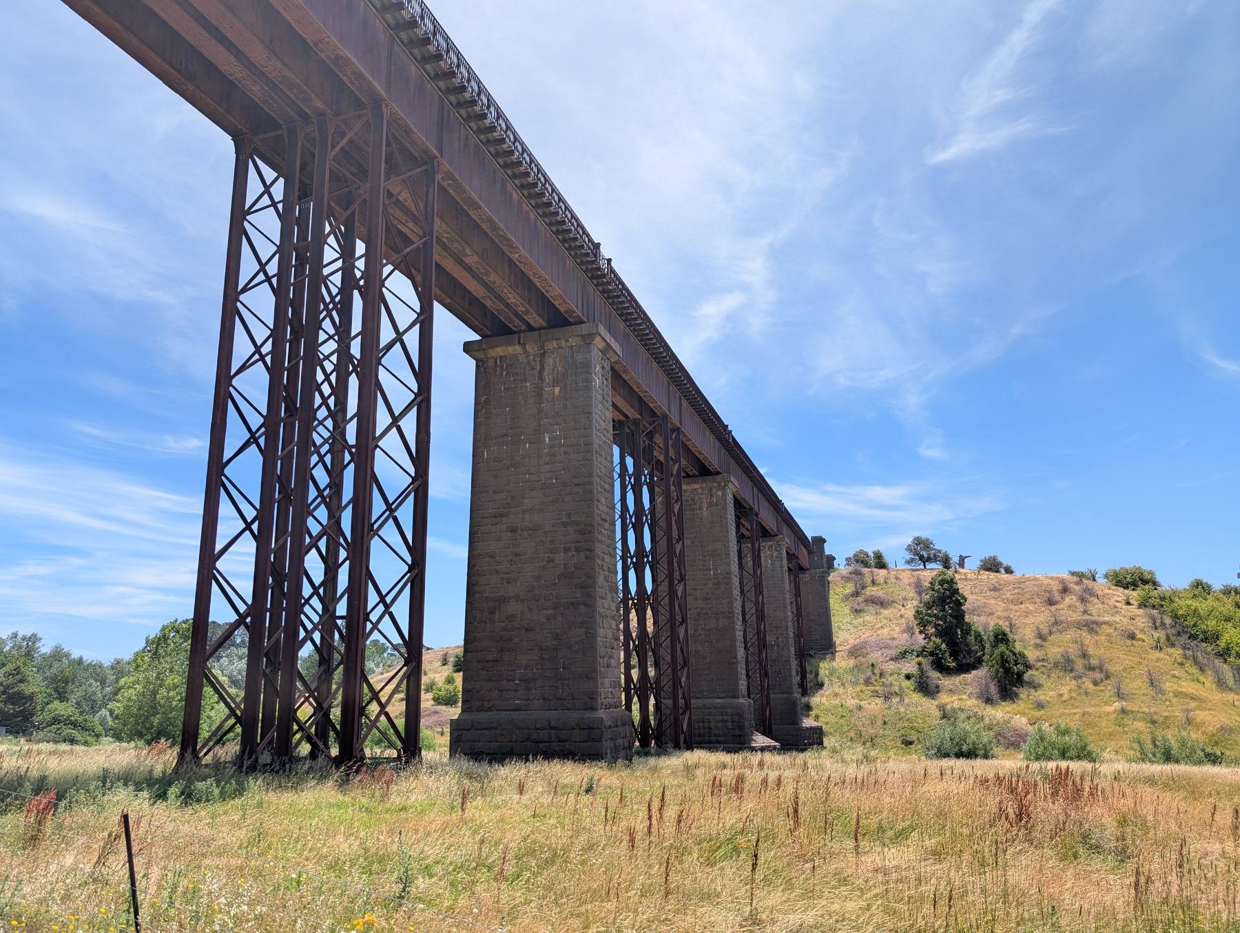
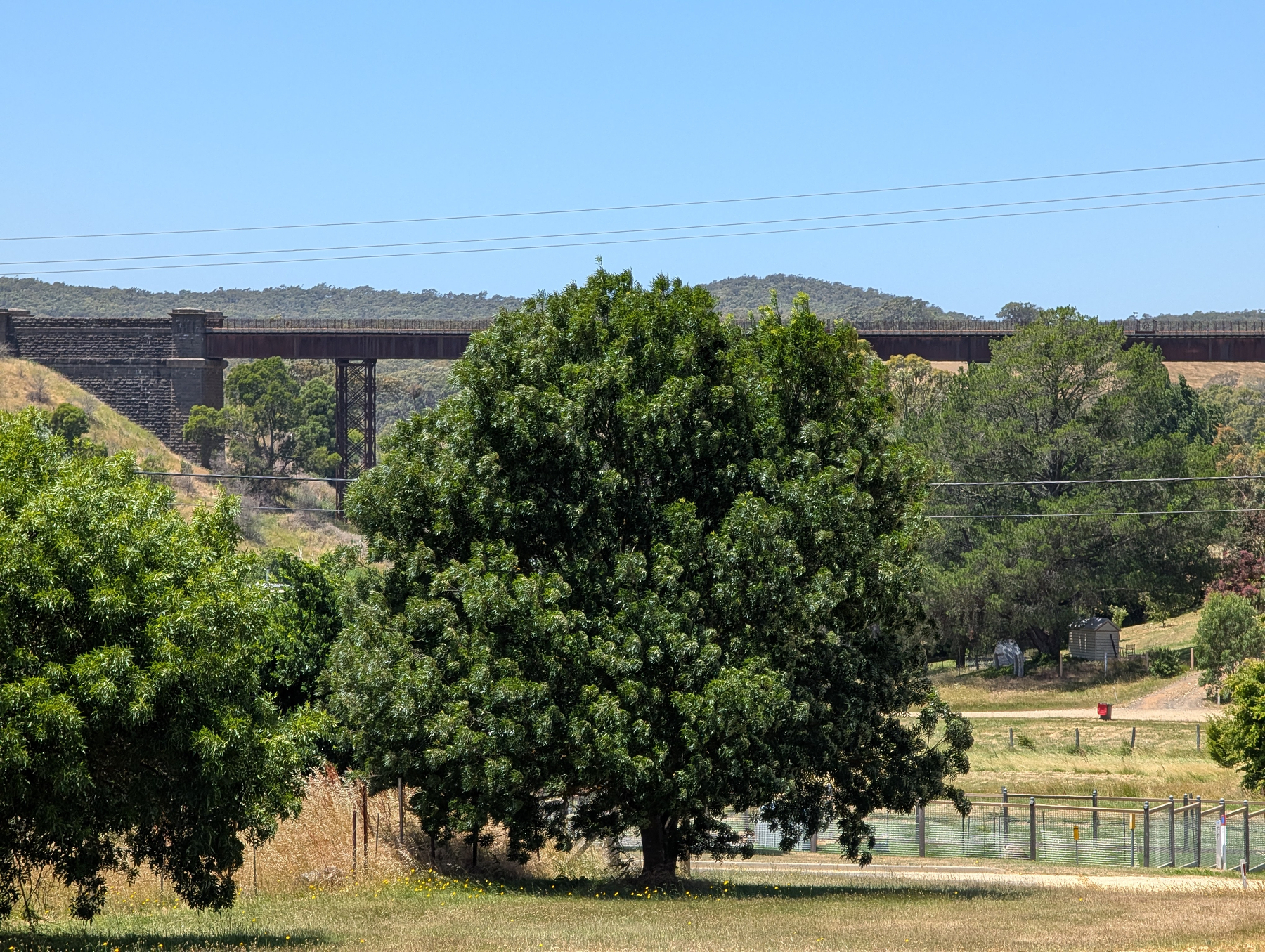
Continue reading →🖼️ GalleryRail Infrastructure Around Taradale
Since I was in the area, I figured I’d take a quick detour to Taradale to check out some of the local rail infrastructure: the closed station and the viaduct. Here are some photos of both.
Continue reading →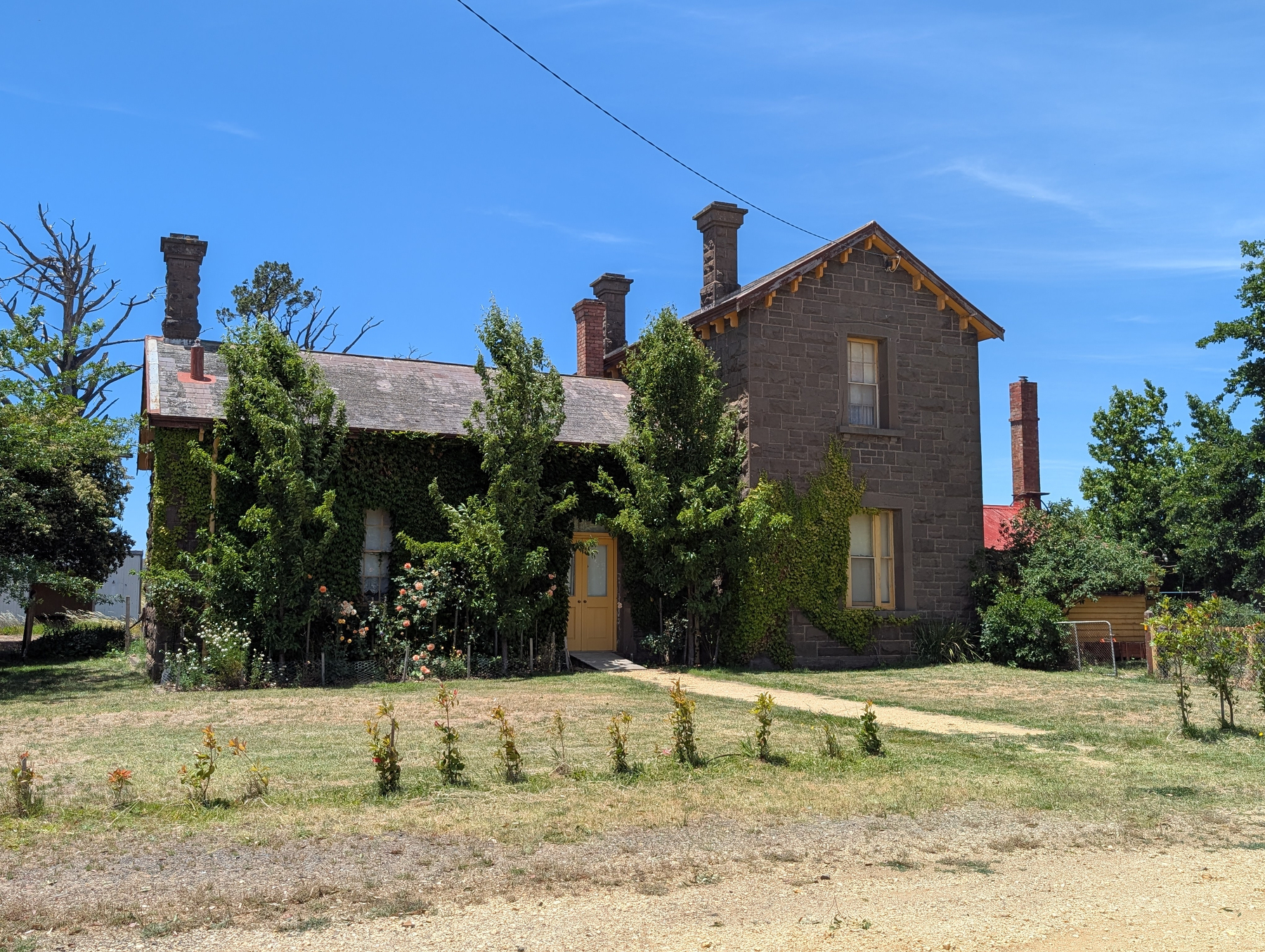


 📘 Devlog
An API For a Keyframe Animation Package
A Go-based key-frame animator for Ebitengine projects was developed, emphasizing a clear API for animating float values with room for future enhancements. Continue reading →
Rendering Outlined Text in Ebitengine
A method for rendering outlined text using the Ebitengine and the shapes package by creating a separate image for the text and applying an outline to it. Continue reading →
2025 Song of the Year
Once again, a need to play something during Christmas Eve Mass has come around, so it’s time to elect 2025’s Song of the Year.
No obvious song stood out this year, unlike 2023 and 2024. Looking back on what new music I listened to, it was mainly a lot of Enya and Lee Rosevere, with a bit of Anders Enger Jensen. Near the end of the year I also started listening to Jon Hopkins, in addition to one or two other artists featured in the “medleys” published on Music For Programming. Apparently the way I find new music — YouTube videos or finding something I can put on the background for a commute or project work — remains unchanged.
Continue reading →🦆 DialogueGood Banter Not Found
Some Caution on Using ROWIDs for Primary Keys in Sqlite 3
Relying on ROWIDs in SQLite can lead to reused IDs, causing issues with foreign key cascading deletes, which can be mitigated by using the
autoincrementfeature despite its overhead. Continue reading →